Awesome
antd-amplify-react
This is an Ant Design specific implementation of AWS Amplify React components for Authentication (SignUp, ConfirmSignUp, SignIn, SignOut, RequireNewPassword, ForgotPassword). You can use less and variables to style these components.
If you like this package and it helped you in any way, Star at github ⭐ ⭐ ⭐
Install
npm i -S antd-amplify-react
Usage
There are two components for each kind of component. One contains just Form and other contains the form component in Card container.
e.g. there is a component SignInForm without any container and SignIn with Card container. If you want more hold on styling of your form outer container, user Form components inside your own containers.
There is a special component AuthFlow which contains all above mentioned components in a single container and it handles all authentication flows and changes UI according to auth state.
Here are following components that you can use:
- AuthFlow - This component contains all components in tab view where you can switch components by clicking on tab navs or you can use radio buttons.
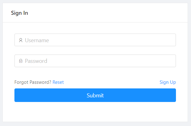
- SignIn: It's a sign in form contained in a Ant Design
Cardcontainer - SignInForm: It's a simple Ant Design form with username and password field. You can wrapp this in any container and apply styles of your choice
- SignUp: It's a sign up or registration form contained in a Ant Design
Cardcontainer - SignUpForm: It's a simple Ant Design form with username and password field. You can enable a confirm password field as well. Wrap this component in any container and apply styles of your choice
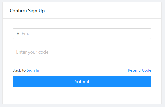
- ConfirmSignUp: This component will be rendered when Congnito will return a response with a challenge to confirm secret code sent to your email or phone number
- ConfirmsignUpForm: A form that contains username and (secret) code fields to verify that given email belongs to one trying to sign up
- ResetPassword: This component wrapps ResetPasswordForm in Ant Design
Cardand will be used to reset password and confirm change password flow. - ResetPasswordForm: This forms contains username/email field and on submission it will change to confirm password form which will ask for secret code that was sent to given email.
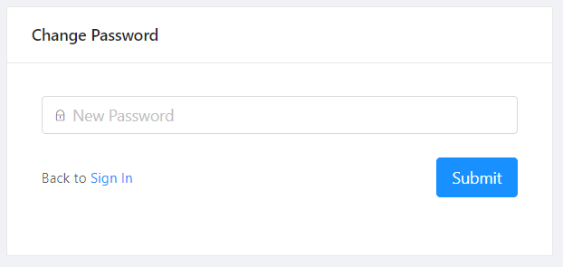
- RequireNewPassword: Youa are required to change your password if Admin created your account and set a temporary password for you. On Signing with temporary password, your will be redirected to this view
- RequireNewPasswordForm: This is a form component containing password field to update your password
AuthFlow
<AuthFlow />

<AuthFlow
  tabPosition="top"
  signInFormProps={{
    hideSignUpLink: true,
    hideResetPasswordLink: true,
    usernameInputProps: {
      message: "Invalid username!"
    }
  }}
/>

| Property | Description | Type | Default |
|---|---|---|---|
| tabPosition | Specify tab position | string | top |
| tabView | In order to use tabs instead of radio group buttons (default view) for switching components | bool | false |
| colProps | An object containing Col props to specify columns, offset etc. See more | object | { xs: 24, sm: 12, md: 8 } |
SignIn
<SignIn />
| Property | Description | Type | Default |
|---|---|---|---|
| title | The label text displayed in Card title/header section. | string|ReactNode | Sign in to your account |
| formProps | This is an object containing SignInForm props that you want to modify. | object | {} |
| colProps | An object containing Col props to specify columns, offset etc. See more | object | { xs: 24, sm: 12, md: 8 } |
SignInForm
<SignInForm />
| Property | Description | Type | Default |
|---|---|---|---|
| usernameInputProps | username input field props | object | { prefix: <Icon type="user" />, size: 'large', placeholder: 'Username', message: 'Please enter your username!' } |
| passwordInputProps | password input field props | object | { prefix: <Icon type="lock" />, size: 'large', placeholder: 'Password', message: 'Please enter your password!' } |
| buttonProps | Submit button props | object | { size: 'large', type: 'primary', label: 'Submit'} |
| hideSignUpLink | In order to hide SignUp link in form, add this props. | bool | false |
| hideResetPasswordLink | In order to hide ResetPassword link in form, add this props. | bool | false |
SignUp
<SignUp />

| Property | Description | Type | Default |
|---|---|---|---|
| title | The label text displayed in Card title/header section. | string|ReactNode | Sign Up |
| formProps | This is an object containing SignInForm props that you want to modify. | object | {} |
| colProps | An object containing Col props to specify columns, offset etc. See more | object | { xs: 24, sm: 12, md: 8 } |
SignUpForm
<SignUpForm />
| Property | Description | Type | Default |
|---|---|---|---|
| usernameInputProps | username input field props | object | { prefix: <Icon type="user" />, size: 'large', placeholder: 'Email', message: 'Please enter your email!'} |
| passwordInputProps | password input field props | object | { prefix: <Icon type="lock" />, size: 'large', placeholder: 'Password', message: 'Please enter your password!'} |
| confirmPasswordInputProps | confirm password input field props | object | { prefix: <Icon type="lock" />, size: 'large', placeholder: 'Confirm', message: 'Please confirm your password!'} |
| buttonProps | Submit button props | object | { size: 'large', type: 'primary', label: 'Submit'} |
| confirmPassword | In order to hide confirm password field, add false. | bool | true |
ConfirmSignUp
<ConfirmSignUp />
| Property | Description | Type | Default |
|---|---|---|---|
| title | The label text displayed in Card title/header section. | string|ReactNode | Confirm Sign Up |
| formProps | This is an object containing SignInForm props that you want to modify. | object | {} |
| colProps | An object containing Col props to specify columns, offset etc. See more | object | { xs: 24, sm: 12, md: 8 } |
ConfirmSignUpForm
<ConfirmSignUpForm />
| Property | Description | Type | Default |
|---|---|---|---|
| usernameInputProps | username input field props | object | { prefix: <Icon type="user" />, size: 'large', placeholder: 'Email', message: 'Please enter your email!'} |
| codeInputProps | secret code input field props | object | { prefix: <Icon type="lock" />, size: 'large', placeholder: 'Enter your code', message: 'Please enter secret code!'} |
| buttonProps | Submit button props | object | { size: 'large', type: 'primary', label: 'Submit'} |
ResetPassword
<ResetPassword />

| Property | Description | Type | Default |
|---|---|---|---|
| title | The label text displayed in Card title/header section. | string|ReactNode | Reset Password |
| formProps | This is an object containing ResetPasswordForm props that you want to modify. | object | {} |
| colProps | An object containing Col props to specify columns, offset etc. See more | object | { xs: 24, sm: 12, md: 8 } |
ResetPasswordForm
<ResetPasswordForm />
| Property | Description | Type | Default |
|---|---|---|---|
| usernameInputProps | username input field props | object | { prefix: <Icon type="user" />, size: 'large', placeholder: 'Email', message: 'Please enter your email!'} |
| passwordInputProps | password input field props | object | { prefix: <Icon type="lock" />, size: 'large', placeholder: 'Password', message: 'Please enter your password!'} |
| buttonProps | Submit button props | object | { size: 'large', type: 'primary', label: 'Submit'} |
RequireNewPassword
<RequireNewPassword />
| Property | Description | Type | Default |
|---|---|---|---|
| title | The label text displayed in Card title/header section. | string|ReactNode | Change Password |
| formProps | This is an object containing ResetPasswordForm props that you want to modify. | object | {} |
| colProps | An object containing Col props to specify columns, offset etc. See more | object | { xs: 24, sm: 12, md: 8 } |
RequireNewPasswordForm
<RequireNewPasswordForm />
| Property | Description | Type | Default |
|---|---|---|---|
| passwordInputProps | password input field props | object | { prefix: <Icon type="lock" />, size: 'large', placeholder: 'New Password', message: 'Please enter your new password!'} |
| buttonProps | Submit button props | object | { size: 'large', type: 'primary', label: 'Submit'} |