Awesome
Fitting Ising Models to Neural Data
by Liberty Hamilton, Jascha Sohl-Dickstein, and Alexander Huth Oct. 2013
Licensing Info
Copyright ©2013 [see note below]. The Regents of the University of California (Regents). All Rights Reserved. Permission to use, copy, modify, and distribute this software and its documentation for educational, research, and not-for-profit purposes, without fee and without a signed licensing agreement, is hereby granted, provided that the above copyright notice, this paragraph and the following two paragraphs appear in all copies, modifications, and distributions. Contact The Office of Technology Licensing, UC Berkeley, 2150 Shattuck Avenue, Suite 510, Berkeley, CA 94720-1620, (510) 643-7201, for commercial licensing opportunities.
[Created by Liberty S. Hamilton, Jascha Sohl-Dickstein, and Alexander Huth at the University of California, Berkeley. Based on code written by Jascha Sohl-Dickstein (2009) available at https://github.com/Sohl-Dickstein/Minimum-Probability-Flow-Learning]
IN NO EVENT SHALL REGENTS BE LIABLE TO ANY PARTY FOR DIRECT, INDIRECT, SPECIAL, INCIDENTAL, OR CONSEQUENTIAL DAMAGES, INCLUDING LOST PROFITS, ARISING OUT OF THE USE OF THIS SOFTWARE AND ITS DOCUMENTATION, EVEN IF REGENTS HAS BEEN ADVISED OF THE POSSIBILITY OF SUCH DAMAGE.
REGENTS SPECIFICALLY DISCLAIMS ANY WARRANTIES, INCLUDING, BUT NOT LIMITED TO, THE IMPLIED WARRANTIES OF MERCHANTABILITY AND FITNESS FOR A PARTICULAR PURPOSE. THE SOFTWARE AND ACCOMPANYING DOCUMENTATION, IF ANY, PROVIDED HEREUNDER IS PROVIDED "AS IS". REGENTS HAS NO OBLIGATION TO PROVIDE MAINTENANCE, SUPPORT, UPDATES, ENHANCEMENTS, OR MODIFICATIONS.
Overview
This document explains how to use our MATLAB code (available at: https://github.com/libertyh/ising-model to fit Ising Models to neural data. We have used this technique in our recent paper (Hamilton et al. 2013) to investigate changes in functional connectivity as measured by Ising Model couplings. The Ising Model couplings are fitted using Minimum Probability Flow learning (Sohl-Dickstein et al. 2011). The code is modified from code available at https://github.com/Sohl-Dickstein/Minimum-Probability-Flow-Learning. To run the code on an example dataset (sample_data.mat), run the MATLAB file run_ising_demo.m.
Preprocessing the data
To use this code, you will need your data preprocessed in the correct format. We have included a sample dataset preprocessed in this manner, called sample_data.mat. In brief, what you want to do is:
- Re-order the channel numbers for your spike data so that they are ordered according to how the channels are positioned in space.
- For each channel on your polytrode/electrode/recording grid, create an
n x tbinary matrix of the spike data, wherenis the number of recording channels andtis the number of time bins. Trials should be concatenated horizontally so there is only one row per electrode site/channel. - Create an
s x tbinary matrix of the stimulus condition at each of the corresponding time points (the time bins must match those of the spike matrix).sis the number of stimuli/stimulus features. In our data, the stimulus condition is represented by the frequency of the tone pip that is playing at a given time (1 = a particular pure tone is "on", 0 = the tone is "off"). - Save your data as a
.matfile with the variablesspk(for then x tbinned spike matrix),stim(for thes x tbinned stimulus condition matrix), andbin_sizeas the bin size in milliseconds (for our sample data the bin size is 5 ms, sobin_size = 0.005.
Re-ordering the channels
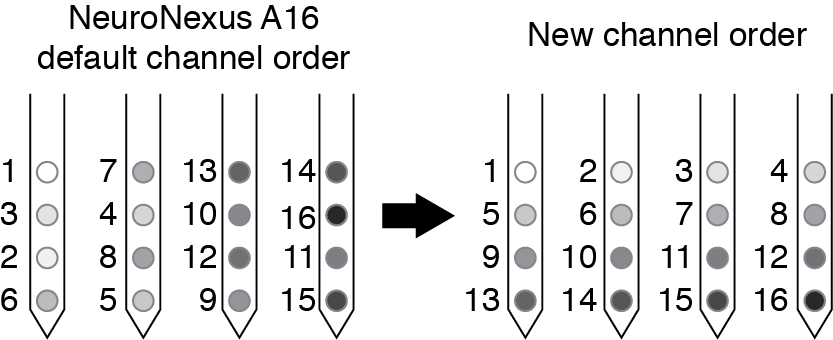
By reordering your channel numbers you will make the plotting easier for yourself later (especially if you are interested in spatial relationships in the couplings). For NeuroNexus probes (used in our study, see p6 of the A16 map document), the channel order on the polytrode is not sequential, so we re-order the channels so that they are relabeled as shown below.
 Example site map for a NeuroNexus A16 probe (left), and corresponding reordering before running the Ising Model (right).
If you export your data with some other channel ordering that you prefer, remember you will have to use that information when plotting spatial relationships between the couplings. The plotting code included here assumes that you have numbered your sites as we have here.
Choosing the bin size
Because the Ising model considers activity in isolated time-slices, the bin size is important. If you are curious about dynamics in a very short time scale (neurons that are co-active within milliseconds), you will want to choose a small bin size (we suggest 2-5 ms for auditory cortex). Conversely, if you are interested in longer time dependencies, you could choose a larger bin size (50-100 ms). One way to choose this in a principled manner is to plot the cross-correlation between each pair of sites and choose a bin that captures the peak as well as when the cross-correlation is significantly above baseline.
A note regarding stimulus matrices
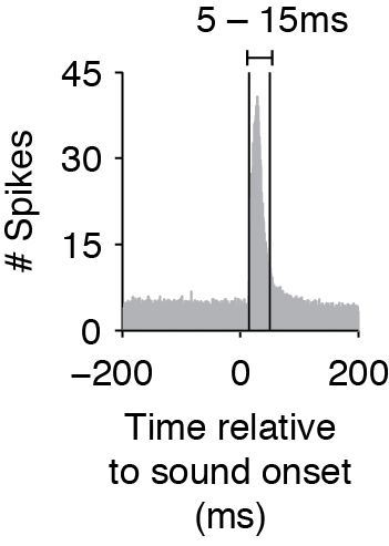
The Ising Model does not consider time delays or interactions between spikes in different time bins, so to capture effects that have a delay, you must shift the timing of the stimulus matrix. When you create the binary matrices for the stimulus, determine the average cross-correlation and find the average time that the cross-correlation exceeds the baseline before and after the cross-correlation peak (as in the figure below). The start and end time of your stimulus should then match this average window (rather than the exact time that the stimulus was on). This is especially important if you use smaller time bins.

Average cross-correlation between stimulus and neural response, showing that the response window is between 5-15ms.
You could also capture interactions at different delays by adding rows to stim that are delayed versions of the stimulus matrix. See the Supplemental Materials in Hamilton et al. 2013 for details.
Running the Ising Model
With your matrices of spike and stimulus data, you can now run the Ising Model on your data using the following MATLAB commands:
>> datafile = 'sample_data.mat';
>> model = 0;
>> nchunks = 10; % number of cross-validation iterations
>> [modelname, logL, J] = ising_neurons_L1reg(datafile, model, nchunks)
This function takes the mat file (sample_data.mat) and runs the Ising model fitting with nchunks cross-validation iterations. The model is currently set to 0 for a "fully connected" model, which fits all possible pairwise connections. We then minimize the MPF function defined in K_dK_ising_L1reg.m using minFunc.m, third party code written by Mark Schmidt) that performs function minimization.
The outputs of ising_neurons_L1reg are the model name (in this case, "fully connected"), the log-likelihood of the data given the model (logL), and a 3D matrix of coupling values ([s+n] x n x # of cross validation iterations).
Evaluating Ising Model performance
Depending on how many electrode sites you record from and how much memory you have on your computer, you may be able to calculate the full log-likelihood of your data given the model, in which case you can directly compare log-likelihoods across models (this is what the code assumes, and calculates the log-likelihood directly with L_dL_ising.m). With 16 sites, this is tractable (2<sup>16</sup> possible spike patterns must be calculated), but if you have something larger (e.g. a 128-channel array) it may not be possible to calculate the partition function. In that case, you may want to use a technique such as annealed importance sampling to compute the log likelihood.
Plotting the couplings
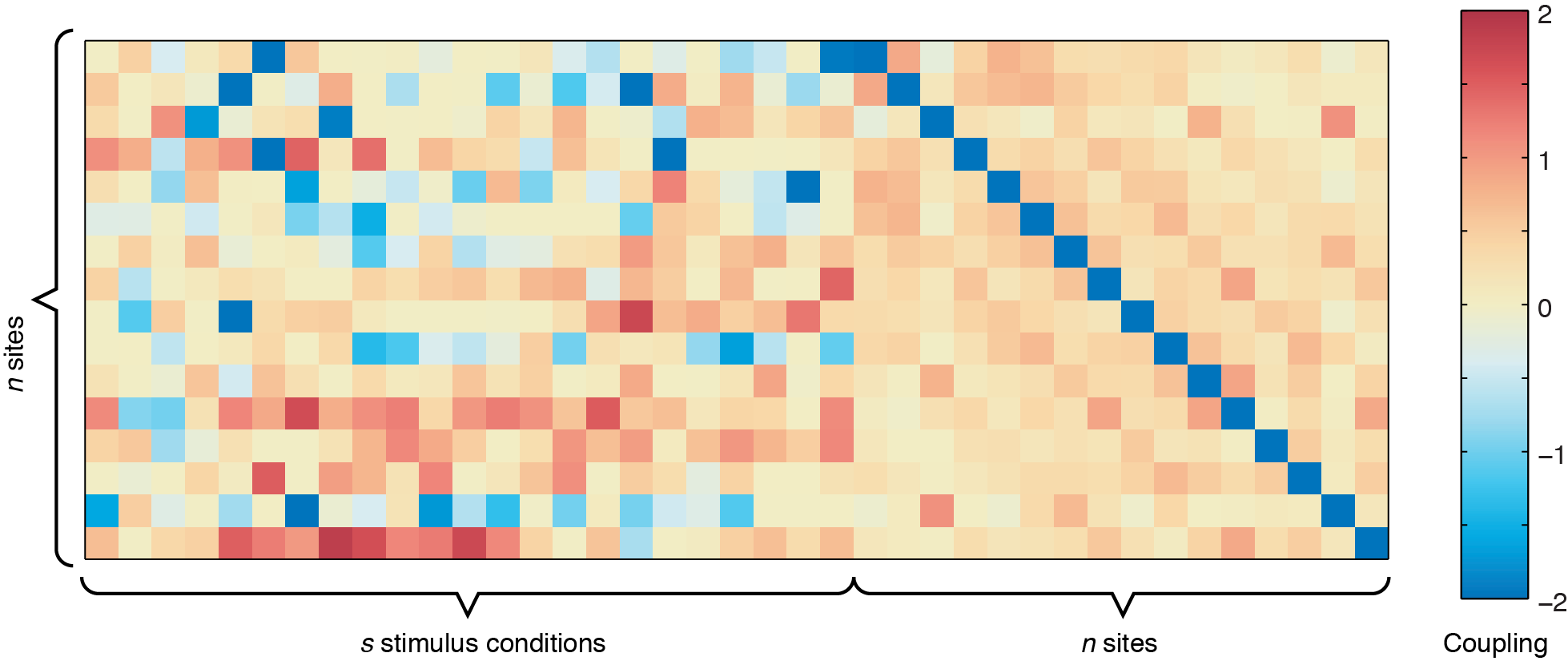
The output from ising_neurons_L1reg.m can be plotted by itself to get an overall view of the couplings (use imagesc(all_J(:,:,1),[-2 2])), but inferring spatial patterns is difficult unless you are used to looking at these plots. For example, running the code using sample_data.mat, you should get a coupling matrix similar to the one below.
 Plotting the coupling output from one cross-validation iteration with no spatial arrangement. The stimulus-to-site (left part of matrix) and site-to-site (right part of matrix) are concatenated together. The blue diagonal in the
 n x n site-to-site coupling matrix shows the values for the bias term, which indicates the intrinsic firing rate of each of the 16 sites shown.
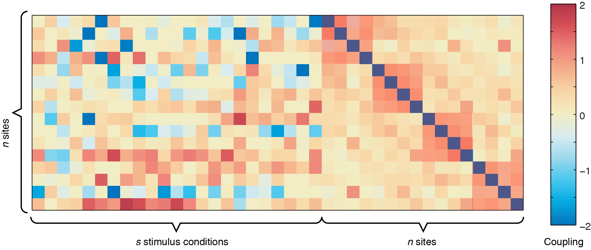
In the figure above, the left side represents the sound-to-site couplings (a n x s matrix) and the right side shows the site-to-site couplings (n x n). The diagonal line through the n x n coupling matrix is the bias term, showing the intrinsic firing rate of the channels. For this dataset, there are two defective channels (site 3 and site 15, which would usually be removed before Ising Model fitting, but are shown here for illustrative purposes). For the remaining channels, you can see some positive responses to the stimulus in the deeper row sites (red couplings in the sound-to-site coupling matrix at left, deeper rows are near the bottom). Since this is for a 4 x 4 electrode arrangement, you can see columnar structure by the slightly stronger couplings in the n x n matrix off the diagonal -- site 1 is strongly coupled to site 5, and site 2 is strongly coupled to site 6, etc. If there were very strong laminar structure, we would see square structures along the diagonal, as shown below.
 Sample coupling matrix if within-layer connections are very strong.
Although these plots give us an overview of the whole coupling matrix, in practice it is more convenient to plot the couplings grouped according to where they are spatially. Here we have included code to plot the couplings within the same layer and within the same columns. Using information about the spatial location of your channels, you can construct other plots yourself to answer questions about diagonal couplings, nearest neighbor couplings, etc.
Troubleshooting tips
A couple of things to check if you are having problems:
- Your bin size is appropriate for your data or for the question you wish to ask
- The regularization parameter is appropriate for your data
- You have enough data/time points to fit the model
- You have enough memory on your system
- Your channels are named appropriately
- If the number of sites is larger than approximately 20, that you have commented out the call to
L_dL_ising.m(which takes a time proportional to 2<sup># sites</sup>).
References
- Hamilton LS, Sohl-Dickstein J, Huth AG, Carels VM, Deisseroth K, Bao S (2013). Optogenetic Activation of an Inhibitory Network Enhances Feedforward Functional Connectivity in Auditory Cortex. Neuron 80(4): 1066-76 https://www.ncbi.nlm.nih.gov/pmc/articles/PMC3841078/
- Sohl-Dickstein J, Battaglino PB, and DeWeese MR (2011). New method for parameter estimation in probabilistic models: minimum probability flow. Physical Review Letters 107:22 p220601.
- Schmidt M. minFunc: Unconstrained optimization of differentiable real-valued multivariate functions. Open source MATLAB software available at http://www.di.ens.fr/~mschmidt/Software/minFunc.html (accessed September 2013).