Awesome
BFPaperTabBarController
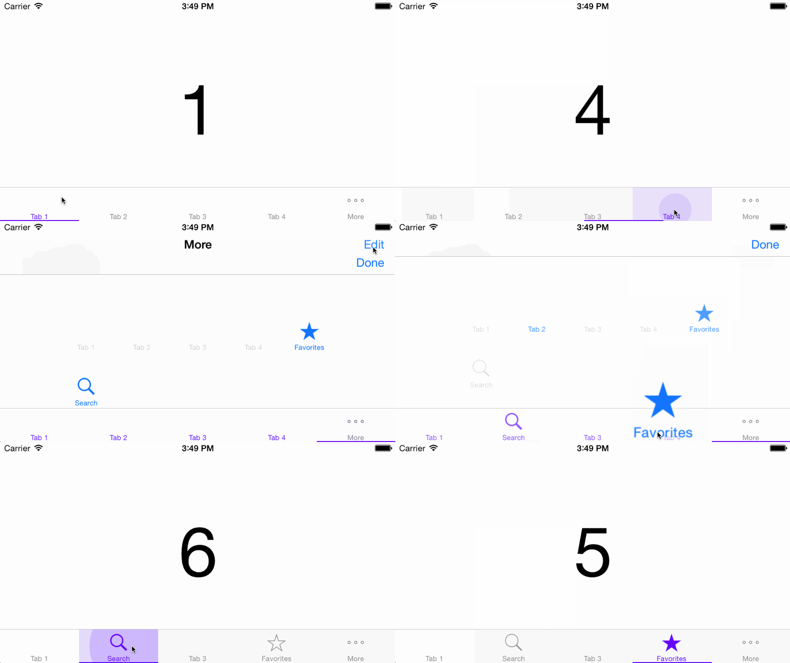
iOS UITabBar (controller) inspired by Google's Paper Material Design.

About
Now with smoother animations and more public properties for even easier customization!
BFPaperTabBarController is a subclass of UITabBarController that behaves much like the new paper tab bar from Google's Material Design Labs. All animation are asynchronous and are performed on sublayers. BFPaperTabBarControllers work right away with pleasing default behaviors, however they can be easily customized! The tap-circle color, background fade color, tap-circle diameter, underline color, and underline thickness are all readily customizable via public properties.
By default, BFPaperTabBarControllers use "Smart Color" which will match the tap-circle, background fade, and underline bar colors to the color of the tabBar.tintColor.
You can turn off Smart Color by setting the property, .usesSmartColor to NO. If you disable Smart Color, a gray color will be used by default for both the tap-circle and the background color fade.
You can set your own colors via: .tapCircleColor and .backgroundFadeColor. Note that setting these disables Smart Color.
Changes
Please refer to this CHANGELOG.md.
Properties
BOOL usesSmartColor
A flag to set YES to use Smart Color, or NO to use a custom color scheme. While Smart Color is the default (usesSmartColor = YES), customization is cool too.
CGFloat touchDownAnimationDuration
A CGFLoat representing the duration of the animations which take place on touch DOWN! Default is
0.25fseconds. (Go Steelers)
CGFloat touchUpAnimationDuration
A CGFLoat representing the duration of the animations which take place on touch UP! Default is
2 * touchDownAnimationDurationseconds.
CGFloat tapCircleDiameterStartValue
A CGFLoat representing the diameter of the tap-circle as soon as it spawns, before it grows. Default is
5.f.
CGFloat tapCircleDiameter
The CGFloat value representing the Diameter of the tap-circle. By default it will be the result of
MAX(self.frame.width, self.frame.height).tapCircleDiameterFullwill calculate a circle that always fills the entire view. Any value less than or equal totapCircleDiameterFullwill result in default being used. The constants:tapCircleDiameterLarge,tapCircleDiameterMedium, andtapCircleDiameterSmallare also available for use.
CGFloat tapCircleBurstAmount
The CGFloat value representing how much we should increase the diameter of the tap-circle by when we burst it. Default is
40.f.
UIColor *tapCircleColor
The UIColor to use for the circle which appears where you tap. NOTE: Setting this defeats the "Smart Color" ability of the tap circle. Alpha values less than
1are recommended.
UIColor *backgroundFadeColor
The UIColor to fade clear backgrounds to. NOTE: Setting this defeats the "Smart Color" ability of the background fade. Alpha values less than
1are recommended.
BOOL rippleFromTapLocation
A flag to set to
YESto have the tap-circle ripple from point of touch. If this is set toNO, the tap-circle will always ripple from the center of the view. Default isYES.
UIColor *underlineColor
The UIColor to use for the underline below the currently selected tab. NOTE: Setting this defeats the "Smart Color" ability of this underline.
CGFloat underlineThickness
The CGFLoat to set the thickness (height) of the underline. NOTE: Large values will cover up the bottoms of low-hanging letters of a default TabBarItem's title.
BOOL animateUnderlineBar
A BOOL flag indicating whether or not we should animate the bar sliding around below the tabs.
YESwill have the bar slide to the selected tab,NOwill have it appear below it instantaneously. Default isYES.
BOOL showUnderline
A flag to set to
YESto show an underline bar that tracks the currently selected tab.
BOOL showTopLine
A flag to set to
YESto show an overline bar that tracks the currently selected tab.
BOOL showTapCircleAndBackgroundFade
A flag to set to
YESto show the tap-circle and background fade. IfNO, they will not appear.
BOOL userInteractionEnabled
A flag that enables or disables the touch gesture of the bar. Set this to NO when something covers the tab bar (like a full screen popup).
Functions
(void)selectTabAtIndex:(NSInteger)index animated:(BOOL)animated
Selects and highlights a tab.
@param index (NSInteger) The index of the tab you wish to select and highlight.
@param animated (BOOL) A flag to determine if we should animate the change or not.
To Do
Support programmatic instantiation.
Usage
BFPaperTabBarController is only supported in the Interface Builder.<br /> Add the BFPaperTabBarController header and implementation file to your project. (.h & .m)
Subclass!
To use a BFPaperTabBarController, create a UITabBarController object and set its superclass to BFPaperTabBarController.
@interface MyTabBarController : BFPaperTabBarController
//...
@end
Customized Example
In your UITabBarController which is a subclass of BFPaperTabBarController:<br />(Taken directly from example project.)<br />
// NOTE: paperColors available from my other library, BFPaperColors :)
self.tabBar.tintColor = [UIColor paperColorDeepPurpleA400]; // set the tab bar tint color to something cool.

self.rippleFromTapLocation = NO;  // YES = spawn tap-circles from tap locaiton. NO = spawn tap-circles from the center of the tab.

self.usesSmartColor = NO; // YES = colors are chosen from the tabBar.tintColor. NO = colors will be shades of gray.

self.tapCircleColor = [[UIColor paperColorLightBlue] colorWithAlphaComponent:0.2];    // Set this to customize the tap-circle color.

self.backgroundFadeColor = [UIColor paperColorGreenA400];  // Set this to customize the background fade color.

self.tapCircleDiameter = bfPaperTabBarController_tapCircleDiameterSmall;    // Set this to customize the tap-circle diameter.

self.underlineColor = [UIColor paperColorDeepPurpleA400]; // Set this to customize the color of the underline which highlights the currently selected tab.

self.animateUnderlineBar = NO;  // YES = bar slides below tabs to the selected one. NO = bar appears below selected tab instantaneously.

self.showUnderline = NO;  // YES = show the underline bar, NO = hide the underline bar.

self.underlineThickness = 4.f;    // Set this to adjust the thickness (height) of the underline bar. Not that any value greater than 1 could cover up parts of the TabBarItem's title.

self.showTapCircleAndBackgroundFade = NO; // YES = show the tap-circles and add a color fade the background. NO = do not show the tap-circles and background fade.
CocoaPods
CocoaPods are the best way to manage library dependencies in Objective-C projects. Learn more at http://cocoapods.org
Add this to your podfile to add BFPaperTabBarController to your project.
platform :ios, '7.0'
pod 'BFPaperTabBarController'
License
BFPaperTabBarController uses the MIT License:
Please see included LICENSE file.
