Awesome
AkarIcons Web Components
AkarIcons Web Components is a non-official Web Components wrapper for the amazing AkarIcons.
Also a handy icon framework for dynamically customizable icons.
Features
- Framework INDEPENDENT, AkarIcons Web Components can be DIRECTLY used in ANY frameworks: React, Vue.js, you name it 🤗
- With lazy loading icons, the main script weighs ~4KB, loading each uncached icon costs ~0.5KB increacement 🤩
- Fully customizable, dynamically color changing is ancient, how about changing
stroke-widthandline-styleON THE FLY? 🤯
Read more about the design philosophies in this article! 📄
Getting Started
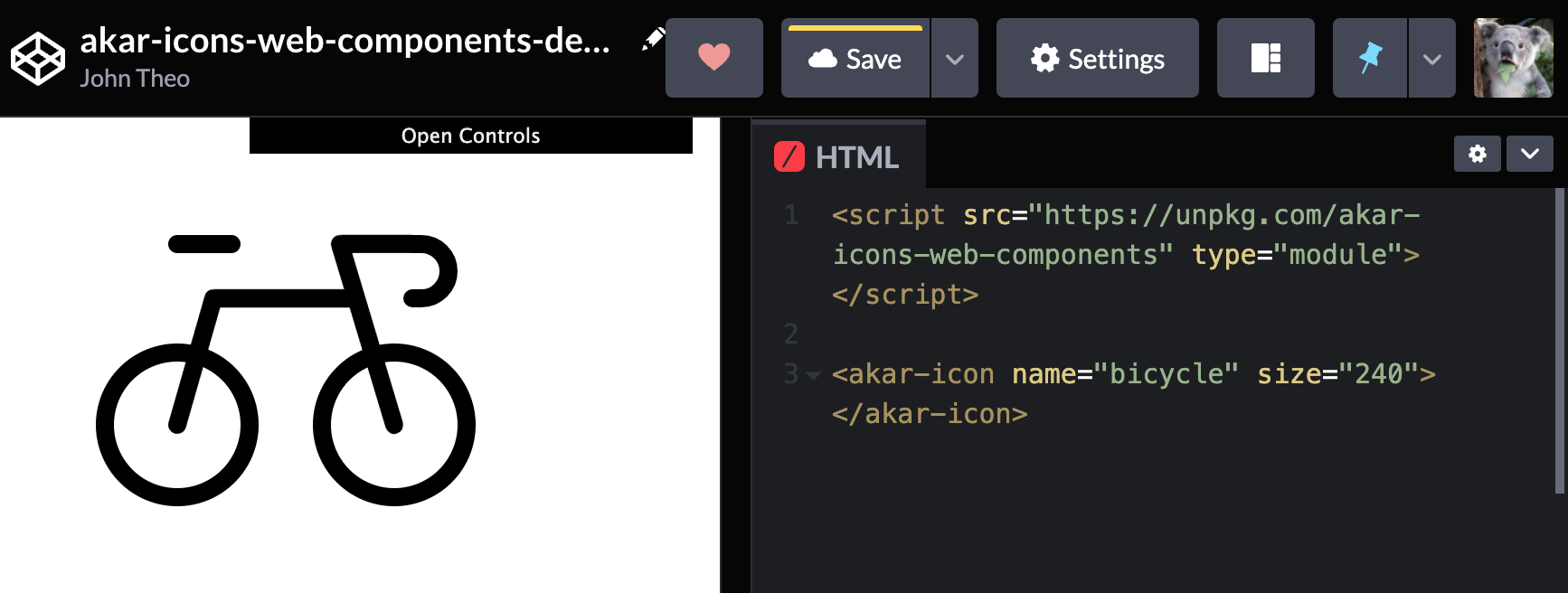
<script src="https://cdn.jsdelivr.net/npm/akar-icons-web-components" type="module"></script>

<body>
  <akar-icon name="bicycle">
</body>
And voilà, the icon is ready.
Play around with the CodePen.
Advanced Usage
Appetizer
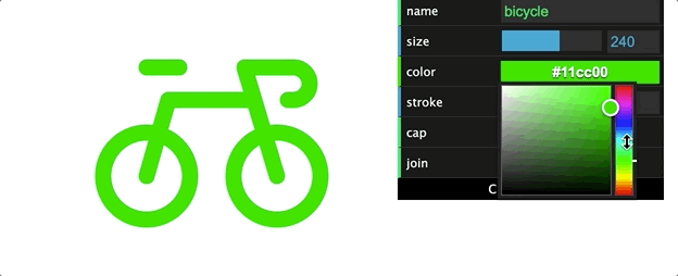
Note on the top right corner of the CodePen, there is a dropdown menu. Open and have fun with it.
Value for the
namefield can be copied from AkarIcons homepage without theai-prefix, eg.arrow-left
Main Course
Everything the menu changes, is simply attributes for the <akar-icon> tag.
So <akar-icon name="air" size="50"> will be rendered as a 50px ✕ 50px AkarIcons air icon.
Attributes
| Attribute | Type | Css Var | Default |
|---|---|---|---|
name | string | (Required) | |
size | number | --size | 24 |
color | string | color | "inherit" |
stroke | number | --stroke | 1 |
cap | enum | --cap | "round" |
join | enum | --join | "round" |
Try the following examples:
<akar-icon name="bicycle" size="50" cap="butt" join="miter"/> </akar-icon>
<akar-icon name="air" stroke="2" style="transform: scaleX(-1)"/> </akar-icon>
Or set a universal style for all <akar-icon>s:
<style>
  akar-icon {
    --cap: butt;
  }
</style>
And yes, it's that simple! 😇
Features (may be) Coming
- Visual alignment adjustment configs
- Framework(React, etc)-friendly wrappers
- Dichromatic Icons
- SVG ANIMATIONS 🤟
- Use <use> tag to reduce elements inserted into page
- Use localstorage to mimic cache
Change Log
0.1/0.2Sep 19, 2021. First commit!
Dev Preparations
git clone git@github.com:awmleer/akar-icons-web-components.git
yarn run start
Authors
- 卡晨 @awmleer
- John @John-Theo
License
MIT License, Copyright © 2021-present @awmleer and @John-Theo.