Awesome
.qube
Quintessential Responsive 3D CSS Cube
Created by @zacharyjohnson — zachstronaut.com
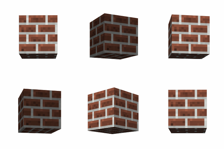
Hello web friend! The styles defined in "src/qube.css" provide you with an ideal way to create 3D CSS3 cubes that are exceptionally easy to work with and very extensible.
Examples / Demo
Features
- Flexible markup! — Build your cubes using
<div>tags,<ul> <li>, or whatever markup you prefer. And, put your cube faces in whatever source order you need by using face classes.
<div class="qube-perspective">
	<!-- Your first cube! -->
	<ul class="qube my-cube">
		<li class="front"></li>
		<li class="left"></li>
		<li class="back"></li>
		<li class="right"></li>
		<li class="top"></li>
		<li class="bottom"></li>
	</ul>
</div>
- Specify the size and color/texture of your cube with just two simple CSS rules.
/* Make your cube red and 200 x 200 x 200px */
.my-cube {
	width: 200px;
	height: 200px;
}

	.my-cube > * {
		background: red;
	}
- Automatic flat shading! — Your cubes will automatically get basic shading, regardless of the color, image texture, or HTML content you define for the cube faces. (This can be easily customized or disabled entirely with:
.qube.no-shading)

- Create responsively resizing cubes! — Really easy with the surprisingly well supported CSS viewport units.
/* This responsive cube will be 25% of the viewport width */
.my-viewport-responsive-cube {
	width: 25vw;
	height: 25vw; /* Cubes need 1:1 ratio! */
}
For more conventional responsive design, you can set your cube's width and height to a percentage of its parent element. (By default, .qube is actually 100% width and 100% height.) However, some care must be taken to make sure that the container element maintains a 1:1 aspect ratio.
<div class="qube-perspective one-half">
	<div class="qube">
		... faces ...
	</div>
</div>
.one-half {
	position: relative;
	width: 50%;
	padding-top: 100%;
	/* Sets height to 100% of width, forcing a 1:1 aspect ratio */
}

	.one-half .qube {
		/* Center this cube in the parent */
		position: absolute;
		left: 0;
		right: 0;
		top: 0;
		bottom: 0;
		margin: auto;

		/* Each of this cube's faces will be
		   a responsive 25% of the parent */
		width: 25%;
		height: 25%;
	}
- Easily rotate your cube along the X, Y, or Z-axis! — Your cube will neatly rotate about its center.
.my-cube {
	transition: transform 1500ms ease;
}

	.my-cube:hover {
		transform: rotateY(359deg);
	}
- Optionally, you can skip the face name classes. — Use
.qube.facesto turn your elements into faces automatically. Note: This does dictate the source order of your cube faces.
<ul class="qube faces my-automatic-cube">
	<li>My front</li>
	<li>My left</li>
	<li>My back</li>
	<li>My right</li>
	<li>My top</li>
	<li>My bottom</li>
</ul>
-
Handy utilities and optimizations! — Use
.qube-perspectiveon a parent element to setup your 3D viewport. Use.qube-preserve3das a shortcut if you need it. Use.qube.solidas an optimization when your cube is not semi-transparent, and you are not displaying the inside of your cube. -
Customize individual cube faces! — It's a snap to change the color or other styles of a single cube face. You can even skip a cube face so people can peek inside.
/* Make just the front blue */
.my-cube > .front {
	background: blue;
}
<ul class="qube my-peekaboo-cube">
	<!-- Skipped the front so we can look inside -->
	<li class="left"></li>
	<li class="back"></li>
	<li class="right"></li>
	<li class="top"></li>
	<li class="bottom"></li>
</ul>
Usage
Download this GitHub project, add the "src/qube.css" or "src/qube.min.css" CSS file to your project, and include the file in your <head>.
<link href="/my/path/qube.min.css" rel="stylesheet" type="text/css" />
Define your cube using your preferred markup. Note: If you do not use .qube-perspective it will be important to establish your own CSS perspective settings or your cubes will look flat.
<div class="qube-perspective">
	<div class="qube my-cube">
		<div class="front">Hey!</div>
		<div class="left">Howdy!</div>
		<div class="back">Hi!</div>
		<div class="right">Hello!</div>
		<div class="top">Foo</div>
		<div class="bottom">Bar</div>
	</div>
</div>
Style your cube.
/* Create a 200 by 200 by 200px cube... */
.my-cube {
	width: 200px;
	height: 200px;
	/* (It is a CUBE, so the width/height are EQUAL.) */
}

	/* ...that is red. */
	.my-cube > * {
		background: #f00;
	}
Browser Support
- Tested in Chrome 16+, Firefox 10+, Safari 5+, Android 3+, and iOS 4+
- Compatible with browsers that fully support CSS3 3D Transforms.
Intro to 3D CSS3 (Helpful Prerequisites)
I recommend that you read this very helpful intro to 3D CSS3 properties and this CSS cube reference. You are going to have a lot fewer headaches if you already understand how and when to use these CSS properties:
perspective: 1234px;transform-style: preserve-3d;transform: translateZ(0);
Change Log
2015-03-04
- GitHub Release
Author / License
This project was created by Zachary Johnson. You can find him on Twitter @zacharyjohnson and also at zachstronaut.com.
This code is released under an MIT style license. See LICENSE.txt.