Awesome
Uranium
Adds media-query support to css-in-js in React Native and React.
export default () => <View css={styles.base} />

const styles = {
  base: {
    height: 120,

    '@media (min-width: 600px)': {
      height: 56,
    },
  },
}
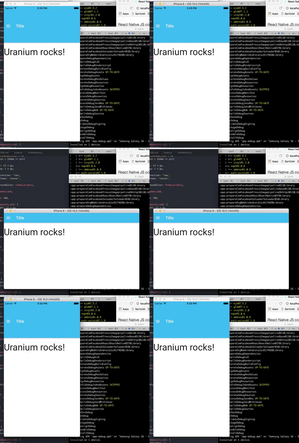
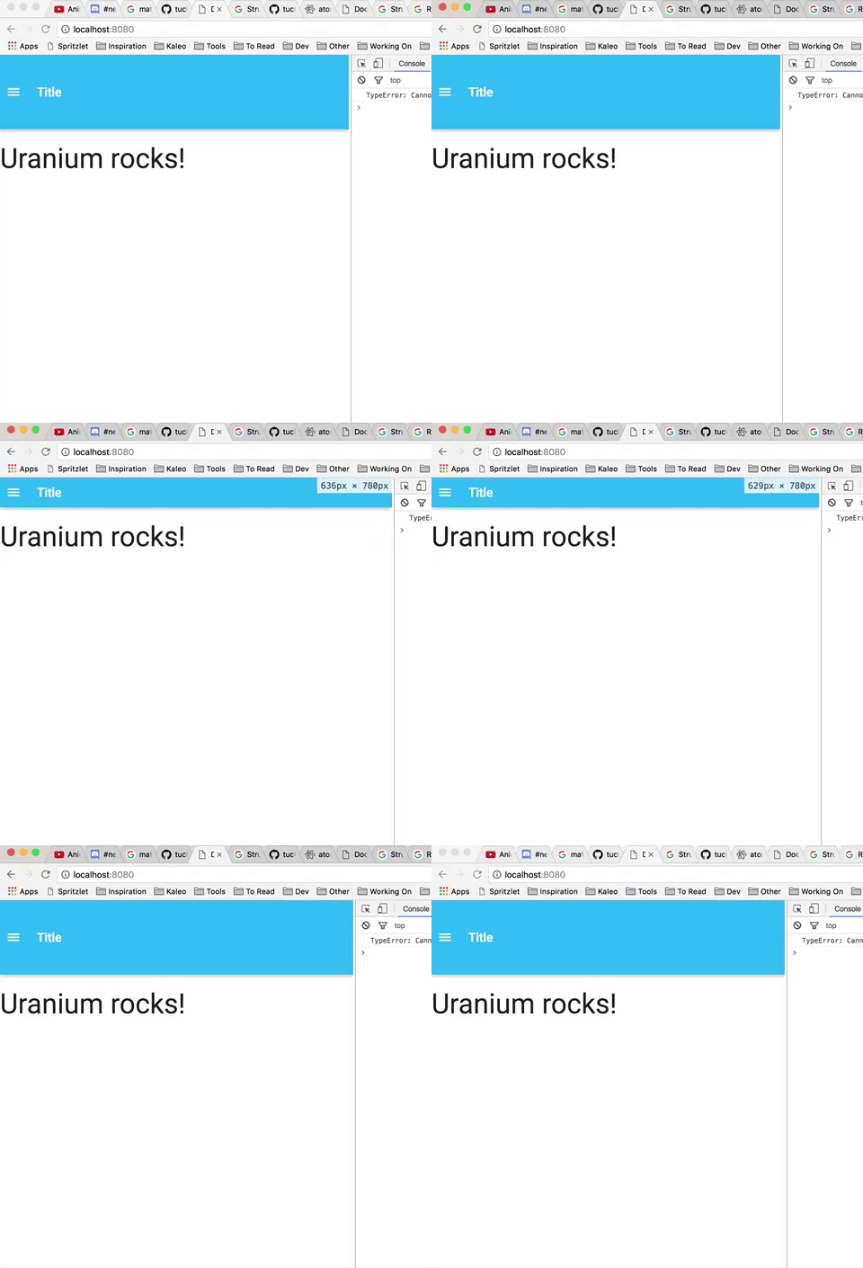
| iOS | Web |
|---|---|
 |  |
Also works with android and server-side rendering
This can be used with react-native-web for a basic write-once, run-anywhere React Native app.
Installation
If using in React Native, install react-native-match-media
Make sure global.matchMedia is set:
import matchMedia from 'react-native-match-media'

// Only for native, will already be set on web
global.matchMedia = matchMedia
Then:
npm -S i tuckerconnelly/uranium
Usage
Use the css property to add styles with media queries.
Then wrap your component in Uranium
import React, { PropTypes } from 'react'
import { View } from 'react-native'
import Uranium from 'uranium'

import Shadows from './styles/Shadows'

const MyComponent = () =>
  <View css={styles.base}>
    <Text>Some text</Text>
  </View>

export default Uranium(MyComponent)


const styles = {
  base: {
    backgroundColor: 'red',

    '@media (min-width: 480px)': {
      backgroundColor: 'blue',
    }
  },
}
animate() function
Uranium adds the animate() function to make animations simple in React Native, and to take into account the current screen size/media query when animating.
It supports the following signatures:
animate(from: Object, to: Object, on: Animated.AnimatedValue)
animate(props: Array<string>, from: Object, to: Object, on: Animated.AnimatedValue)
animate(prop: string, from: number, to: number, on: AnimatedValue)
It expects the AnimatedValue to animate from 0 to 1.
Here it is used in a component:
import React from 'react'
import { View, Animated } from 'react-native'
import Uranium, { animate } from 'uranium'

class ExpandOnPress extends Component {
  state = { expanded: false }

  _expandAV = new Animated.Value(0)

  _toggleExpanded() {
    Animated.timing(this._expandAV, {
      toValue: this.state.expanded ? 0 : 1,
      duration: 300,
    })

    this.setState({ expanded: !this.state.expanded })
  }

  render() {
    return (
      <View
        css={[
          styles.base,
          animate(styles.notExpanded, styles.expanded, this._expandAV),
          animate('opacity', 0.25, 1, this._expandAV)
        ]}
        onPress={this._toggleExpanded} />
    )
  }
}

export default Uranium(ExpandOnClick)

const styles = {
  base: {
    backgroundColor: 'blue',
  },

  notExpanded: {
    width: 20,
    height: 20,
  },

  expanded: {
    width: 40,
    height: 40,
  }
}
This will animate all the styles on styles.notExpanded to all the styles on styles.expanded on the _expandAV AnimatedValue.
So width will animate from 20 to 40, and height will also animate from 20 to 40.
This also animates opacity from '0.25' to '1'.
If styles.notExpanded contained a property you didn't want to animate, like borderRadius, you could have specified specific values to animate:
animate(['width', 'height'], styles.notExpanded, styles.expanded, this._expandAV)

...

styles = {
  notExpanded: {
    width: 20,
    height: 20,
    borderRadius: 2,
  },

  expanded: {
    width: 40,
    height: 40,
  }
}
Note! The AnimatedValue must go from 0 to 1 (and vice versa).
Inspiration
Many thanks to the creators of Radium who inspired this library.
In fact, the name is a play on Radium: Universal Radium = Uranium :)
Connect
Follow the creator on Twitter, @TuckerConnelly
License
MIT