Awesome
Quick Explorer for Obsidian
New in 0.2.11: Vim-style navigation hotkeys: Mod+h/j/k/l (Mod=Cmd on Mac, Ctrl on PC) New in 0.2.0: If you're using Obsidian 0.16.3 and have tab titlebars turned on, Quick Explorer can use them in addition to (or in place of) the main title bar or status bar. If you want to hide QE's default breadcrumbs, you can turn them off using the Style Settings plugin.
Obsidian's in-app file explorer is pretty flexible, but it's almost 100% mouse-driven and not at all keyboard-friendly. Worse, if you have a lot of folders with lots of files in them, you can spend a lot of time expanding and collapsing folders, and scrolling around to find what you're looking for. This can be especially annoying when all you want is to do something with the "current" folder, or a parent of it... without needing to open a sidebar and close it again afterwards. (And last, but not least, trying to rapidly preview the contents of a lot of notes with the mouse is a giant PITA.)
Enter Quick Explorer. It's menu-based and keyboard-friendly, stays out of your way when you aren't using it, and makes it super-easy to navigate from either the vault root or current folder, without needing to scroll through or collapse a zillion other folders to find what you're looking for. You can even search by name within a folder, just by typing.

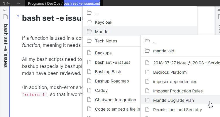
But wait, there's more: a quick-preview mode that makes previewing lots of notes super easy, with no mousing and no popups overhanging the file list: you can just keep hitting the PgDn key to scroll through the full contents of every note in a folder, as quickly as if they were pages in a notebook, or as scrolling through a single giant document:

Folder notes are supported, too: previewing a folder shows the folder note without you first needing to navigate into the folder and find the note, and when you do navigate into the folder its folder note will be automatically selected, if present. (A "folder note" is a note whose name is the same as the name of its enclosing folder: other Obsidian plugins such as Note Folder Autorename can be used to help create or maintain them.)

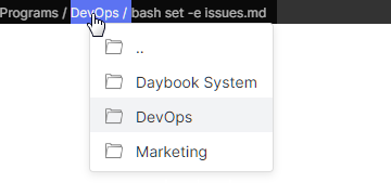
And last, but far from least, you can even see the path of the current note file as a "breadcrumbs bar" in each window's title bar (or status bar if the Obsidian title bar is disabled). Each breadcrumb, when clicked, drops down (or pops up) a list of the the files and folders in the same directory. So if you click on the breadcrumb for the current file, you'll see the items in its folder, and the first breadcrumb will show items in the vault root.

No matter where you click, though, you can then do almost anything that can be done with Obsidian's built-in file explorer:
- Ctrl/Cmd + Hover to preview files with the mouse (if the built-in Page Preview plugin is enabled)
- Click to open files (with ctrl or cmd to open in a new pane)
- Right-click to get a full context menu for any file, folder, or breadcrumb
- Drag any file, folder, or breadcrumb to drop anywhere that supports dropping (e.g. to stars, into text editors to create links, pane headers to open in the pane, folders in the file explorer to move them, Kanban lanes, etc.)
And an extensive set of keyboard operations is available as well:
- Typing normal text searches item names within a folder (or context menu), selecting the next matching item
- Up, Down, Home, and End move within a folder or context menu
- Left and Right arrows select parent or child folders
- Vim enjoyer? Use Mod-j/k for up and down, Mod-h/l for left and right (Mod=Cmd on Mac, Ctrl on PC)
- Enter selects an item to open, Ctrl-or-Cmd + Enter opens a file in a new pane
- Backslash (
\), the "Context Menu" key, or Alt + Enter opens a context menu for the selected file or folder - F2 initiates a rename of the current file or folder, Shift+F2 begins a move
- Tab toggles "quick preview" mode: when active, hovering or arrowing to an item will automatically display a hover preview for it, positioned so that it's always outside the menu (unless you're so deep in subfolders you've reached the edge of your screen). This makes it really easy to browse the contents of a folder just by arrowing down through it.
- If a page preview is active for the current file or folder, PageUp and PageDown scroll it up and down, with Ctrl-or-Cmd + Home or End jumping to the beginning or end of the note. Scrolling past the end or before the beginning (or using any of these keys without an active preview) advances the selection to the next or previous file/folder in the list.
Like the built-in file explorer, Quick Explorer will either show all files, or only the ones supported by Obsidian, depending upon whether the "Detect all file extensions" setting is enabled in the "Files and Links" options tab.
Quick explorer also includes six hotkeyable commands:
- Browse vault, which opens the dropdown for the vault root, and
- Browse current folder, which opens the dropdown for the active file's containing folder
- Go to next file in folder, which opens the next file in the active file's folder
- Go to previous file in folder, which opens the previous file in the active file's folder
- Go to first file in folder, which opens the first file in the active file's folder
- Go to last file in folder, which opens the last file in the active file's folder
(Note: the "go to" commands navigate using Quick Explorer's menu order, which is to say: folder note first, subfolders second, and files last. Roughly speaking, they're equivalent to issuing the "browse current folder" command and then arrowing up or down (or using Home/End) and hitting enter until a file is opened. So the "first file" is either the folder note (if any) or the first file in any subfolder of the current folder, and the "last file" is either the last actual file, or the last file in any subfolder if the folder only contains a folder note.)
And last, but not least, Quick Explorer also adds a "Show in Quick Explorer" option to all file menus other than its own. That way, you can use it from links, graph views, the Pane Relief history menus, other views (like Stars or Recent Files), etc., so you can use it instead of the File Explorer.
Theme and Plugin Compatibility
While active, Quick Explorer may reformat the title bar so that the standard Obsidian title appears on the right, rather than the center, to make room for Quick Explorer itself. It also removes the name of the current file from the display, but not from the operating system-level window title! This means that if you're using a plugin like Custom Window Title that manipulates the window title directly, it will still be working at the OS level even if the displayed title is shortened, so that automations/scripts/etc. that find the window by its title should still work correctly.
Quick Explorer was initially written using the same color variables as Obsidian itself does for menus. Unfortunately, the vast majority of themes do not set these variables in such a way as to provide adequate contrast for the menu selection in dark mode, and some do not do so in light mode, either. (This is probably because selection contrast in menus isn't terribly important if you have to use the mouse cursor anyway, but it makes keyboard navigation impossible.)
To work around this, Quick Explorer now uses the color variables Obsidian uses to highlight selected mode buttons, which provides adequate contrast on most themes in both dark and light mode, but may be too bright or vivid in some themes. There is unfortunately no easy way to make this perfect for everybody, without basically getting all the theme developers to fix their menu color sets for base Obsidian, at which point Quick Explorer could be changed back to using the same variables as Obsidian does.
Another compatibility issue: some themes attempt to hide or downplay title bar items, making Quick Explorer's UI invisible. Others (or CSS snippets) may color the titlebar in such a way that it becomes unreadable. There is not really anything that Quick Explorer can do to fix these issues, so you may need to add your own CSS snippet workarounds or ask your theme's developer to make adjustments.
Current Limitations
- Files are always sorted in ascending name order (using the same collation rules as the file-explorer view)
- You can drag things out of the dropdowns, but you can't drop anything into them
- There is no way to configure sorting or grouping of files
- Only "inside same"-style folder notes are supported