Awesome
admin-panel


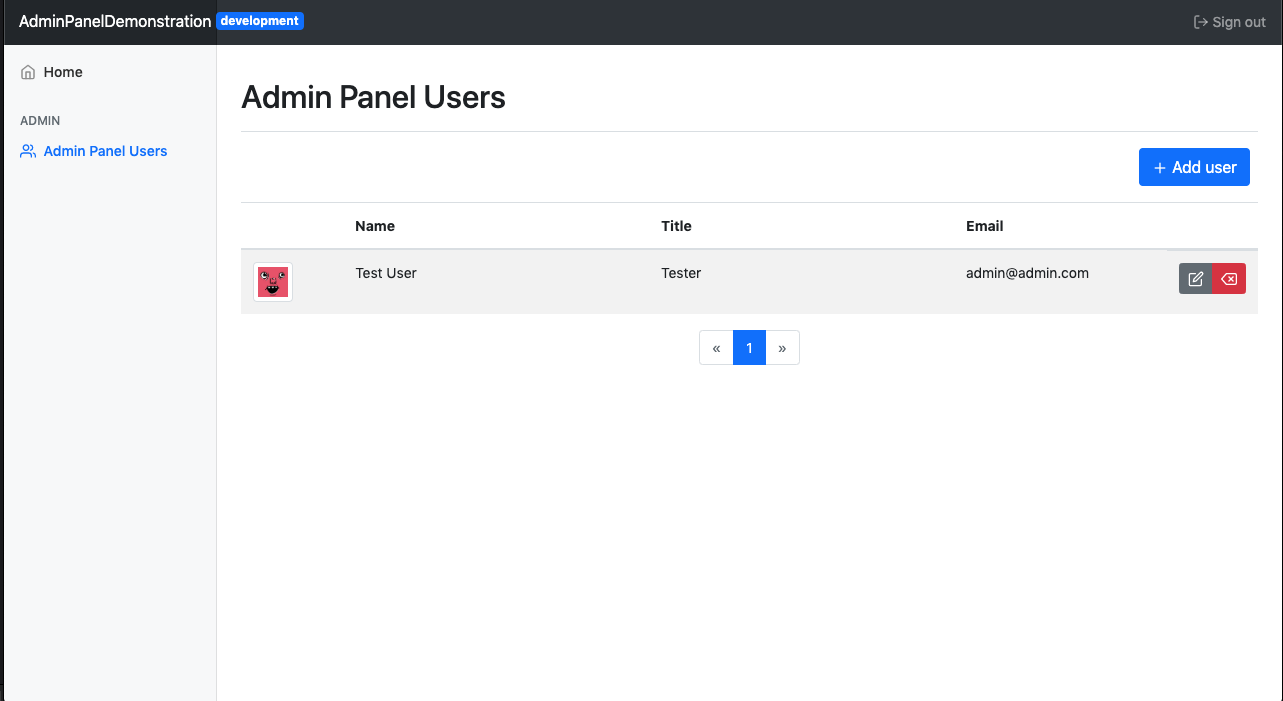
Features
Confirm Modal
Admin Panel includes a generic confirmation modal for links, out of the box. Using HTML data attributes on <a>-tags the modal can be configured in different ways. Just add a data attribute to your link and you're all set.
Triggering the modal will append a HTML-element form to the DOM, containing title, text, confirm button and dismiss button.
By default confirm submits the form and dismiss will remove the HTML-element from the DOM
Basic usage
<a href="#" data-confirm="true">Open modal</a>
Data Attributes
| Attribute | Description | example |
|---|---|---|
| data-confirm | Initialize the modal | data-confirm="true" |
| data-title | Sets the title of the modal | data-title="Please confirm" |
| data-text | Sets the text of the modal | data-text="Are you sure you want to continue?" |
| data-button | Sets bootstrap css selector for the confirm button | data-button="danger" [primary,secondary,success,danger,warning,info,light,dark] |
| data-confirm-btn | Set the text label on the "confirm"-button | data-confirm-btn="Yes" |
| data-dismiss-btn | Set the text label on the "dismiss"-button | data-confirm-btn="No" |
Override default behavior
// Override modal confirm action
modalConfirmation.actions.confirm = function(event) {
    alert("Confirmed");
}

// Overríde modal dismiss action
modalConfirmation.actions.dismiss = function(event) {
    alert("Dismissed");
}
Leaf tags
Admin panel comes with a variety of leaf tags for generating certain HTML/js elements
#adminPanel:avatarURL
Use user image or fallback to Adorable avatars
| Parameter | Type | Description |
|---|---|---|
email | String | user's email |
url | String | image url |
Example usage
<img src="#adminPanel:avatarURL(user.email, user.avatarURL)" alt="Profile picture" class="img-thumbnail" width="40">
#adminPanel:config
Convenience method to output configuration strings such as app or environment name or paths to certain templates
Supported input values and what they output
name: App namebaseURL: App base URLsidebarMenuPath: Path to sidebar menu view templatedashboardPath: Path to dashboard view templateenvironment: Environment name
| Parameter | Type | Description |
|---|---|---|
configName | String | Config variable name |
Example usage
<!-- outputs app name ->
#adminPanel:config("name")
#adminPanel:user
Outputs a field on the current user object as a string
| Parameter | Type | Description |
|---|---|---|
fieldName | String | User field name |
Example usage
<!-- outputs user's name ->
#adminPanel:user("name")
#adminPanel:user:requireRole
Make sure user has required role to output element. If not throws an error.
| Parameter | Type | Description |
|---|---|---|
roleName | String | User role |
Example usage
#adminPanel:user:requireRole("superAdmin") {
    <div>I show if user is super admin</div>
}
#adminPanel:user:hasRequiredRole
Check if user has a required role
| Parameter | Type | Description |
|---|---|---|
roleName | String | User role |
Example usage
#if(adminPanel:user:hasRequiredRole("superAdmin")) {
    // Do something
} else {
    // Do something else
}
#adminPanel:sidebar:heading
Renders a header, styled in a certain way, for the navigation sidebar.
Example usage
#adminPanel:sidebar:heading() { Super Admin }
#adminPanel:sidebar:menuItem
Renders a sidebar menu item, styled in a certain way, for the navigation sidebar.
| Parameter | Type | Description |
|---|---|---|
url | String | Menu item link reference |
icon | String | Feather icon for menu item |
activeURLPatterns | String | URL pattern to determine active state |
Example usage
#adminPanel:sidebar:menuItem("/admin/dashboard", "home", "/admin/dashboard*") { Home }