Awesome
Angular Desktop UI


This is a collection for native desktop like user interface components in Angular, especially useful for Electron apps.
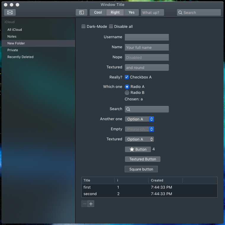
It starts with MacOS support, light and dark mode.
Goal
The goal of this library is to provide native looking and behaving Angular UI components like buttons, checkboxes, inputs, tables, etc to match the user interface of common operating systems.
Since all native UI designs of browser engines (like <input>, <button>) look and behave differently in browsers engines compared to the actual operating system UI you have to manually
design those elements when you want to provide a native look and feel. Material design and alike is for websites and not desktop applications.
The most obvious use-case is for Electron apps. Although it also works in browsers directly, you get the most out of it when using Electron since it provides certain Electron features to make your life easier.
Features
- Button, Inputs, Radiobox, Checkbox, Slider, Dropdown
- Window decoration: Actionbar, sidebar, splitter. Linux Ubuntu with Closer/Minimize/Maximize buttons
- Lists and tables with sorting, dynamic columns, context menu
- Emoji chooser
- Form handling
- Custom icon abstraction (converting automatically into svg font) for your svg icons.
- Simple dialog system (build-in alert, prompt, confirm)
- Zoneless support for high-performance
- App menu abstraction ("File, Edit, View" menus of desktop applications)
Angular versions:
With the new rendering engine Ivy this library will switch to Angular v9 Ivy support only.
It might work in the non-ivy renderer as well, but is not tested.
Documentation
The full interactive auto-generated documentation is available at angular-desktop-ui.marcj.dev.
Installation
Getting started documentation.
As example see marcj/angular-desktop-ui-example you can find an freshly installed Angular v9 with configured angular-desktop-ui. Take a look at the last commit.
Screens
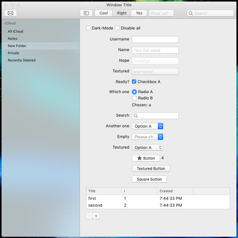
<dui-form #form>
    <dui-form-row label="Username">
        <dui-input [(ngModel)]="username"></dui-input>
    </dui-form-row>

    <dui-form-row label="Really?">
        <dui-checkbox [(ngModel)]="checkbox">Checkbox A</dui-checkbox>
    </dui-form-row>

    <dui-form-row label="Which one">
        <dui-radiobox [(ngModel)]="radioValue" value="a">Radio A</dui-radiobox><br/>
        <dui-radiobox [(ngModel)]="radioValue" value="b">Radio B</dui-radiobox>
        <p>
            Chosen: {{radioValue}}
        </p>
    </dui-form-row>

    <dui-form-row label="Another one">
        <dui-select [(ngModel)]="radioValue" placeholder="Please choose">
            <dui-option value="a">Option A</dui-option>
            <dui-option value="b">Option B</dui-option>
        </dui-select>
    </dui-form-row>

    <dui-form-row label="Empty">
        <dui-select style="width: 100px;" [(ngModel)]="selectBox1" placeholder="Please choose">
            <dui-option value="x">Option X</dui-option>
            <dui-option value="y">Option Y</dui-option>
        </dui-select>
    </dui-form-row>

    <diu-button [submitForm]="form">Send</diu-button>
</dui-form>