Awesome
Partition Kit
Recently Featured In Top 10 Trending Android and iOS Libraries in October and in 5 iOS libraries to enhance your app!

What is PartitionKit?
- It is the solution to the need for composable and dynamically sized user interface content in SwiftUI.
- also the first piece of software I have ever made into a library so please be gentle(both with use cases and with my heart).
What PartitionKit is not ?
- PartitionKit is not a means to work with an form of stored data, this is not for partitioning hard drives or any other type of formattable data drive.
Requirements
PartitionKit as a default requires the SwiftUI Framework to be operational, as such only these platforms are supported:
- macOS 10.15 or Greater
- iOS 13 or Greater
- tvOS 13 or Greater
- watchOS 6 or Greater
How To Add To Your Project
- Snag that URL from the github repo
- In Xcode -> File -> Swift Packages -> Add Package Dependencies
- Paste the URL Into the box
- Specify the minimum version number (This is new so 1.0.0 and greater will work).
Less Than 2 Minute Tutorial Video
How To Use
Vertical Partition
- Decide on what view you would like to have on
Top, which you would like to have on theBottomand optionally aHandleto be used to drag the partitions to different sizes. - Do This
VPart(top: {
    MyTopView()
    }, bottom: {
    MyBottomView()
    }) {
    MyHandle()
}
Horizontal Partition
- Decide on what view you would like to have on
Left, which you would like to have on theRightand optionally aHandleto be used to drag the partitions to different sizes. - Do This
HPart(left: {
    MyLeftView()
    }, right: {
    MyRightView()
    }) {
    MyHandle()
}
GridPartition
- Decide on what Views will go in each corner
TopLeft,TopRight,BottomLeft,BottomRightand optionally aHandlefor the user to drag and resize the views with. - Do this
    GridPart(topLeft: {
        MyTopLeftView()
        }, topRight: {
        MyTopRightView()
        }, bottomLeft: {
        MyBottomLeftView()
        }, bottomRight: {
        MyBottomRightView()
        }) {
        MyHandle()
}
Examples
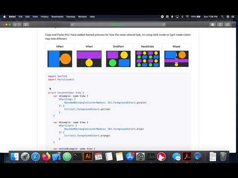
Copy and Paste this I have added Named pictures for how the views should look, Im using dark mode so light mode colors may look different.
| HPart | VPart | GridPart | NestGrids | Mixed |
|---|---|---|---|---|
 |  |  |  |  |
import SwiftUI
import PartitionKit


struct ContentView: View {
    var vExample: some View {
        VPart(top: {
            RoundedRectangle(cornerRadius: 25).foregroundColor(.purple)
        }) {
            Circle().foregroundColor(.yellow)
        }
    }

    var hExample: some View {
        HPart(left: {
            RoundedRectangle(cornerRadius: 10).foregroundColor(.blue)
        }) {
            Circle().foregroundColor(.orange)
        }
    }

    var nestedExample: some View {
        VPart(top: {
            hExample
        }) {
            vExample
        }
    }

    var gridExample: some View {
        GridPart(topLeft: {
            RoundedRectangle(cornerRadius: 25).foregroundColor(.purple)
        }, topRight: {
            Circle().foregroundColor(.yellow)
        }, bottomLeft: {
            Circle().foregroundColor(.green)
        }) {
            RoundedRectangle(cornerRadius: 25).foregroundColor(.blue)
        }
    }

    var nestedGridsExample: some View {
        GridPart(topLeft: {
            gridExample
        }, topRight: {
            gridExample
        }, bottomLeft: {
            gridExample
        }) {
            gridExample
        }
    }

    var body: some View {
        nestedExample

    }
}


struct ContentView_Previews: PreviewProvider {
    static var previews: some View {
        ContentView()
    }
}
Todo
- Add in constraints so that partitions will not cause negative frame values that invert the views when the handle is dragged beyond the frame of the container
- Add more customizability to initial layouts
- Add a
ListStyle grid collection layout that can be initiated with a list of Identifiable data elements. - General cleanup, some stuff was not meant to be left in, i will find it at some point.