Awesome
qv-steem-beneficiaries
Quasar Vue component for managing Steem beneficiaries
This Quasar based Vue component will allow your users to add and remove beneficiaries before submitting a new post on the Steem blockchain.
This component was originally developed by @irelandscape for StemQ, a question and answer dapp similar to Quora dedicated to Science Technology, Engineering and Mathematics (STEM) and rewarding contributors with Steem cryptocurrency.
Component in action
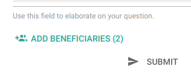
The component provides a button for managing beneficiaries:
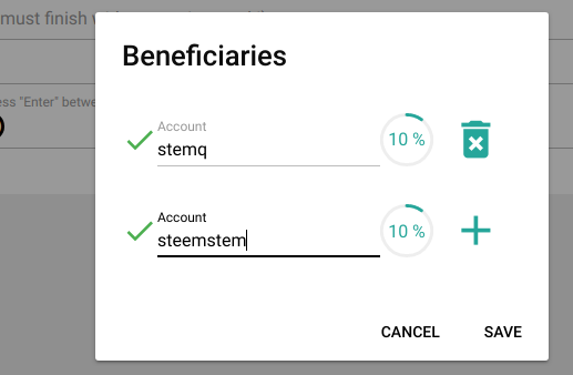
 Once clicked, the button opens a dialog (QDialog) which allows the user to input beneficiary usernames and amounts expressed in percentage (in 5% steps):

The component stores the information in a json string suitable for insertion into a Steem broadcast operation (see below).
Usage
Install the component into your Node.js project:
npm install qv-steem-beneficiaries
In your component, import the Beneficiaries component as follows:
import Beneficiaries from 'qv-steem-beneficiaries'
Insert the component into your template and bind a data variable using v-model:
<template>
...
    <beneficiaries
      v-model="beneficiaries"
      buttonColor="secondary"
      knobColor="secondary"
      dialogButtonsColor="secondary"
    />
...
</template>
The beneficiaries data can then be inserted into your broadcast operation as follows:
<script>
...
      let operations = []
      const params = {
        parent_author: ...,
        parent_permlink: ...
        ...
      }
      operations.push(['comment', params])

      let commentOptionsConfig = {
        ...
        extensions: []
      }
      if (this.beneficiaries.length) {
        commentOptionsConfig.extensions.push([
          0,
          {
            beneficiaries: this.beneficiaries
          }
        ])
      }
      operations.push(['comment_options', commentOptionsConfig])
      vue.$store.getters['steem/client'].broadcast(operations).then(() => {
      ...
      }
...
</script>
Component properties
The following code snippet gives you an indication of those properties that can be set from your application:
  props: {
    steemApiUrl: {
      type: String,
      default: 'https://api.steemit.com'
    },
    buttonColor: {
      type: String,
      default: 'primary'
    },
    dialogButtonsColor: {
      type: String,
      default: 'primary'
    },
    knobColor: {
      type: String,
      default: 'primary'
    }
  },
Dependencies
This component relies on the following packages to be installed in your app:
- Quasar: make sure to add the QDialog, QBtn, QIcon, QInput, QKnob
- dsteem
- debounce
- vue-i18n: not strictly essential, but will allow you to provide your own string locales if you include it.
Getting support
For help, join the StemQ Discord Server
