Awesome
New Heterodox Mono
A Didone-esque Monospaced Typeface based on Alexey Kryukov's Old Standard TT.
Some years ago I made an adaption of the beautiful open-source font Old Standard TT into a monospaced font for my own use. I have been using this a lot as my programming font but I had never made it public. Despite the typeface still has some room for improvement, I decided perhaps I should upload it in case someone finds this useful or wants to help developing it, as there are almost no free alternatives of this kind of monospace fonts out there. In 2021 summer, I channelled some of my COVID-19 boredom into creating a new weight.
I felt that it is very much non-"standard" in the computer science/programming community to use this kind of typeface in programming, so I named it "New Heterodox" as opposed to "Old Standard". (Occasionally you may see Century School Book Mono in textbooks but it is definitely not popular) Ironically, "Old Standard" was named as opposed to "Obyknovennaya Novaya" ("New Standard"), and now in the age of computers, the old-time new standard has become a new heterodoxy, as in many other things in design.
Linux and Microsoft Version
Windows users should use "New Heterodox Mono A", the TTF version, and Linux users may prefer "New Heterodox Mono", the OTF version. Unfortunately "New Heterodox Mono A" does not have a bold weight yet. If you use Linux you can use either version.
This is because the original version of "New Heterodox Mono" is a cubic spline OTF font, while "New Heterodox Mono A" is a quadratic spline font which contains some Truetype bytecode tweaks among other adjustments. Linux is generally fine with both types of fonts, but Windows' rasterizers are still very broken when it comes to cubic spline in 2021. On Windows, VSCode, MS Edge, and most PDF readers seem to use a more reasonable rasterizer for the cubic, but the rasterizer widely used by other native apps such as Notepad, Notepad++ and emacs is completely dysfunctional on cubic splines, due to their insistence on aggressive grid-fitting even on those OTF Postscript fonts which cannot have Truetype bytecode.
Screenshots


Design Notes
Over the years I have grown increasingly tired of looking at the mainstream sans-serif "programming fonts" all days. Underlying many of them seems to be a shared vision that only "readability", or in other words, utility, matters; while aesthetics, elegance and feeling are somewhat a by-product, some sort of an opinion that needs to be justified through some "objective" reasoning around readability, in which history and tradition have no roles to play. But this vision is rather awkward in itself: if we go back a hundred years and ask a French whether they find Didot difficult to read, they may tell you that it is totally readable, as historically it was not uncommon to set newspapers in high-contrast typefaces like the Didot, while nowadays most people would probably say that Dejavu Mono is more readable for coding. Once we expand our time horizon a little, it is immediately obvious that much, but of course, not all, reasonings around readability nowadays are, rather than some objectively derived right-thing-to-be, nothing more than traditions and customs: one which has been passed down from the days when the resolution of computer screens was too low to accurately display the serifs.
As a result of this vision, most popular sans-serif programming fonts look minimalistic, or dull, depending on how you look at it. Serifs are not mission-critical, let's remove them. Creativity and irregularity is discouraged by default unless there are some arguments for its utility.
But if utility were the only thing that matters, why don't we write programs in a monospaced version of Comic Sans? A quick Google will show you that Comic Sans is very legible at small size. It feels wrong, of course, because the feeling of a piece of art work matters. Serifed types are attractive for programming because they evoke a feeling of thoughtfulness.
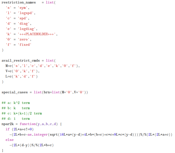
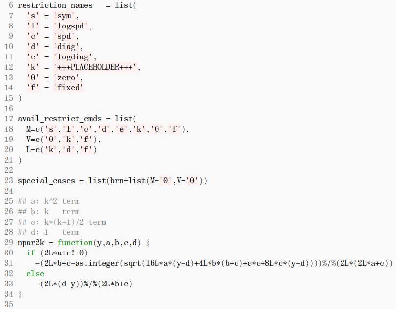
But how readable is this font? I am comfortable programming with it everyday but perhaps the right person to answer this question is you, rather than me.
Some details
The design of the letterforms has been modified from Old Standard to adapt to monospace -- especially, the proportion of the letters, in this typeface, significantly deviates from Old Standard to adapt to the monospaced typesetting environment. This, of course, changes the texture and rhythm of the entire typeface, but my goal is, instead, to find a new proportion that works for monospace rather than to keep the slim-looking modern serif tradition; as it is pretty much impossible to maintain the same rhythm in a monospaced type as in a proportional type.
For the letterform, some glyphs such as 'f', 'r', 'j' etc. look quite unorthodoxical with respect to the historical norm. This is perhaps not driven by necessity, but, rather, by taste. I don't like Century Schoolbook Mono's approach, which prioritises keeping more 'agreeable' letterforms over making the amount of whitespace between letters more uniform. So for some glyphs I have got a little creative, liberally deviating from the tradition while still taken care to retain the metalish feeling. Also the contrast has been slightly adjusted compared to Old Standard in order to improve readability in small size.
In 2021, I added a "Bold" weight, although most professional type designers would perhaps rather call it "Medium" or "Semi-bold". I named it "Bold" anyway because some editors may not be smart enough to automatically pick up the name "Medium". In traditional non-coding typography, the medium weight is usually not strong enough to make a piece of text visually stand out from the long body text, but coding is a bit different, as nowadays most people use syntax highlighting or at least some sort of colour coding in their programming editors. In such an environment, the visual contrast is achieved primarily via colours but not font weights, where the latter only serves to add typographic variation and increase the contrast created by the colours. Therefore I decided to make a lighter bold weight, which is usually more comfortable to read in a smaller size but still can add some weight to the already colour-coded text.
Further improvement may be to add more glyphs/language support. Greeks would be my priority if I had time because science is what I use this typeface for. Of course, any contribution is welcome.
Designer-circle Urban Myths
- There is a "dazzle" effect in modern types: this seems to have arisen after 2000. Wikipedia cites the earliest mention of this is in Cees W. De Jong et al. 2005; I don't know if they are responsible for this or not. Modern types have survived several generations of people, two world wars, facilitated mass literacy, been used from books to train timetables. It certainly does not dazzle anybody before the internet was invented, nor me.
- Didone types are not suitable to body text because of high contrast, so body size fonts need to be made sort of non-Didone, non-modern to be readable: I read this on Wikipedia and from several bloggers, but, to be fair to Firmin Didot, Giambattista Bodoni and many others who are dead and hence unable to make a comment on the internet, the sentence should be rephrased as "many people in the 21st century dislike high contrast fonts in body text." Not even the rephrased sentence is very generalisable, though, as the entire mathematics community has decided to use, as their default, Computer Modern, whose 10pt and 12pt still have quite extreme a contrast.