Awesome
Introduction
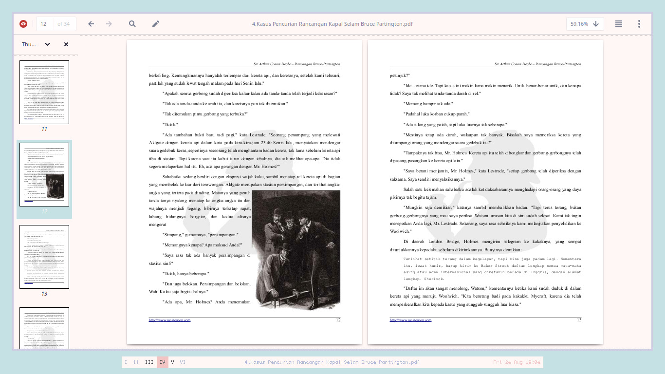
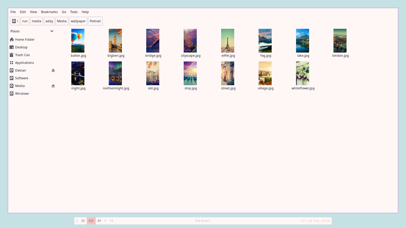
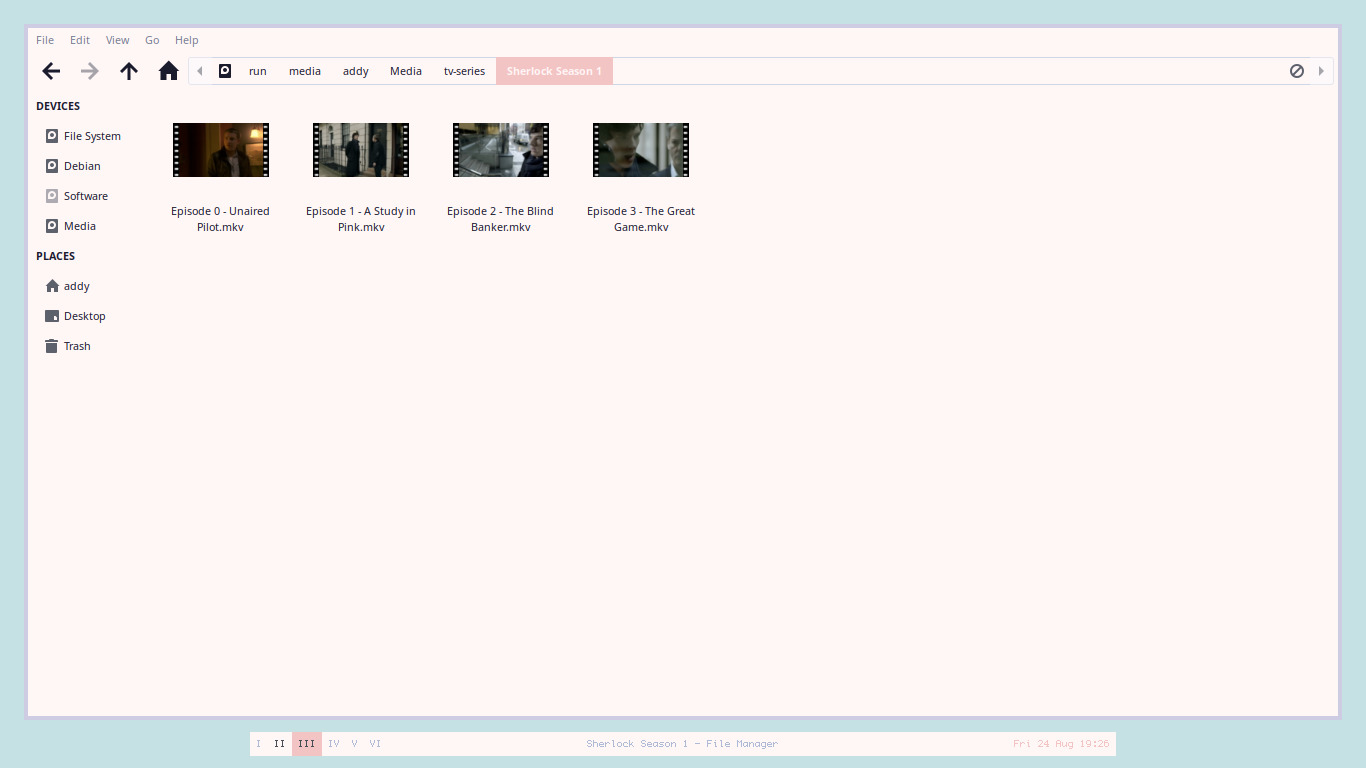
Just a messy edit of Arc GTK theme, designed as a companion for my Xfwm, Openbox, and Fluxbox theme collections. So, You can't find Gnome Shell, Metacity, Emerald, Cinnamon, etc here. Contains a dark variant called Fantome and a light variant called Lumiere. The GTK3 part mostly default, the gtk.css is too hard for me to be understood.
Preview
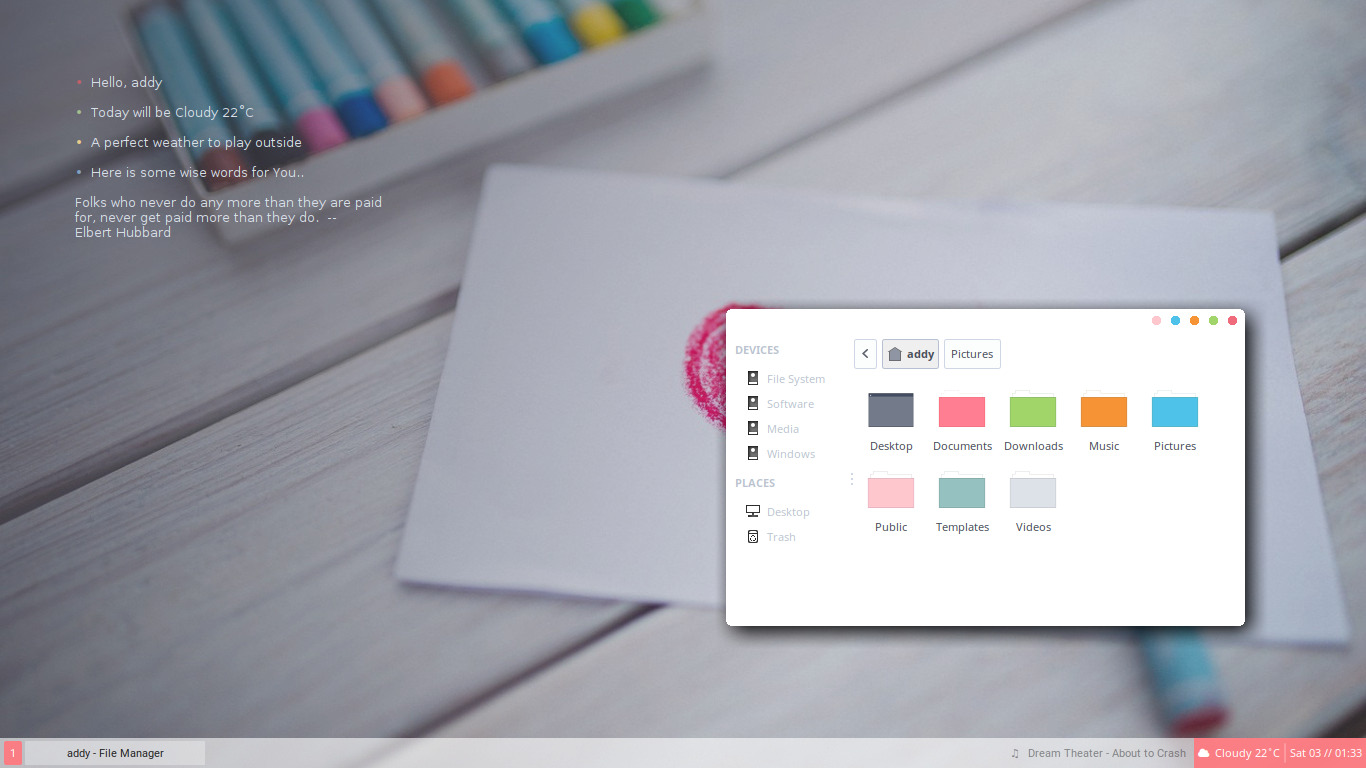
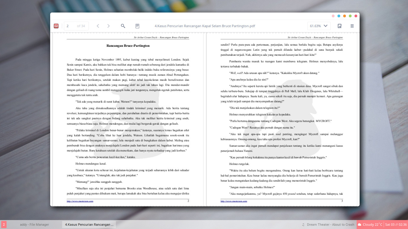
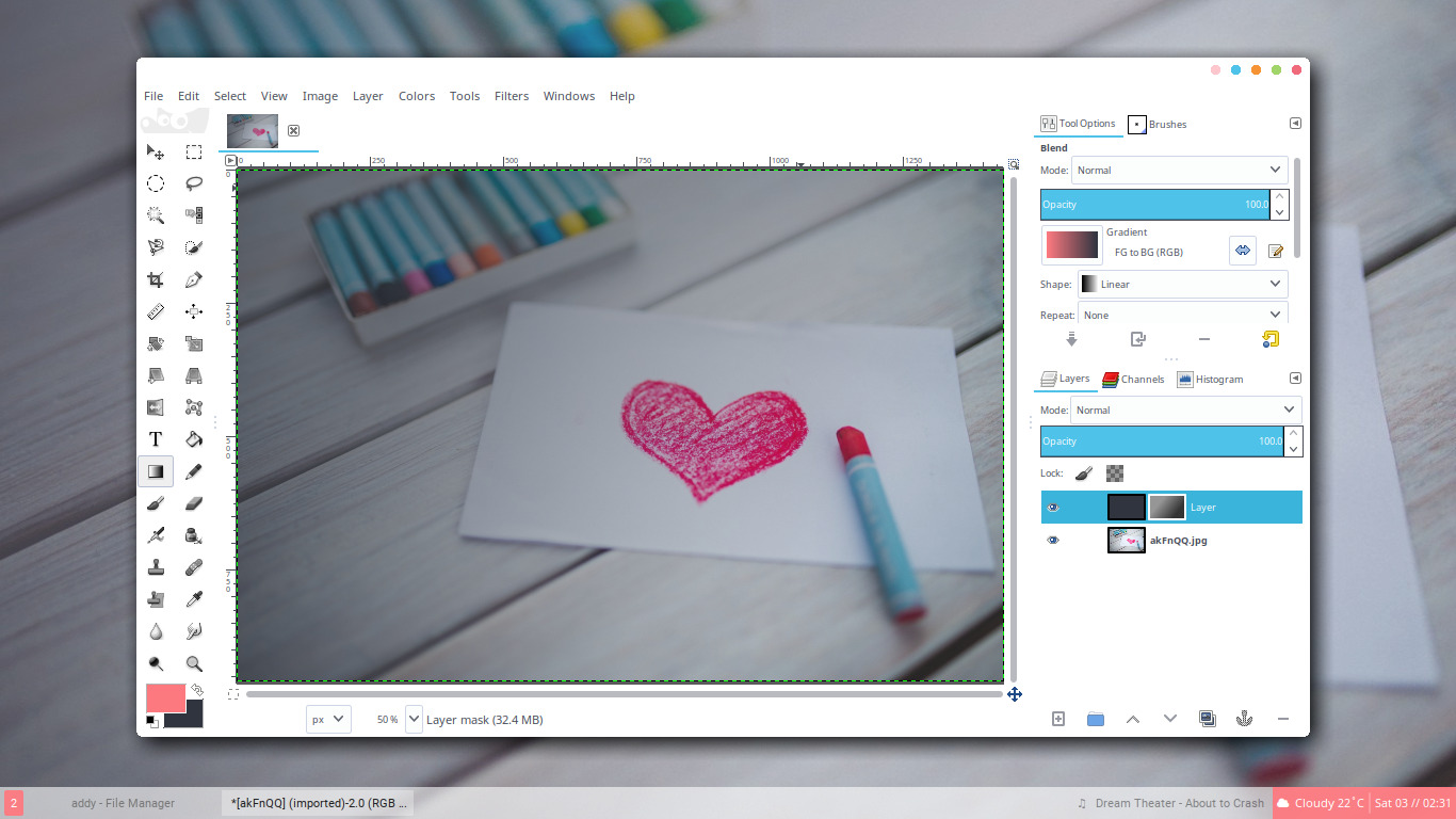
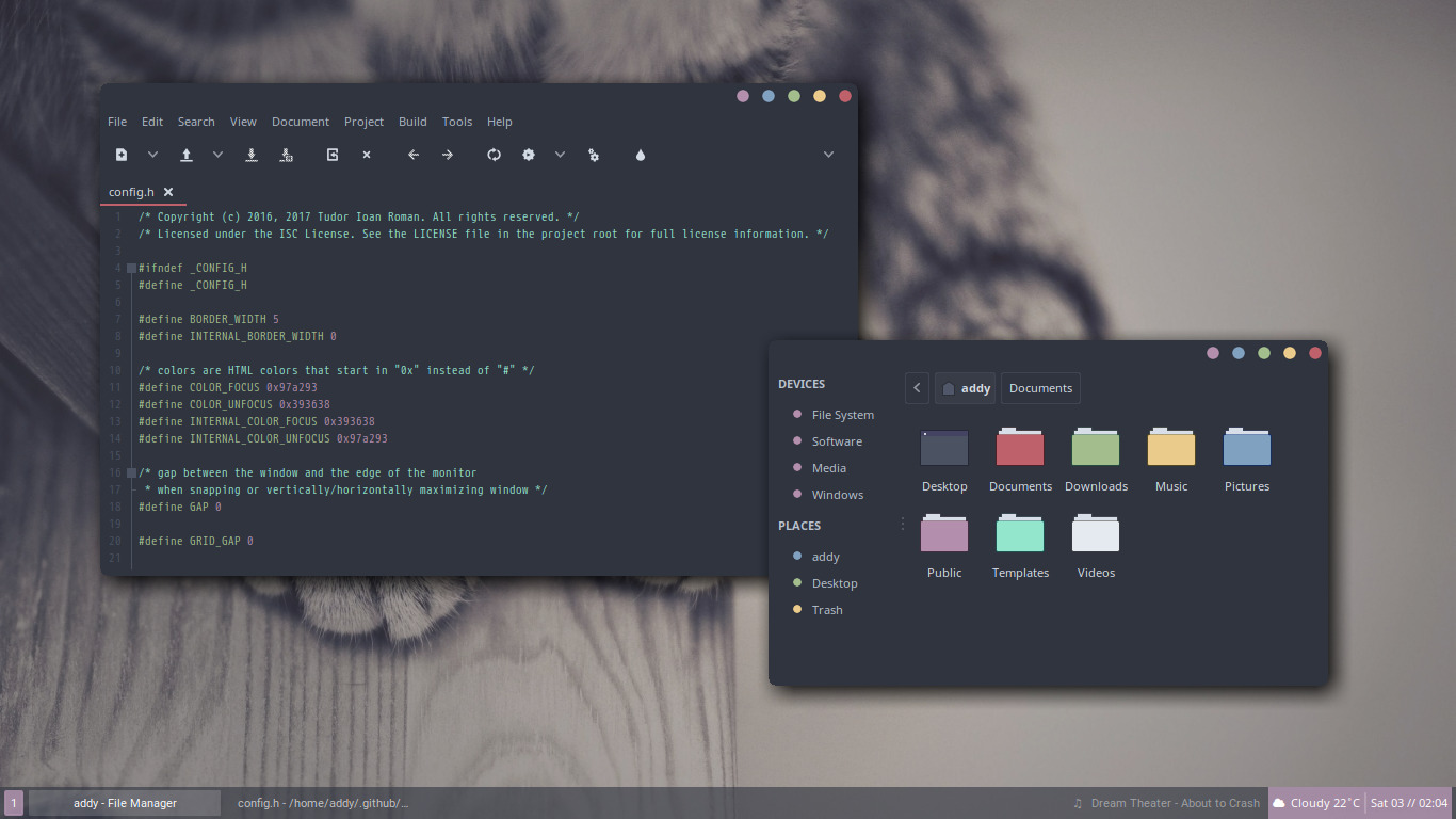
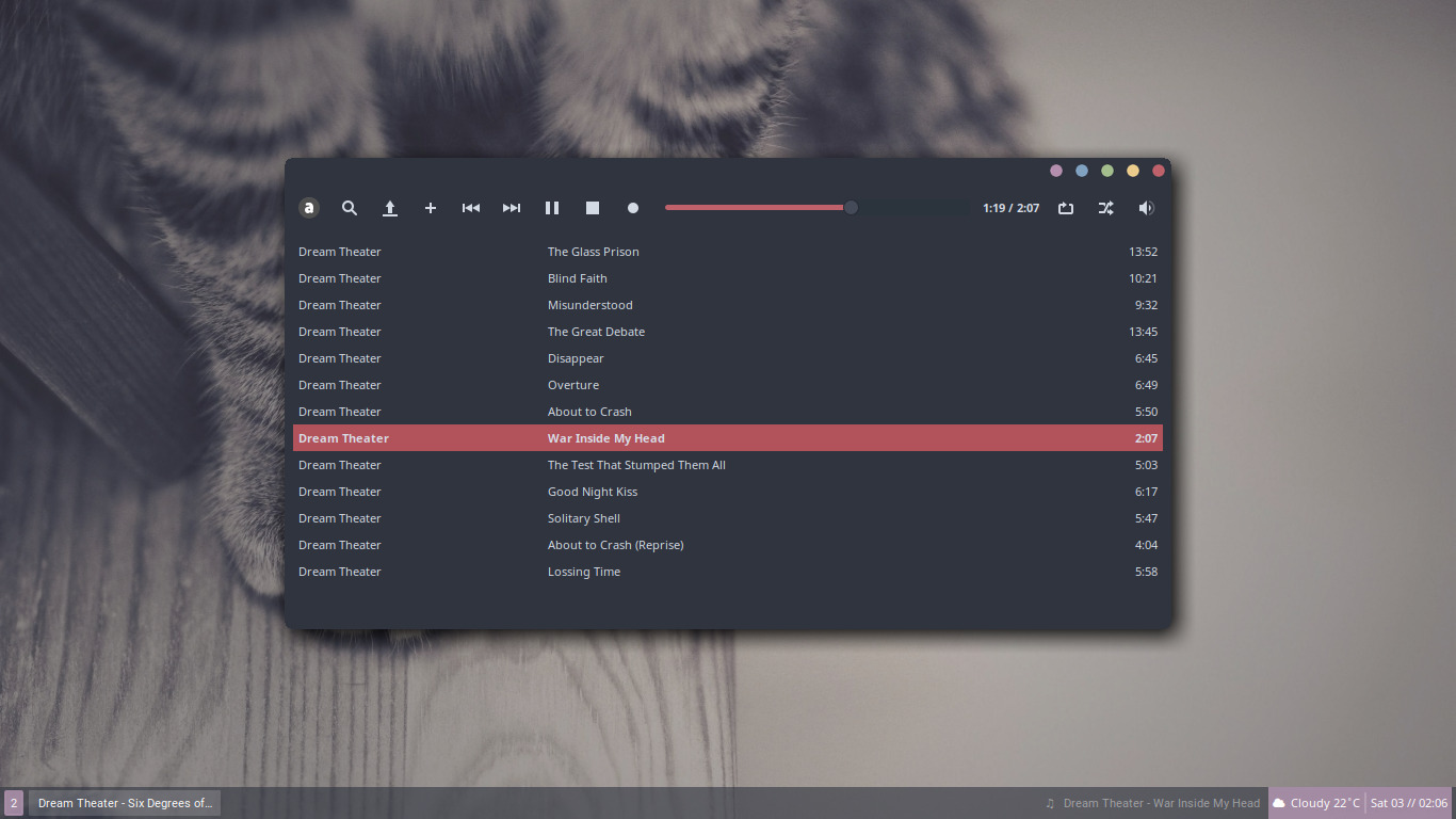
I use Openbox for the light colour preview, and Fluxbox for my the dark colour preview. The icons theme used is Arc, but I delete some components. Then set Papirus as a fallback instaed of Moka. I also edit the folder icons using GIMP to make it match with my colour scheme. GTK CSD is removed using gtk-nocsd. And the album in the playlist is Six Degrees of Inner Turbulence by Dream Theater. I recommend You to listen to it.
Thunar Lumiere
 <br />
Audacious Lumiere
 <br />
Evince Lumiere
 <br />
GIMP Lumiere
 <br />
Thunar & Geany Fantome
 <br />
Audacious Fantome
 <br />
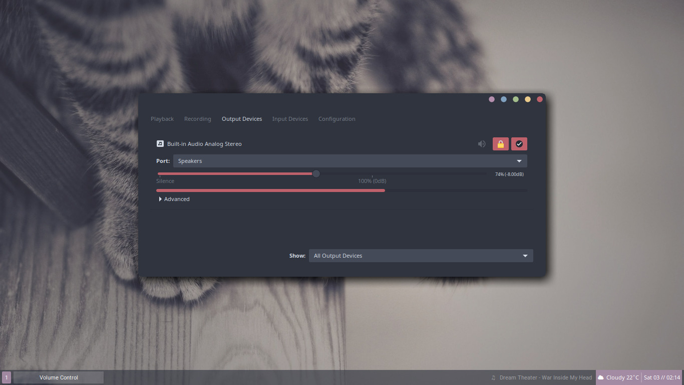
Pavucontrol Fantome
 <br />
Installation
Simply just clone this repository to your ~/.themes folder.
git clone https://github.com/addy-dclxvi/gtk-theme-collections ~/.themes
Then apply your desired theme using LXAppearance or Xfce4 Settings Appearance.
Failed to clone? Remove the .git folder inside the ~/.themes folder first
Notes
-
Panel frame is a bloat, so I remove it.
-
Combo entry is a bloat, so I remove it. But don't worry, there will be an outline when it's selected.
-
Scrollbar placeholder is a bloat, so I remove it. Don't worry, the scrollbar itself remains visible.
-
Progressbar placeholder is a bloat, so I remove it. Don't worry, the progressbar itself remains visible.
-
Tab button is a bloat, so I replace it with simple underline for top and bottom tab. And sideline for left and right tab.
-
Multiple background colour is a bloat, so I unify the colour. #ffffff for light theme and #2f343f for dark theme.
-
Button actually is a bloat, previously I completely remove the Button Pixmap. But it breaks my workflow, especially when I deal with an app with so many buttons like GIMP. So, now I made the button only visible as a thin outline for inactive button. And slight highlight for active button.
-
GTK CSD is the best example of bloat. It breaks some compositing effect, like multiple shadow, wrong transparency, and having hide, maximize, & close buttons in tiling window manager which is ridiculous. I recommend You to remove it using gtk-nocsd (╯°□°)╯︵ ┻━┻
-
Just like any dark theme. Sometimes it breaks web browsing experience, and I don't know how to fix it.
-
I designed this theme for myself. So I use "It works for me" philosophy. Don't complain if it doesn't work for You :p
-
Folder icons are included as a bonus.
Update 30 August 2018
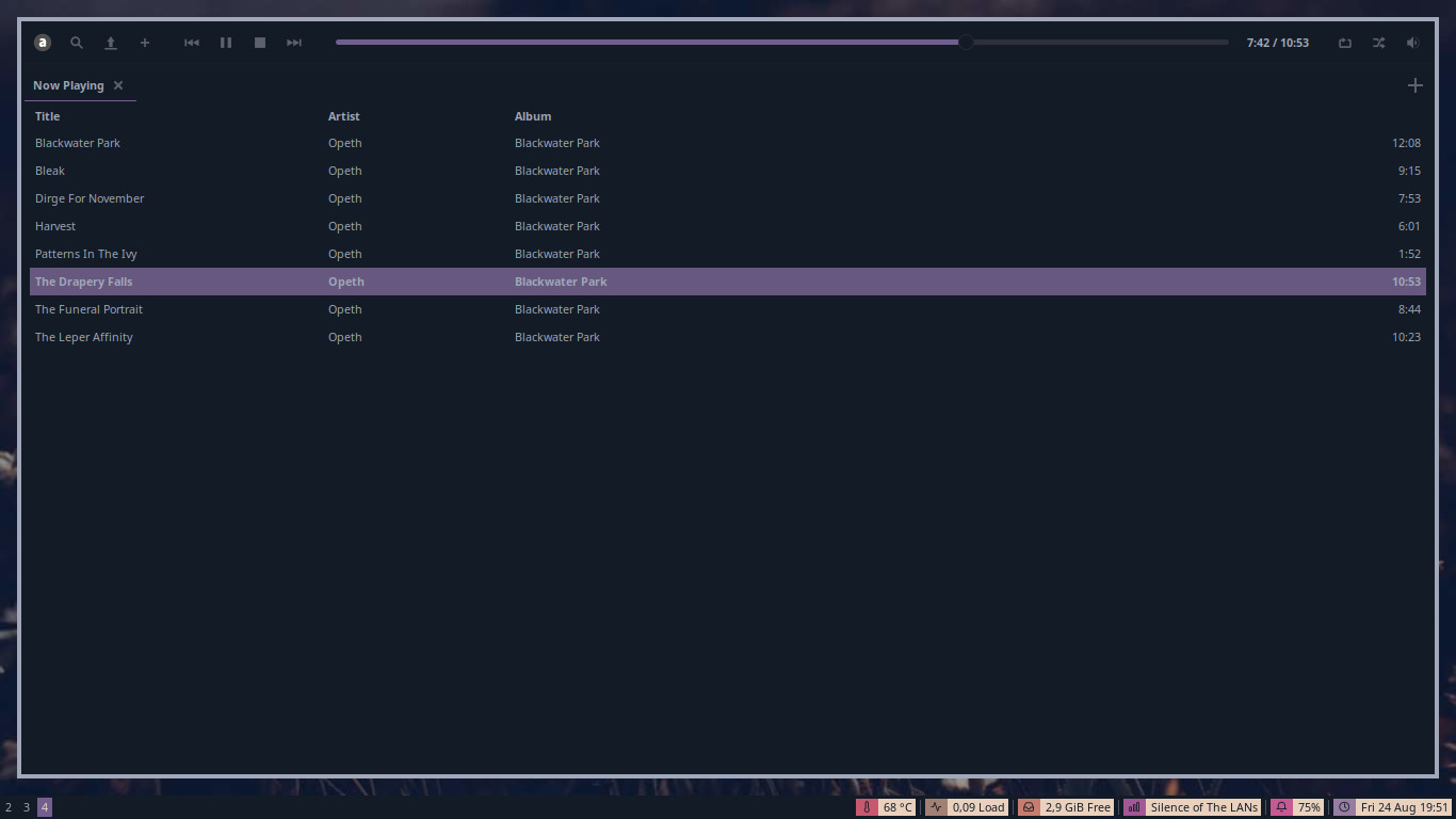
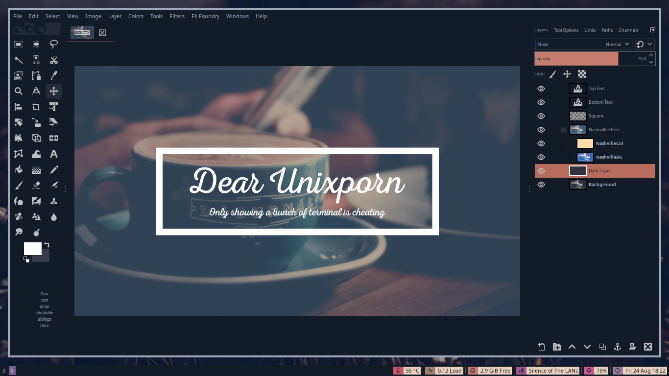
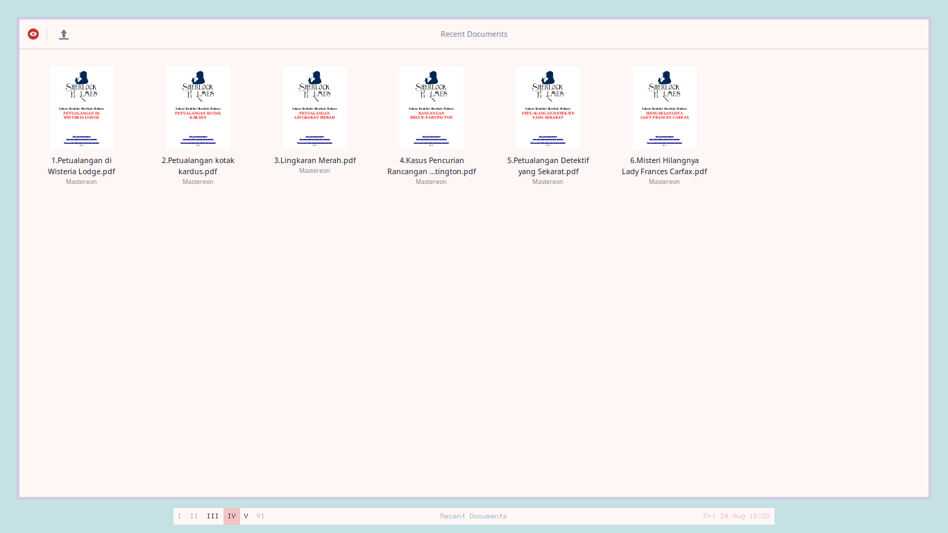
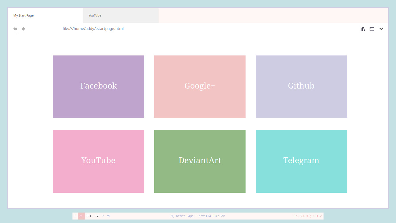
Added Noita, Vescita, Ocha, and Tee.
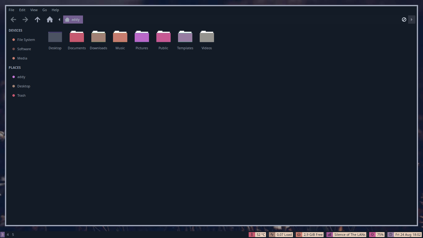
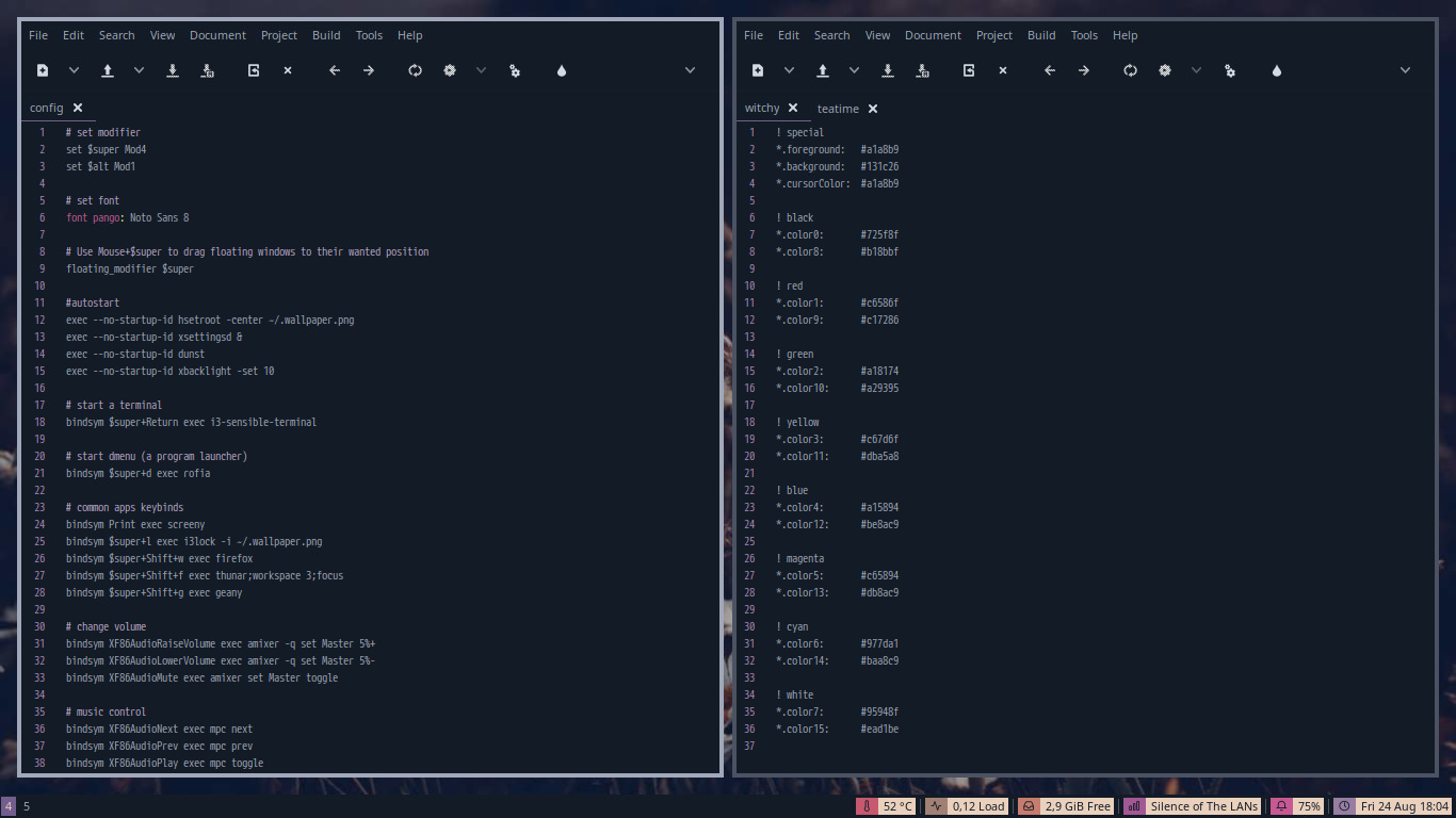
I use background color, foreground color, and accent color from Witchy and Teatime colorscheme by @atrnh.
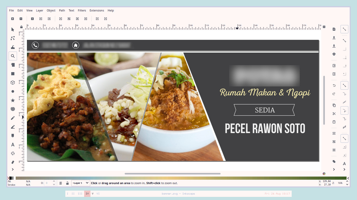
Just like others, they are a messy edit of Arc GTK Theme with some removal of component to make them look minimal and less distracting.
And GTK3 part only slightly modified because they are too hard for me to be understood.
I edited the Arc GTK Theme without a proper knowledge, just using sporadic trials, errors, and reverts with Inkscape, GIMP, and Geany.
Here is some random previews of them. I use i3-gaps and Bspwm when taking screenshoots. <br /> <br />
 <br /> <br />
 <br /> <br />
 <br /> <br />
 <br /> <br />
 <br /> <br />
 <br /> <br />
 <br /> <br />
 <br /> <br />
 <br /> <br />
 <br /> <br />
License
GPL of course, feel free to modify and share this theme ;)