Awesome
Less-Confusing-Digital-Ocean-Menus
I manage more than 100 DO droplets across several accounts & teams and DO's navigation always confused me.
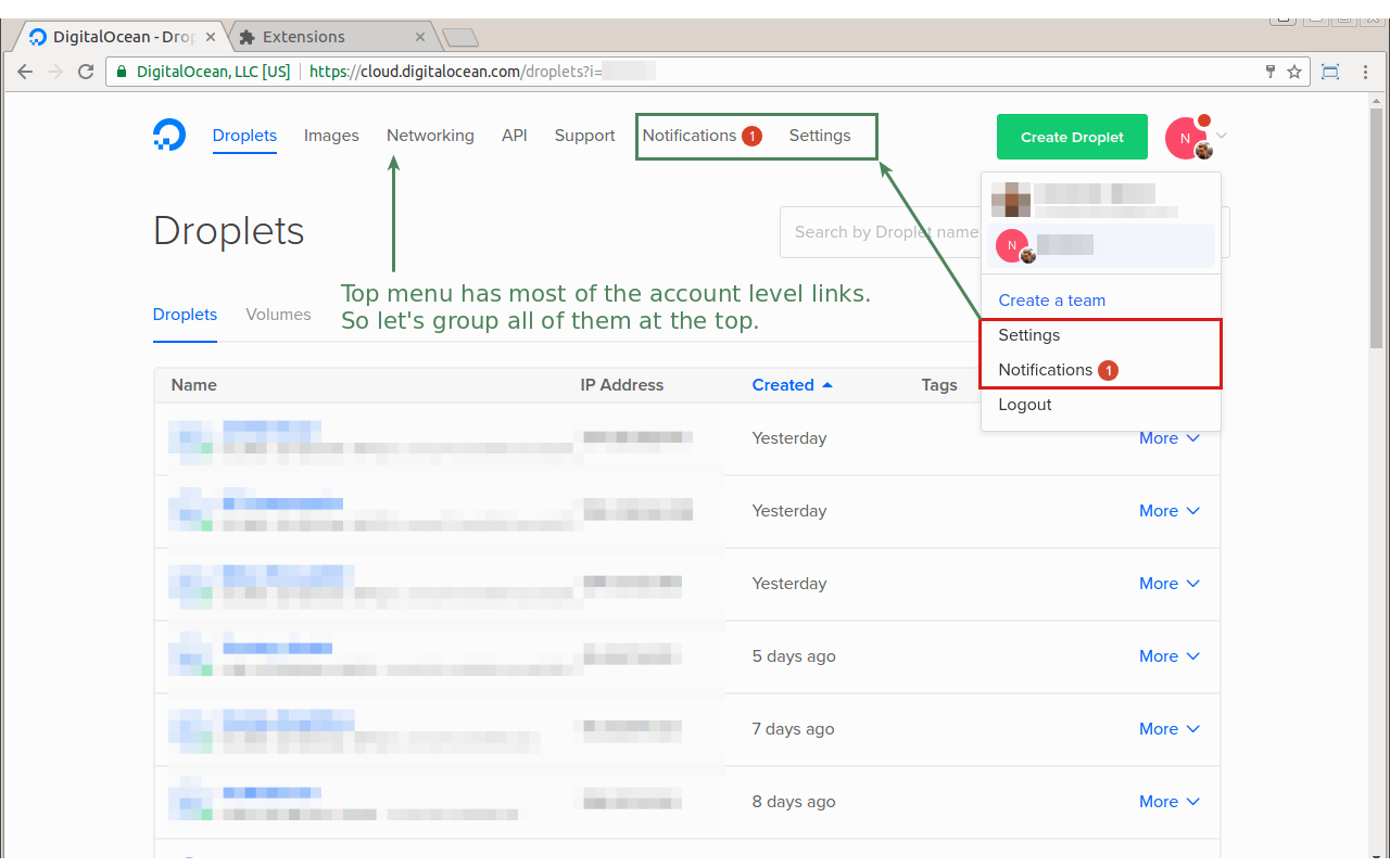
This simple Chrome extension makes the Digital Ocean account menus less confusing:
- Moves
SettingsandNotificationsto the top menu where they belong with the other account level links - Renames
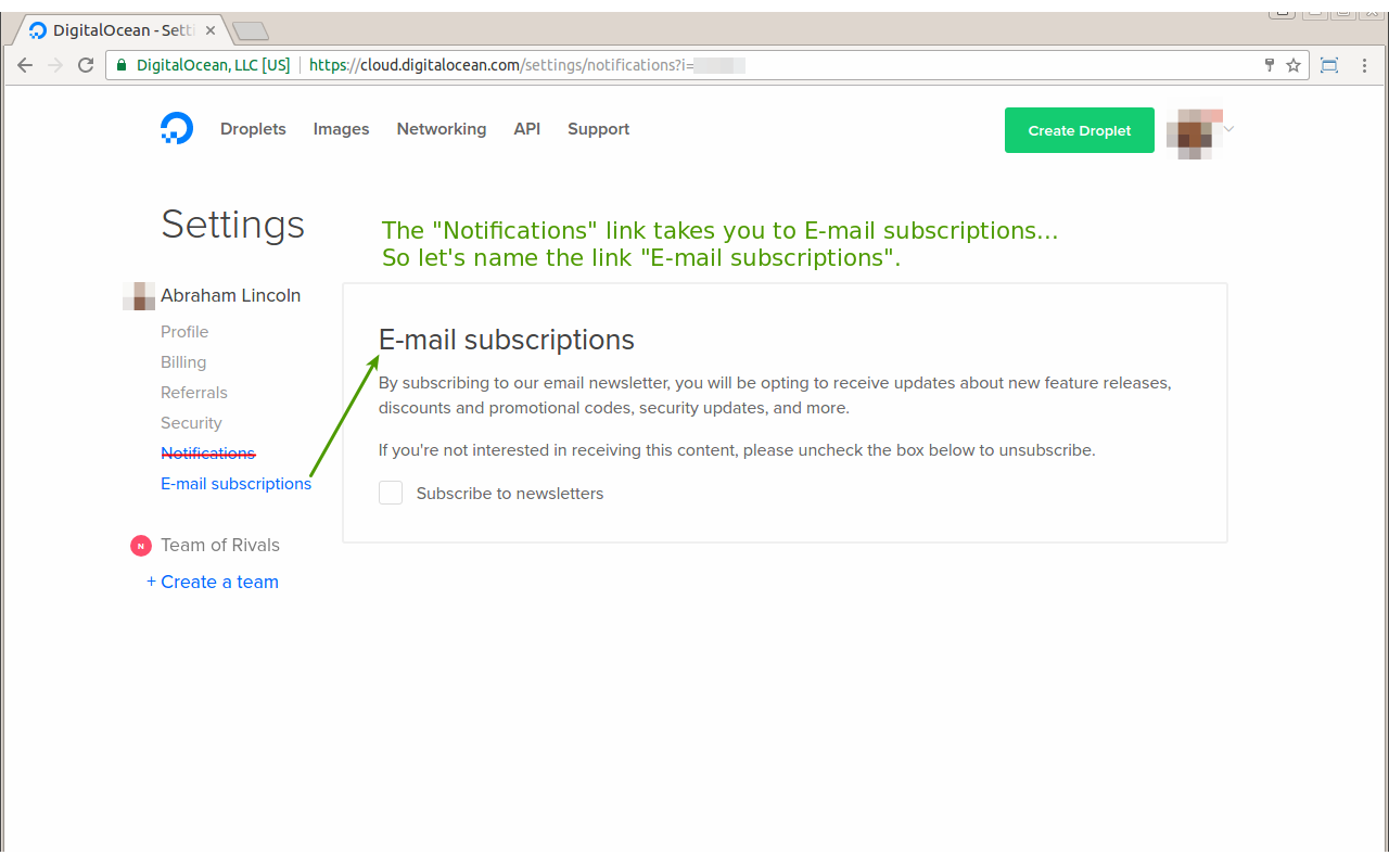
Settings > NotificationstoSettings > E-mail subscriptionswhich is where it actually takes you
Update: Hooray! In response to this extension Digital Ocean quickly implemented the 2nd change (HN thread , DO's update on HN ).
Install: Get it from Chrome Webstore
Screenshots:

2nd change:
