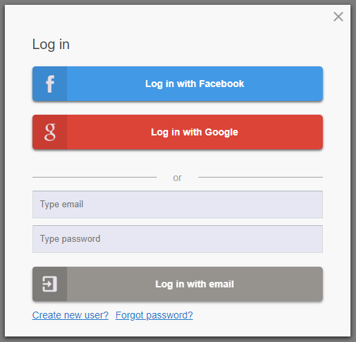
Awesome
Customizable React Social Media login modal
A lightweight, customizable react component log-in modal including social media buttons. No functionality is applied. Functions for click events can be passed via props. As can varies options for text and behavior.
:mag_right: Preview

Live example
https://silind.github.io/react-login-modal-sm/
:cloud: Installation
Install
npm i react-login-modal-sm
Run example
# Start development server using create-react-app
npm run example
Bootstrap and Google Icons
Put following tags in your public index.html file's header section
<!-- Google Icons -->
<link href="https://fonts.googleapis.com/icon?family=Material+Icons" rel="stylesheet">

<!-- Bootstrap -->
<link href="https://stackpath.bootstrapcdn.com/bootstrap/4.1.1/css/bootstrap.min.css" rel="stylesheet" integrity="sha384-WskhaSGFgHYWDcbwN70/dfYBj47jz9qbsMId/iRN3ewGhXQFZCSftd1LZCfmhktB" crossorigin="anonymous">
Import and use component
import LoginModal from "react-login-modal-sm";

<LoginModal showModal={true} />
:memo: Documentation
Constant that is passed via props
| Prop name | Description |
|---|---|
showModal | Boolean that determines whether the modal is visible or hidden |
Functions that is passed via props
| Prop name | Description |
|---|---|
toggleModal | Show / hide the modal. When user clicks the 'x' button or clicks the overlay-background |
onLoginFacebook | When user clicks on 'log in with Facebook' button |
onLoginGoogle | When user clicks on 'log in with Google' button |
onLoginEmail | When user clicks on 'log in with email' button. Passes (email, password) as parameters |
onSignupFacebook | When user clicks on 'sign up with Facebook' button |
onSignupGoogle | When user clicks on 'sign up with Google' button |
onSignupEmail | When user clicks on 'sign up with email' button. Passes (email, username, password) as parameters |
onForgotPassword | When user clicks on 'send new password' button. Passes (email) as parameter |
Regular expressions that can be passed via props (optional)
| Prop name | Description | Default value |
|---|---|---|
emailRegex | Regex that defines correct email format | https://stackoverflow.com/questions/46155/how-to-validate-an-email-address-in-javascript |
usernameRegex | Regex that defines correct username format | /^[a-zA-Z0-9_-]{5,}/ |
passwordRegex | Regex that defines correct password format | /^[a-zA-Z0-9_@!#()]{8,}/ |
Custom labels that can be passed via props (optional)
| Prop name | Description |
|---|---|
labels | Optional labels. Must be passed as an entire object |
Default
{
  loginTitle: "Log in",
  signupTitle: "Create new user",
  forgotTitle: "Reset password",
  loginFacebookButton: "Log in with Facebook",
  loginGoogleButton: "Log in with Google",
  loginEmailButton: "Log in with email",
  signupFacebookButton: "Sign up with Facebook",
  signupGoogleButton: "Sign up with Google",
  signupEmailButton: "Sign up with email",
  forgotButton: "Send new password",
  loginEmailPlaceholder: "Type email",
  loginPasswordPlaceholder: "Type password",
  signupUsernamePlaceholder: "Type username",
  signupLink: "Create new user?",
  loginLink: "Already a user?",
  forgotLink: "Forgot password?",
  orLabel: "or"
}
:clipboard: Example
import React, { Component } from "react";
import LoginModal from "react-login-modal-sm";

export default class App extends Component {
  state = {
    showModal: false
  };

  toggleModal = () => {
    this.setState({ showModal: !this.state.showModal });
  };

  handleLoginWithFacebook = () => {
    // Do something when 'Login with Facebook' is clicked
    console.log("Login with Facebook...");
  };

  handleSignupByEmail = (email, username, password) => {
    // Do something when 'Signup by email' is clicked
    console.log("Sign up by email...");
  };

  render() {
    const customUsernameRegex = /^[a-zA-Z0-9_]{5,}/;

    return (
      <div className="App">
        <h1>react-login-modal-sm example</h1>

        <LoginModal
          showModal={this.state.showModal}
          toggleModal={this.toggleModal}
          onLoginFacebook={this.handleLoginWithFacebook}
          onSignupEmail={this.handleSignupByEmail}
          usernameRegex={customUsernameRegex}
        />

        <button
          className="test-btn btn btn-primary btn-lg"
          onClick={this.toggleModal}
        >
          Log in
        </button>
      </div>
    );
  }
}
:question: Get Help
- Contact me on contact@silind.com
- - or if appropriate; raise an issue on Github