Awesome
Toou 2D - To facilitate the use and created for simplicity!
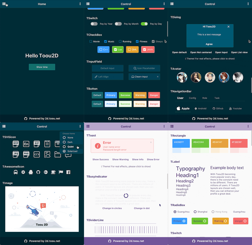
Hereinafter referred to as "T2D", Qt(quick) 2D lightweight framework crafted by the Toou team, is written using its own interface specifications and can be used for free for commercial software and open source projects. Concise code structure is easy to expand and modify, The performance and dynamics of the application are perfectly considered, solve the problem of few components, large volume, no theme package. The T2D use threshold is extremely low without in-depth study to get it right away.Every detail from the core code to the component API is carefully crafted to make it ideal for rapid development of the application interface.
::: What are his advantages
- Dozens of components to meet your different development needs
- Support for dynamic library, static library multi-mode compilation
- Qml plug-in is installed automatically without any environment setup
- All components support Theme feature
- Themes can be easily configured in the INI file
- Efficient running of switching theme without delay
- Better performance with Toou2D without Controls and Controls2
- Support for Font Awesome, Svg Icon
- Rich Demo for learning and reference, T2D is easier to get started with
- Support the use of local API documentation and network API documentation
- Planning a long-term open source route is clearandof and long-term maintenance is safe to use
- Inherit Qt cross-platform features and follow Qt syntax specification
- Let's create a better tomorrow together :)
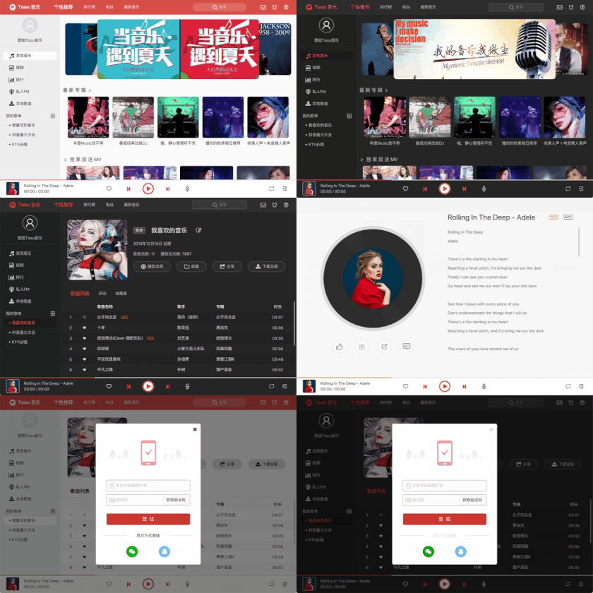
::: These open source demos were developed using T2D


::: Start with running Example
Qt 5.6 or later is required.
- Turn the project clone locally and open Toou-2D.pro using Qt creator
T2D support for macOS, Windows Build, can be published to macOS, Windows, iOS, Android and other multi-platform.
::: What components did T2D develop
| Component | Description |
|---|---|
| TAvatar | Used to display user icon or rounded corner pictures |
| TawesomeIcon | Font Awesome icon |
| TBadge | Numbers or status markers that appear next to buttons, icons, or status tags |
| TBusyIndicator | Show dynamics when loading data |
| TButton | Common action buttons |
| TCarousel | In a limited space, loop through the same type of pictures, text, and more |
| TCheckBox | Multi-select in a set of alternatives |
| TDialog | Inform the user and host the relevant action while retaining the current page state. |
| TDialogBasic | which can customize the pop-up effects |
| TDialogButton | Manipulation buttons embedded in the bottom of Dialog body |
| TDividerLine | A line that divides content |
| TFlickable | Content can be dragged, With horizontal and vertical scrollbars |
| TFpsMonitor | Monitor current usage of FPS |
| TIcon | Load automatically depending on source |
| TIconButton | You can add icon buttons |
| TImage | Qt supports all format image files |
| TImageButton | Use images to make a button |
| TInputField | Receives keyboard input characters |
| TLabel | Displays a text content |
| TMask | You can specify a specified area to display to the user |
| TMouseArea | Receiving and corresponding mouse and touch area |
| TSandBar | Provide navigation for applications |
| TObject | Improved QtObject |
| TPagination | Paging or shredding data |
| TPopover | Modal, arbitrary position pop-up item |
| TPopoverMenu | Shape-out menu boxes anywhere |
| TPopup | shows a pop-up window that requires a custom body |
| TProgressBar | Used to show the progress of a task |
| TRadioBox | Select one of a set of alternatives |
| TRadioBoxGroup | Manage RadioBox. Only one can be selected in the group |
| TRectangle | A rectangle with color |
| TSVGIcon | Svg icon,We did a lot of optimizations |
| TScrollbarH | Horizontal scroll bars, controlable ListView, GridView, Flickablet, and more |
| TScrollbarV | Vertical scroll bar,Apply to ListView or GridView or Flickablet |
| TSwitch | Represents a switch between two opposing states |
| TTag | Used for marking and selection |
| TToast | Lightweight message feedback, in the form of little bullet boxes |
| ... | The new version will be more exciting :) |
::: How to make a theme pack
The T2D topic data is all defined in the ini file. The ini file configuration can be written inside or outside the application. Ini node properties and simple general rules can be modified to achieve the theme production.
In example, we have made two skins for you to use. An App without skin has no vitality.
::: How do you bind theme styles
TThemeBinder lets components bind with theme-style data:
//!When the theme changes,This Rectangle will change the width and color
//!It does not break the original binding of rect
Rectangle{
    id:rect;
    width : parent.width;
    height: 100;
    color : "red";

    TThemeBinder{
        id:theme
        className: "Myrect"
        property alias color:  rect.color;
        property alias width:  rect.width;
    }
}
::: T2D api docs
We provide online and offline documentation。Offline document support Qt Creator(F1) or Qt Assistant
::: Compatibility
| Windows 7 | OK | Windows 10 | OK | iOS iPad mini | OK |
| macOS 10.12 | OK | macOS 10.14 | OK | iOS iPhone XR | OK |
| Android Huawei 4.4 | OK | Android Mi 7.0 | OK | iOS iPhone 8 plus | OK |
| Android Mi Pad 8.0 | OK | Android vivo 8.0 | OK | iOS iPhone 6 | OK |
::: Development planning route

::: The last thing I want to say
Toou Please give us encouragement add star!~


