Awesome
Dual gauge card
[!IMPORTANT] Looking for new maintainer!
I can't find the time or inspiration to take care of this project anymore.
So if you'd like to become the new maintainer of this project please let me know via a Pull request!
Two gauges in one, built mostly with CSS.
Heavily inspired by ciotlosm's gauge-card, but completly written from scratch.
Installation
Use HACS (recommended) or download dual-gauge-card.js and place it in your www directory.
In your ui-lovelace.yaml add this:
  - url: /community_plugin/dual-gauge-card/dual-gauge-card.js
    type: js
If you don't use HACS please change the url accordingly.
Config
| Name | Type | Default | Description |
|---|---|---|---|
| title | string | Common title | |
| min | int | 0 | minimum value |
| max | int | 100 | maximum value |
| colors | object | color config (optional) | |
| background_color | string | background color of the gauges | |
| shadeInner | bool | true | shade (darken) colors of the inner gauge by 25% |
| cardwidth | int | 300 | width of the card in pixels (see below) |
| outer | object | config for the outer gauge | |
| inner | object | config for the inner gauge | |
| precision | int | 2 | decimal precision |
gauge config
Both gauges have the same attributes:
| Name | Type | Default | Description |
|---|---|---|---|
| entity | string | entity id | |
| attribute | string | use this attribute of the entity instead of its state (optional) | |
| label | string | label for this gauges value (optional) | |
| unit | object | unit to add to the value (optional) | |
| min | int | minimum value | |
| max | int | maximum value | |
| colors | object | color config (optional) | |
| precision | int | 2 | decimal precision |
cardwidth
You may use the config value cardwidth to set the overall width of the card as an absolute value in pixels. All elements of the gauge are sized relative to this so that the gauge scales to this, but the card is not responsive for now, i.e. it doesn't resize automatically.
color config
Colors can be configured as list of pairs of each a color and a minimum value.
If a gauges value is greater than or equal to one of those minimum values, the according color is used for that gauge. If no color is found, the last color in the list is used as a fallback. To use a single color regardless of the value just use a single list entry with any value to always trigger the fallback.
By default, colors for the inner gauge are shaded by 25% (see option shadeInner).
The list is automatically sorted so you don't need to do that in your config - but I recommend it anyways.
common config vs. individual config
Colors, as well as the min and max values, may be configured once for both gauges or individually for each gauge. Individual values override common values.
Example
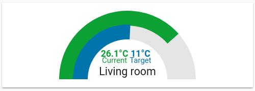
The example on the screenshot is configured like this:
- type: custom:dual-gauge-card
  title: Living room
  min: -20
  max: 40
  outer:
    entity: climate.living_room
    attribute: current_temperature
    label: "Current"
    unit: "°C"
  inner:
    entity: climate.living_room
    label: "Target"
    attribute: temperature
    unit: "°C"
  colors:
    - color: "var(--label-badge-red)"
      value: 27.5
    - color: "var(--label-badge-green)"
      value: 25
    - color: "var(--label-badge-yellow)"
      value: 18
    - color: "var(--label-badge-blue)"
      value: 0
    - color: "var(--paper-blue-400)"
      value: -40
In this example, the outer gauge has individual min and max values and uses default colors, whereas the inner gauge has individual colors and uses the common min and max values.
- type: custom:dual-gauge-card
  title: Living room
  min: -20
  max: 40
  precision: 2
  outer:
    entity: climate.living_room
    attribute: current_temperature
    label: "Current"
    unit: "°C"
    min: -30
    max: 50
  inner:
    entity: climate.living_room
    label: "Target"
    attribute: temperature
    unit: "°C"
    colors:
      - color: "var(--label-badge-green)"
        value: 25
      - color: "var(--label-badge-yellow)"
        value: 18
      - color: "var(--label-badge-blue)"
        value: 0