Awesome
HistogramLogAnalyzer
HistogramLogAnalyzer is a User Interface (UI) tool that plots log files in a histogram log format produced by jHiccup, cassandra-stress, or other tools that support this format.
How to Build
Use Maven to build it from the source code
% mvn clean package
How to Run
You can run it by using the command line: java -jar HistogramLogAnalyzer.jar or just by double-clicking the jar file.
Select a log file to plot (by selecting the “File->Open” menu, using the command-line option “-f file”, or just dragging and dropping the log file in the main window).
Timeline and Percentile Charts
The tool produces two charts arranged vertically one above the other:
- Timeline chart
- Percentile chart
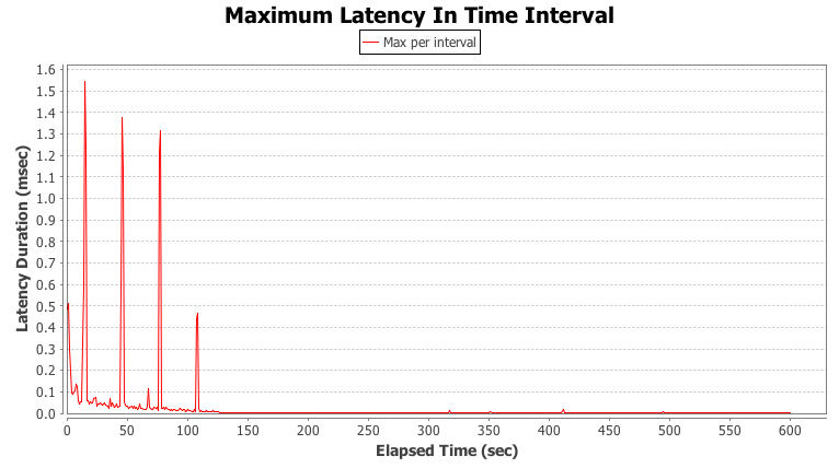
The timeline chart plots the maximum latency duration observed in each time interval. There is a spike in every recorded sample. The height of each spike indicates the maximum pause time experienced during that interval.

The percentile chart plots the observed latency durations at varying percentiles.

The tool enables viewing SLA (service level agreement) data in the percentile chart. Use the “Master SLA” button in the toolbar to open new tab and configure SLA values (arbitrary number of percentile/latency pairs). Use the “Show SLA” button to display SLA in the percentile chart.
The tool also enables plotting multiple percentiles and multiple moving window widths on the timeline chart. Use the “Master MWP” button in the toolbar to open a new tab and configure MWP (a multiple window percentile) values (percentile/“window length” pairs). Use the “Show MWP” button to display MWP in the timeline chart.
Customize Charts
The tool provides several options to customize the charts:
- Chart properties
Right-click a chart to open a popup menu and then select the “Properties…” menu item to open the "Chart properties" dialog. This dialog allows you to customize different chart settings (titles, fonts, colors, etc).
- Zooming functionality
To zoom in, left-click inside a chart and drag over an area in the chart<br /> To zoom out, left-click inside a chart and drag outside the chart<br /> When zooming in on a range in the timeline chart, the percentile chart changes to represent only the percentiles in that time range.<br />
Snapshot
The tool also provides a way to make a snapshot image of charts by using the “Snapshot” button in the toolbar.
Plotting Tags
The tool supports log files with multiple tags. It plots multiple tags (with different colors) on the same chart. Clicking a tag item in the chart legend toggles visibility of this tag in the chart.