Awesome
Angular Multiselect Dropdown - Angular version support 2, 4, 6, 8, 13, 14, 15, 16, 17, 18


Angular 2 multiselect dropdown component for web applications. Easy to integrate and use.
Important Notice !!
From v3.0.0 onwards, you need to include default.theme.css file to get the basic styling of the dropdown. Refer to themes and theming section below
Documentation | Demos / Examples.
Table of Contents
1. Getting Started
2. Installation
3. Usage
4 Theming
5. Templates
6. Template Driven Forms support
7. Reactive Forms support
8. Settings configuration
9. Callbacks and events
10. Lazy lodaing - handle large data lists
11. Group By feature
12. Search filter for both plain list and grouped list
13. Custom Search / Search API
Getting Started
Installation
-
The Mutiselect Dropdown package is published on the npm Registry.
-
Install the package :
npm install angular2-multiselect-dropdown -
Once installed import
AngularMultiSelectModulefrom the installed package into your module as follows:
Dependencies
Latest version available for each version of Angular
| angular2-multiselect-dropdown | Angular |
|---|---|
| 10.0.0 | 18.X.X |
| 9.0.0 | 17.X.X |
| 8.0.0 | 16.X.X |
| 7.0.0 | 15.X.X |
| 6.0.0 | 14.X.X |
Usage
Import AngularMultiSelectModule into NgModule in app.module.ts. Angular's FormsModule is also required.
import { AngularMultiSelectModule } from 'angular2-multiselect-dropdown';
import { FormsModule } from '@angular/forms';

@NgModule({
  // ...
  imports: [
    AngularMultiSelectModule,
    FormsModule
  ]
  // ...
})
Declare the component data variables and options in your component where you want to consume the dropdown component.
import { Component, OnInit } from '@angular/core';
export class AppComponent implements OnInit {
dropdownList = [];
selectedItems = [];
dropdownSettings = {};
ngOnInit(){
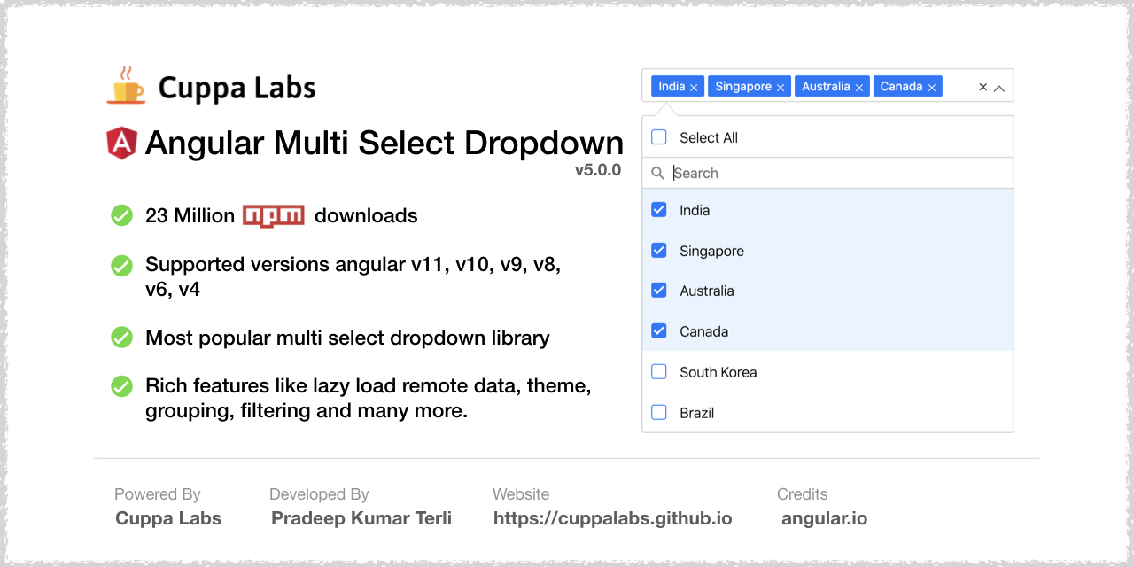
this.dropdownList = [
{"id":1,"itemName":"India"},
{"id":2,"itemName":"Singapore"},
{"id":3,"itemName":"Australia"},
{"id":4,"itemName":"Canada"},
{"id":5,"itemName":"South Korea"},
{"id":6,"itemName":"Germany"},
{"id":7,"itemName":"France"},
{"id":8,"itemName":"Russia"},
{"id":9,"itemName":"Italy"},
{"id":10,"itemName":"Sweden"}
];
this.selectedItems = [
{"id":2,"itemName":"Singapore"},
{"id":3,"itemName":"Australia"},
{"id":4,"itemName":"Canada"},
{"id":5,"itemName":"South Korea"}
];
this.dropdownSettings = {
singleSelection: false,
text:"Select Countries",
selectAllText:'Select All',
unSelectAllText:'UnSelect All',
enableSearchFilter: true,
classes:"myclass custom-class"
};
}
onItemSelect(item:any){
console.log(item);
console.log(this.selectedItems);
}
OnItemDeSelect(item:any){
console.log(item);
console.log(this.selectedItems);
}
onSelectAll(items: any){
console.log(items);
}
onDeSelectAll(items: any){
console.log(items);
}
}
Add the following component tag in you template
<angular2-multiselect [data]="dropdownList" [(ngModel)]="selectedItems"
    [settings]="dropdownSettings"
    (onSelect)="onItemSelect($event)"
    (onDeSelect)="OnItemDeSelect($event)"
    (onSelectAll)="onSelectAll($event)"
    (onDeSelectAll)="onDeSelectAll($event)"></angular2-multiselect>
Themes and Theming
- From v3.0.0 onwards, you need to include
default.theme.cssfile to get the basic styling of the dropdown. - The component package has a themes folder in node_modules at
angular2-multiselect-dropdown\themes\default.theme.css - Include the
default.theme.cssinangular-cli.json(for versions below angular 6) andangular.json(for version 6 or more). - Refer this file on how to add the css file to your angular project.
You can create your own theme from now on. You can have a look at example scss theming file at Default theme
Template - For custom html of menu item
<angular2-multiselect [data]="dropdownList" [(ngModel)]="selectedItems" [settings]="dropdownSettings">
  <c-item>
          <ng-template let-item="item">
            <label style="color: #333;min-width: 150px;">{{item.itemName}}</label>
            <img [src]="item.image" style="width: 30px; border: 1px solid #efefef;margin-right: 20px;" />
            <label>Capital - {{item.capital}}</label>
          </ng-template>
  </c-item>
</angular2-multiselect>
Template - For custom html of Selected item - badge
<angular2-multiselect [data]="dropdownList" [(ngModel)]="selectedItems" [settings]="dropdownSettings">
  <c-badge>
           <ng-template let-item="item">
            <label style="margin: 0px;">{{item.itemName}}</label>
            <img [src]="item.image" style="width: 16px; margin-right: 5px;" />
           </ng-template>
  </c-badge>
</angular2-multiselect>
Template Driven Forms support
<form (ngSubmit)="onSubmit()" #loginForm="ngForm" style="border: 1px solid #ccc; padding: 10px;">
        <div class="form-group">
            <label for="name">Skills</label>
            <angular2-multiselect [data]="itemList" [(ngModel)]="formModel.skills"
                                  [settings]="settings"
                                  (onSelect)="onItemSelect($event)"
                                  (onDeSelect)="OnItemDeSelect($event)"
                                  (onSelectAll)="onSelectAll($event)"
                                  (onDeSelectAll)="onDeSelectAll($event)" name="skills">
            </angular2-multiselect>
        </div>
</form>
formModel = {
        name: '',
        email: 'ascasc@aa.com',
        skills: [{ "id": 1, "itemName": "Angular" }]
    };
Reactive Forms support
<form [formGroup]="userForm" novalidate style="border: 1px solid #ccc; padding: 10px;">
        <div class="form-group">
            <label for="name">Skills</label>
           <angular2-multiselect [data]="itemList" [(ngModel)]="selectedItems"
                                  [settings]="settings"
                                  (onSelect)="onItemSelect($event)"
                                  (onDeSelect)="OnItemDeSelect($event)"
                                  (onSelectAll)="onSelectAll($event)"
                                  (onDeSelectAll)="onDeSelectAll($event)" formControlName="skills">
            </angular2-multiselect>
        </div>
</form>
userForm: FormGroup;
this.userForm = this.fb.group({
            name: '',
            email: ['', Validators.required],
            skills: [[], Validators.required]
        });
Settings
The following list of settings are supported by the component. Configure the settings to meet your requirement.
| Setting | Type | Description | Default Value |
|---|---|---|---|
| singleSelection | Boolean | To set the dropdown for single item selection only. | false |
| text | String | Text to be show in the dropdown, when no items are selected. | 'Select' |
| enableCheckAll | Boolean | Enable the option to select all items in list | false |
| selectAllText | String | Text to display as the label of select all option | Select All |
| unSelectAllText | String | Text to display as the label of unSelect option | UnSelect All |
| enableSearchFilter | Boolean | Enable filter option for the list. | false |
| enableFilterSelectAll | Boolean | A 'select all' checkbox to select all filtered results. | true |
| filterSelectAllText | String | Text to display as the label of select all option | Select all filtered results |
| filterUnSelectAllText | String | Text to display as the label of unSelect option | UnSelect all filtered results |
| maxHeight | Number | Set maximum height of the dropdown list in px. | 300 |
| badgeShowLimit | Number | Limit the number of badges/items to show in the input field. If not set will show all selected. | All |
| classes | String | Custom classes to the dropdown component. Classes are added to the dropdown selector tag. To add multiple classes, the value should be space separated class names. | '' |
| limitSelection | Number | Limit the selection of number of items from the dropdown list. Once the limit is reached, all unselected items gets disabled. | none |
| disabled | Boolean | Disable the dropdown | false |
| searchPlaceholderText | String | Custom text for the search placeholder text. Default value would be 'Search' | 'Search' |
| groupBy | String | Name of the field by which the list should be grouped. | none |
| selectGroup | Boolean | Select a group at once. GroupBy should be enabled, to use this. | false |
| searchAutofocus | Boolean | Autofocus search input field | true |
| labelKey | String | The property name which should be rendered as label in the dropdown | itemName |
| primaryKey | String | The property by which the object is identified. Default is 'id'. | id |
| position | String | Set the position of the dropdown list to 'top' or 'bottom' | bottom |
| noDataLabel | String | Label text when no data is available in the list | 'No Data Available' |
| searchBy | Array | Search the list by certain properties of the list item. Ex: ["itemName, "id","name"]. Deafult is , it will search the list by all the properties of list item | [] |
| lazyLoading | Boolean | Enable lazy loading. Used to render large datasets. | false |
| showCheckbox | Boolean | Show or hide checkboxes in the list | true |
| addNewItemOnFilter | Boolean | Whe you filter items and if, the item is not found, you can add the text as new item to the list | false |
| addNewButtonText | String | The text in the button when addNewItemOnFilter is enabled | 'Add' |
| escapeToClose | boolean | Press excape key to close the dropdown | true |
| autoPosition | boolean | Enable dropdown to open either on 'top' or 'bottom' Ex: settings = { position: 'bottom', autoPosition: false }; open the dropdown always at bottom | true |
| tagToBody | boolean | If the dropdown to be appended to body or not ? | true |
Events
onSelect- Return the selected item on selection. Example : (onSelect)="onItemSelect($event)"onDeSelect- Return the un-selected item on un-selecting. Example : (onDeSelect)="OnItemDeSelect($event)"onSelectAll- Return the list of all selected items. Example : (onSelectAll)="onSelectAll($event)"onDeSelectAll- Returns an empty array. Example : (onDeSelectAll)="onDeSelectAll($event)"onGroupSelect- Returns the selected group items as an array. Example: (onGroupSelect)="onGroupSelect($event)"onGroupDeSelect- Returns the sun-elected group items as an array. Example: (onGroupDeSelect)="onGroupDeSelect($event)"onOpen- Callback method fired after the dropdown opens Example : (onOpen)="onOpen($event)"onClose- Callback method, fired when the dropdown is closed Example : (onClose)="onClose($event)"onScrollToEnd- Callback event fired when the dropdown list is scrolled to the end. Usually used with virtual scrolling, to load data on scroll. Example : (onScrollToEnd)="fetchMore($event)"onAddFilterNewItem- Callback event fired when you click theAddbutton which will appear whenaddNewItemOnFiltersetting is enabled. Example : (onAddFilterNewItem)="onAddItem($event)"onFilterSelectAll- Callback event fired when the list is filtered and all filtered items are selected with select all filtered items checkbox. Example : (onFilterSelectAll)="onFilterSelectAll($event)"onFilterDeSelectAll- Callback event fired when the list is filtered and all filtered items are de-selected with de-select all filtered items checkbox. Example : (onFilterDeSelectAll)="onFilterDeSelectAll($event)"
Run locally
- Clone the repository or downlod the .zip,.tar files.
- Run
npm install - Run
ng servefor a dev server - Navigate to
http://localhost:4200/The app will automatically reload if you change any of the source files.
License
MIT License.