Awesome
 Material.Avalonia
Customizable Material Design implementation for AvaloniaUI framework.

- More screenshots
- Live demo in your browser
Currently, in the alpha stage, many things can be broken.
 Overview
This library is a collection of styles and controls to help you customize your Avalonia application with Material Design theme.
- Material Design styles for almost all Avalonia controls
- Additional controls to support the Snackbars, side sheets, floating buttons, cards, dialogs and more
- Easy configuration of palette (at design and runtime), according to Material Guidelines guidelines
- Full Material Design Icons icon pack support (must be installed separately, in favor of small library size)
- Demo applications included in the source project
 Getting started
Check out the getting started wiki page. Or follow these instructions:
-
Add Material.Avalonia nuget package to your project:
dotnet add package Material.Avalonia -
Edit
App.xamlfile:<Application ... xmlns:themes="clr-namespace:Material.Styles.Themes;assembly=Material.Styles" ...> <Application.Styles> <themes:MaterialTheme BaseTheme="Dark" PrimaryColor="Purple" SecondaryColor="Lime" /> </Application.Styles> </Application> -
Installing additional packages:
All styles will be included automatically if you using
MaterialTheme-
If you want to use
DataGridcontrol, add Material.Avalonia.DataGrid package:dotnet add package Material.Avalonia.DataGrid -
If you want to use dialogs provided from Material.Avalonia, add Material.Avalonia.Dialogs package:
dotnet add package Material.Avalonia.Dialogs
-
-
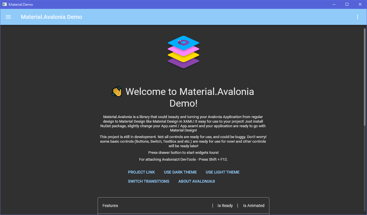
Done! Now your app is styled! You can use the Demo app to view how different styles look.
Every control has the ShowMeTheXaml button in the right bottom corner which will show you a markup needed to recreate it.
 Useful links
- Advanced theming wiki page
- Nightly packages wiki page
- Material Design Icons icon pack support
- DialogHost.Avalonia that provides a simple way to display a dialog


