Awesome
<img src="https://raw.githubusercontent.com/AndyObtiva/glimmer/master/images/glimmer-logo-hi-res.png" height=85 /> Glimmer DSL for Web 0.6.3 (Beta)
Ruby-in-the-Browser Web Frontend Framework
The "Rails" of Frontend Frameworks!!!
Finally, Ruby Developer Productivity, Happiness, and Fun in the Frontend!!!

(Based on Original Glimmer Library Handling World’s Ruby GUI Needs Since 2007. Beware of Imitators!)
(Talk Videos: Intro to Ruby in the Browser & Frontend Ruby with Glimmer DSL for Web)
(Ruby Rogues Podcast: Building Better Ruby Apps: Glimmer Component Slots and More)

You can finally live in pure Rubyland on the Web in both the frontend and backend with Glimmer DSL for Web! Glimmer DSL for Web enables building Web Frontends (aka SPA: Single Page Applications) using Ruby in the Browser, as per Matz's recommendation in his RubyConf 2022 keynote speech to replace JavaScript with Ruby. It supports Rails' principle of the One Person Framework by not requiring any extra developers with JavaScript expertise, yet enabling Ruby (Backend) Software Engineers to develop the Frontend with Ruby code that is better than any JavaScript code produced by JS developers. It aims at providing the simplest, most intuitive, most straight-forward, and most productive frontend framework in existence. The framework follows the Ruby way (with DSLs and TIMTOWTDI) and the Rails way (Convention over Configuration) in building Isomorphic Ruby on Rails Applications. It provides a Ruby HTML DSL (including full support for SVG), which uniquely enables writing both structure code and logic code in one language. It supports both Unidirectional (One-Way) Data-Binding (using <=) and Bidirectional (Two-Way) Data-Binding (using <=>). Dynamic rendering (and re-rendering) of HTML content is also supported via Content Data-Binding. Modular design is supported with Glimmer Web Components, Component Slots, and Component Custom Event Listeners. And, a Ruby CSS DSL is supported with the included Glimmer DSL for CSS. To automatically convert legacy HTML & CSS code to Glimmer DSL Ruby code, Software Engineers could use the included html_to_glimmer and css_to_glimmer commands. Many samples are demonstrated in the Rails sample app (there is a very minimal Standalone [No Rails] static site sample app too).
You can finally have Ruby developer happiness and productivity in the Frontend! No more wasting time splitting your resources across multiple languages, using badly engineered, over-engineered, or premature-optimization-obsessed JavaScript libraries, fighting JavaScript build issues (e.g. webpack), or rewriting Ruby Backend code in Frontend JavaScript. With Ruby in the Browser, you can have an exponential jump in development productivity (2x or higher), time-to-release (1/2 or less time), cost (1/2 or cheaper), and maintainability (~50% the code that is simpler and more readable) over JavaScript libraries like React, Angular, Ember, Vue, and Svelte, while being able to reuse Backend Ruby code as is in the Frontend for faster interactions when needed. Also, with Frontend Ruby SPA (Single Page Applications), companies can cut their hiring budget in half by having Backend Ruby Software Engineers do Frontend Development in Ruby! Ruby in the Browser finally fulfills every smart highly-productive Rubyist's dream by bringing Ruby productivity fun to Frontend Development, the same productivity fun you had for years and decades in Backend Development.
Glimmer DSL for Web aims to be a very simple Ruby-based SPA drop-in replacement for your existing JavaScript Frontend SPA library (e.g. React, Angular, Vue, Ember, Svelte) or your JavaScript Frontend layer in general. It does not change how your Frontend interacts with the Backend, meaning you can continue to write Rails Backend API endpoints as needed and make HTTP/Ajax requests or read data embedded in elements, but from Ruby in the Browser. Whatever is possible in JavaScript is possible when using Glimmer DSL for Web as it integrates with any existing JavaScript library. The Rails sample app demonstrates how to make HTTP calls and how to integrate with a JavaScript library (highlightjs) that performs code syntax highlighting. Glimmer DSL for Web currently runs on Opal (Fukuoka Ruby 2023 Award Winner), a Ruby-to-JavaScript transpiler. In the future, it might support other Frontend Ruby environments, such as ruby.wasm.
After looking through the samples below, read the FAQ (Frequently Asked Questions) to learn more about how Glimmer DSL for Web compares to other approaches/libraries like Hotwire (Turbo), Phlex, ViewComponent, Angular, Vue, React, Svelte, and other JS frameworks.
Anyone not considering this kind of technology in 2024 is like someone stuck in the dark ages riding horse carriage (e.g. JavaScript developers using frameworks like React) despite cars having been invented already and providing exponential jumps in productivity (way more than small linear jumps provided by some JavaScript libraries, which are akin of modifying horse carriage). Obviously, those who do make this jump will end up winning their work over from customers and beating the competition while delivering the best Frontend value possible to customers.
(Attention Software Engineers, Bloggers, and Contributors: Please use Glimmer DSL for Web in web projects, blog about it, and submit a PR with your article, project, and/or open-source-repo added to the README. Also, I give everyone permission to present this project at their local Ruby user group, local Software Engineering meetup, or Software Conferences outside of North America (e.g. Europe). I am willing to present at Software Conferences in North America and Japan (the birthplace of Ruby) only. If you want to have this project presented elsewhere, like in Europe or South America, feel free to prepare and give your own presentations of the project, and if needed, hit me up for help on the Glimmer Gitter chat)
Hello, World! Sample
(Note: in real app development, we build Glimmer Web Components, but this sample is just introducing basic building blocks towards building components)
lib/glimmer-dsl-web/samples/hello/hello_world.rb
Glimmer HTML DSL Ruby code in the frontend:
require 'glimmer-dsl-web'

include Glimmer

Document.ready? do
  div {
    'Hello, World!'
  }
end
That produces the following under <body></body>:
<div data-parent="body" class="element element-1">
  Hello, World!
</div>

You can also mount the div elsewhere by passing the parent: parent_css_selector option (e.g. div(parent: 'div#app-container') { 'Hello, World!' }).
Hello, Button!
(Note: in real app development, we build Glimmer Web Components, but this sample is just introducing basic building blocks towards building components)
Event listeners can be setup on any element using the same event names used in HTML (e.g. onclick) while passing in a standard Ruby block to handle behavior. $$ gives access to JS global scope from Ruby to invoke functions like alert.
lib/glimmer-dsl-web/samples/hello/hello_button.rb
Glimmer HTML DSL Ruby code in the frontend:
require 'glimmer-dsl-web'

include Glimmer

Document.ready? do
  div {
    button('Greet') {
      onclick do
        $$.alert('Hello, Button!')
      end
    }
  }
end
That produces the following under <body></body>:
<div data-parent="body" class="element element-1">
  <button class="element element-2">Greet</button>
</div>
Screenshot:

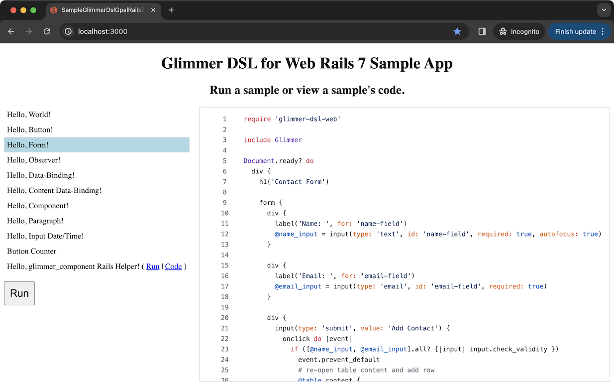
Hello, Form!
(Note: in real app development, we build Glimmer Web Components, but this sample is just introducing basic building blocks towards building components)
Glimmer DSL for Web gives access to all Web Browser built-in features like HTML form validations, input focus, events, and element functions from a very terse and productive Ruby HTML DSL. Also, you can apply CSS styles by including directly in Ruby code as a string, using Glimmer DSL for CSS, or managing CSS completely separately using something like SCSS. The CSS techniques could be combined as well, like by managing common reusable CSS styles separately in SCSS, but adding component specific CSS styles in Ruby when it is more convenient.
lib/glimmer-dsl-web/samples/hello/hello_form.rb
Glimmer HTML DSL Ruby code in the frontend:
require 'glimmer-dsl-web'

include Glimmer

Document.ready? do
  div {
    h1('Contact Form')

    form {
      div {
        label('Name: ', for: 'name-field')
        @name_input = input(type: 'text', id: 'name-field', required: true, autofocus: true)
      }

      div {
        label('Email: ', for: 'email-field')
        @email_input = input(type: 'email', id: 'email-field', required: true)
      }

      div {
        input(type: 'submit', value: 'Add Contact') {
          onclick do |event|
            if ([@name_input, @email_input].all? {|input| input.check_validity })
              # re-open table content and add row
              @table.content {
                tr {
                  td { @name_input.value }
                  td { @email_input.value }
                }
              }
              @email_input.value = @name_input.value = ''
              @name_input.focus
            end
          end
        }
      }
    }

    h1('Contacts Table')

    @table = table {
      tr {
        th('Name')
        th('Email')
      }

      tr {
        td('John Doe')
        td('johndoe@example.com')
      }

      tr {
        td('Jane Doe')
        td('janedoe@example.com')
      }
    }

    # CSS Styles
    style {
      # CSS can be included as a String as done below, or as Glimmer DSL for CSS syntax (Ruby code) as done in other samples
      <<~CSS
        input {
          margin: 5px;
        }
        input[type=submit] {
          margin: 5px 0;
        }
        table {
          border:1px solid grey;
          border-spacing: 0;
        }
        table tr td, table tr th {
          padding: 5px;
        }
        table tr:nth-child(even) {
          background: #ccc;
        }
      CSS
    }
  }
end
That produces the following under <body></body>:
<div data-parent="body" class="element element-1">
  <h1 class="element element-2">Contact Form</h1>

  <form class="element element-3">
    <div class="element element-4">
      <label for="name-field" class="element element-5">Name: </label>
      <input type="text" id="name-field" required="true" autofocus="true" class="element element-6">
    </div>

    <div class="element element-7">
      <label for="email-field" class="element element-8">Email: </label>
      <input type="email" id="email-field" required="true" class="element element-9">
    </div>

    <div class="element element-10">
      <input type="submit" value="Add Contact" class="element element-11">
    </div>
  </form>

  <h1 class="element element-12">Contacts Table</h1>

  <table class="element element-13">
    <tr class="element element-14">
      <th class="element element-15">Name</th>
      <th class="element element-16">Email</th>
    </tr>

    <tr class="element element-17">
      <td class="element element-18">John Doe</td>
      <td class="element element-19">johndoe@example.com</td>
    </tr>

    <tr class="element element-20">
      <td class="element element-21">Jane Doe</td>
      <td class="element element-22">janedoe@example.com</td>
    </tr>
  </table>

  <style class="element element-23">
    input {
      margin: 5px;
    }
    input[type=submit] {
      margin: 5px 0;
    }
    table {
      border:1px solid grey;
      border-spacing: 0;
    }
    table tr td, table tr th {
      padding: 5px;
    }
    table tr:nth-child(even) {
      background: #ccc;
    }
  </style>
</div>
Screenshot:

Hello, Data-Binding!
(Note: in real app development, we build Glimmer Web Components, but this sample is just introducing basic building blocks towards building components)
Glimmer DSL for Web intuitively supports both Unidirectional (One-Way) Data-Binding via the <= operator and Bidirectional (Two-Way) Data-Binding via the <=> operator, incredibly simplifying how to sync View properties with Model attributes with the simplest code to reason about.
lib/glimmer-dsl-web/samples/hello/hello_data_binding.rb
Glimmer HTML DSL Ruby code in the frontend:
require 'glimmer-dsl-web'

Address = Struct.new(:street, :street2, :city, :state, :zip_code, :billing_and_shipping, keyword_init: true) do
  STATES = {
    "AK"=>"Alaska",
    "AL"=>"Alabama",
    "AR"=>"Arkansas",
    "AS"=>"American Samoa",
    "AZ"=>"Arizona",
    "CA"=>"California",
    "CO"=>"Colorado",
    "CT"=>"Connecticut",
    "DC"=>"District of Columbia",
    "DE"=>"Delaware",
    "FL"=>"Florida",
    "GA"=>"Georgia",
    "GU"=>"Guam",
    "HI"=>"Hawaii",
    "IA"=>"Iowa",
    "ID"=>"Idaho",
    "IL"=>"Illinois",
    "IN"=>"Indiana",
    "KS"=>"Kansas",
    "KY"=>"Kentucky",
    "LA"=>"Louisiana",
    "MA"=>"Massachusetts",
    "MD"=>"Maryland",
    "ME"=>"Maine",
    "MI"=>"Michigan",
    "MN"=>"Minnesota",
    "MO"=>"Missouri",
    "MS"=>"Mississippi",
    "MT"=>"Montana",
    "NC"=>"North Carolina",
    "ND"=>"North Dakota",
    "NE"=>"Nebraska",
    "NH"=>"New Hampshire",
    "NJ"=>"New Jersey",
    "NM"=>"New Mexico",
    "NV"=>"Nevada",
    "NY"=>"New York",
    "OH"=>"Ohio",
    "OK"=>"Oklahoma",
    "OR"=>"Oregon",
    "PA"=>"Pennsylvania",
    "PR"=>"Puerto Rico",
    "RI"=>"Rhode Island",
    "SC"=>"South Carolina",
    "SD"=>"South Dakota",
    "TN"=>"Tennessee",
    "TX"=>"Texas",
    "UT"=>"Utah",
    "VA"=>"Virginia",
    "VI"=>"Virgin Islands",
    "VT"=>"Vermont",
    "WA"=>"Washington",
    "WI"=>"Wisconsin",
    "WV"=>"West Virginia",
    "WY"=>"Wyoming"
  }

  def state_code
    STATES.invert[state]
  end

  def state_code=(value)
    self.state = STATES[value]
  end

  def summary
    string_attributes = to_h.except(:billing_and_shipping)
    summary = string_attributes.values.map(&:to_s).reject(&:empty?).join(', ')
    summary += " (Billing & Shipping)" if billing_and_shipping
    summary
  end
end

@address = Address.new(
  street: '123 Main St',
  street2: 'Apartment 3C, 2nd door to the right',
  city: 'San Diego',
  state: 'California',
  zip_code: '91911',
  billing_and_shipping: true,
)

include Glimmer

Document.ready? do
  div {
    div(style: 'display: grid; grid-auto-columns: 80px 260px;') { |address_div|
      label('Street: ', for: 'street-field')
      input(id: 'street-field') {
        # Bidirectional Data-Binding with <=> ensures input.value and @address.street
        # automatically stay in sync when either side changes
        value <=> [@address, :street]
      }

      label('Street 2: ', for: 'street2-field')
      textarea(id: 'street2-field') {
        value <=> [@address, :street2]
      }

      label('City: ', for: 'city-field')
      input(id: 'city-field') {
        value <=> [@address, :city]
      }

      label('State: ', for: 'state-field')
      select(id: 'state-field') {
        Address::STATES.each do |state_code, state|
          option(value: state_code) { state }
        end

        value <=> [@address, :state_code]
      }

      label('Zip Code: ', for: 'zip-code-field')
      input(id: 'zip-code-field', type: 'number', min: '0', max: '99999') {
        # Bidirectional Data-Binding with <=> ensures input.value and @address.zip_code
        # automatically stay in sync when either side changes
        # on_write option specifies :to_s method to invoke on value before writing to model attribute
        # to ensure the numeric zip code value is stored as a String
        value <=> [@address, :zip_code,
                    on_write: :to_s,
                  ]
      }

      div(style: 'grid-column: 1 / span 2') {
        input(id: 'billing-and-shipping-field', type: 'checkbox') {
          checked <=> [@address, :billing_and_shipping]
        }
        label(for: 'billing-and-shipping-field') {
          'Use this address for both Billing & Shipping'
        }
      }

      # Programmable CSS using Glimmer DSL for CSS
      style {
        # `r` is an alias for `rule`, generating a CSS rule
        r("#{address_div.selector} *") {
          margin '5px'
        }
        r("#{address_div.selector} input, #{address_div.selector} select") {
          grid_column '2'
        }
      }
    }

    div(style: 'margin: 5px') {
      # Unidirectional Data-Binding is done with <= to ensure @address.summary changes
      # automatically update div.inner_text
      # (computed by changes to address attributes, meaning if street changes,
      # @address.summary is automatically recomputed.)
      inner_text <= [@address, :summary,
                      computed_by: @address.members + ['state_code'],
                    ]
    }
  }
end
Screenshot:

Hello, Content Data-Binding!
(Note: in real app development, we build Glimmer Web Components, but this sample is just introducing basic building blocks towards building components)
If you need to regenerate HTML element content dynamically, you can use Content Data-Binding to effortlessly
rebuild HTML elements based on changes in a Model attribute that provides the source data.
In this example, we generate multiple address forms based on the number of addresses the user has using content(@user, :address_count) (you can add a computed_by: array_of_attributes option if you want to re-render content based on changes to multiple attributes like content(@user, computed_by: [:address_count, :street_count]), which fires on changes to address_count or street_count) .
lib/glimmer-dsl-web/samples/hello/hello_content_data_binding.rb
Glimmer HTML DSL Ruby code in the frontend:
require 'glimmer-dsl-web'

class Address
  attr_accessor :text
  attr_reader :name, :street, :city, :state, :zip

  def name=(value)
    @name = value
    update_text
  end

  def street=(value)
    @street = value
    update_text
  end

  def city=(value)
    @city = value
    update_text
  end

  def state=(value)
    @state = value
    update_text
  end

  def zip=(value)
    @zip = value
    update_text
  end

  private

  def update_text
    self.text = [name, street, city, state, zip].compact.reject(&:empty?).join(', ')
  end
end

class User
  attr_accessor :addresses
  attr_reader :address_count

  def initialize
    @address_count = 1
    @addresses = []
    update_addresses
  end

  def address_count=(value)
    value = [[1, value.to_i].max, 3].min
    @address_count = value
    update_addresses
  end

  private

  def update_addresses
    address_count_change = address_count - addresses.size
    if address_count_change > 0
      address_count_change.times { addresses << Address.new }
    else
      address_count_change.abs.times { addresses.pop }
    end
  end
end

@user = User.new

include Glimmer

Document.ready? do
  div {
    div {
      label('Number of addresses: ', for: 'address-count-field')
      input(id: 'address-count-field', type: 'number', min: 1, max: 3) {
        value <=> [@user, :address_count]
      }
    }

    div {
      # Content Data-Binding is used to dynamically (re)generate content of div
      # based on changes to @user.addresses, replacing older content on every change
      content(@user, :address_count) do
        @user.addresses.each do |address|
          div {
            div(style: 'display: grid; grid-auto-columns: 80px 280px;') { |address_div|
              [:name, :street, :city, :state, :zip].each do |attribute|
                label(attribute.to_s.capitalize, for: "#{attribute}-field")
                input(id: "#{attribute}-field", type: 'text') {
                  value <=> [address, attribute]
                }
              end

              div(style: 'grid-column: 1 / span 2;') {
                inner_text <= [address, :text]
              }

              style {
                r(address_div.selector) {
                  margin '10px 0'
                }
                r("#{address_div.selector} *") {
                  margin '5px'
                }
                r("#{address_div.selector} label") {
                  grid_column '1'
                }
                r("#{address_div.selector} input, #{address_div.selector} select") {
                  grid_column '2'
                }
              }
            }
          }
        end
      end
    }
  }
end
Screenshot:

Hello, Component!
You can define Glimmer web components (View components) to reuse visual concepts to your heart's content,
by simply defining a class with include Glimmer::Web::Component and encasing the reusable markup inside
a markup {...} block. Glimmer web components automatically extend the Glimmer HTML DSL with new keywords
that match the underscored versions of the component class names (e.g. an OrderSummary class yields
the order_summary keyword for reusing that component within the Glimmer HTML DSL).
You may insert a Glimmer component anywhere into a Rails View using glimmer_component(component_path, *args)
Rails helper (more about it in Hello, glimmer_component Rails Helper!).
Below, we define an AddressForm component that generates an address_form keyword, and then we
reuse it twice inside an AddressPage component displaying a Shipping Address and a Billing Address.
You can specify CSS styles that apply to all instances of a component by opening a style {...} block, which is
evaluated against the component class given that it applies to all instances.
That would automatically generate one <style> element for a component inside <head> if at least one instance
of it exists. Every Glimmer web component's markup root element will automatically get a CSS class matching its Ruby
class name underscored, which can be used to scope styles for all component instances inside its style {...} block.
For example, AddressForm gets the CSS class address-form on its top-level div. You can find out the default CSS class
that is attached to every component by calling ComponentClass.component_element_class. You can get a CSS selector version of
it by calling ComponentClass.component_element_selector.
lib/glimmer-dsl-web/samples/hello/hello_component.rb
Glimmer HTML DSL Ruby code in the frontend:
require 'glimmer-dsl-web'

Address = Struct.new(:full_name, :street, :street2, :city, :state, :zip_code, keyword_init: true) do
  STATES = {
    "AK"=>"Alaska",
    "AL"=>"Alabama",
    "AR"=>"Arkansas",
    "AS"=>"American Samoa",
    "AZ"=>"Arizona",
    "CA"=>"California",
    "CO"=>"Colorado",
    "CT"=>"Connecticut",
    "DC"=>"District of Columbia",
    "DE"=>"Delaware",
    "FL"=>"Florida",
    "GA"=>"Georgia",
    "GU"=>"Guam",
    "HI"=>"Hawaii",
    "IA"=>"Iowa",
    "ID"=>"Idaho",
    "IL"=>"Illinois",
    "IN"=>"Indiana",
    "KS"=>"Kansas",
    "KY"=>"Kentucky",
    "LA"=>"Louisiana",
    "MA"=>"Massachusetts",
    "MD"=>"Maryland",
    "ME"=>"Maine",
    "MI"=>"Michigan",
    "MN"=>"Minnesota",
    "MO"=>"Missouri",
    "MS"=>"Mississippi",
    "MT"=>"Montana",
    "NC"=>"North Carolina",
    "ND"=>"North Dakota",
    "NE"=>"Nebraska",
    "NH"=>"New Hampshire",
    "NJ"=>"New Jersey",
    "NM"=>"New Mexico",
    "NV"=>"Nevada",
    "NY"=>"New York",
    "OH"=>"Ohio",
    "OK"=>"Oklahoma",
    "OR"=>"Oregon",
    "PA"=>"Pennsylvania",
    "PR"=>"Puerto Rico",
    "RI"=>"Rhode Island",
    "SC"=>"South Carolina",
    "SD"=>"South Dakota",
    "TN"=>"Tennessee",
    "TX"=>"Texas",
    "UT"=>"Utah",
    "VA"=>"Virginia",
    "VI"=>"Virgin Islands",
    "VT"=>"Vermont",
    "WA"=>"Washington",
    "WI"=>"Wisconsin",
    "WV"=>"West Virginia",
    "WY"=>"Wyoming"
  }

  def state_code
    STATES.invert[state]
  end

  def state_code=(value)
    self.state = STATES[value]
  end

  def summary
    to_h.values.map(&:to_s).reject(&:empty?).join(', ')
  end
end

# AddressForm Glimmer Web Component (View component)
#
# Including Glimmer::Web::Component makes this class a View component and automatically
# generates a new Glimmer HTML DSL keyword that matches the lowercase underscored version
# of the name of the class. AddressForm generates address_form keyword, which can be used
# elsewhere in Glimmer HTML DSL code as done inside AddressPage below.
class AddressForm
  include Glimmer::Web::Component

  option :address

  # Optionally, you can execute code before rendering markup.
  # This is useful for pre-setup of variables (e.g. Models) that you would use in the markup.
  #
  # before_render do
  # end

  # Optionally, you can execute code after rendering markup.
  # This is useful for post-setup of extra Model listeners that would interact with the
  # markup elements and expect them to be rendered already.
  #
  # after_render do
  # end

  # markup block provides the content of the
  markup {
    div {
      div(style: 'display: grid; grid-auto-columns: 80px 260px;') { |address_div|
        label('Full Name: ', for: 'full-name-field')
        input(id: 'full-name-field') {
          value <=> [address, :full_name]
        }

        @somelabel = label('Street: ', for: 'street-field')
        input(id: 'street-field') {
          value <=> [address, :street]
        }

        label('Street 2: ', for: 'street2-field')
        textarea(id: 'street2-field') {
          value <=> [address, :street2]
        }

        label('City: ', for: 'city-field')
        input(id: 'city-field') {
          value <=> [address, :city]
        }

        label('State: ', for: 'state-field')
        select(id: 'state-field') {
          Address::STATES.each do |state_code, state|
            option(value: state_code) { state }
          end

          value <=> [address, :state_code]
        }

        label('Zip Code: ', for: 'zip-code-field')
        input(id: 'zip-code-field', type: 'number', min: '0', max: '99999') {
          value <=> [address, :zip_code,
                      on_write: :to_s,
                    ]
        }

        style {
          r("#{address_div.selector} *") {
            margin '5px'
          }
          r("#{address_div.selector} input, #{address_div.selector} select") {
            grid_column '2'
          }
        }
      }

      div(style: 'margin: 5px') {
        inner_text <= [address, :summary,
                        computed_by: address.members + ['state_code'],
                      ]
      }
    }
  }
end

# AddressPage Glimmer Web Component (View component)
#
# This View component represents the main page being rendered,
# as done by its `render` class method below
class AddressPage
  include Glimmer::Web::Component

  before_render do
    @shipping_address = Address.new(
      full_name: 'Johnny Doe',
      street: '3922 Park Ave',
      street2: 'PO BOX 8382',
      city: 'San Diego',
      state: 'California',
      zip_code: '91913',
    )
    @billing_address = Address.new(
      full_name: 'John C Doe',
      street: '123 Main St',
      street2: 'Apartment 3C',
      city: 'San Diego',
      state: 'California',
      zip_code: '91911',
    )
  end

  markup {
    div {
      h1('Shipping Address')

      address_form(address: @shipping_address)

      h1('Billing Address')

      address_form(address: @billing_address)
    }
  }
end

Document.ready? do
  # renders a top-level (root) AddressPage component
  AddressPage.render
end
Screenshot:

Hello, glimmer_component Rails Helper!
You may insert a Glimmer component anywhere into a Rails View using
glimmer_component(component_path, *args) Rails helper. Add include GlimmerHelper to ApplicationHelper
or another Rails helper, and use <%= glimmer_component("path/to/component", *args) %> in Views.
lib/glimmer-dsl-web/samples/hello/hello_glimmer_component_helper/address_form.rb
Rails ApplicationHelper setup code:
require 'glimmer/helpers/glimmer_helper'

module ApplicationHelper
  # ...
  include GlimmerHelper
  # ...
end
Rails View code:
<div id="address-container">
<h1>Shipping Address </h1>
<legend>Please enter your shipping address information (Zip Code must be a valid 5 digit number)</legend>
<!-- This sample demonstrates use of glimmer_component helper with arguments -->
<%= glimmer_component('address_form',
full_name: params[:full_name],
street: params[:street],
street2: params[:street2],
city: params[:city],
state: params[:state],
zip_code: params[:zip_code]
)
%>
<div>
<a href="/"><< Back Home</a>
</div>
</div>
Glimmer HTML DSL Ruby code in the frontend (app/assets/opal/address_form.rb):
require 'glimmer-dsl-web'

class AddressForm
  Address = Struct.new(:full_name, :street, :street2, :city, :state, :zip_code, keyword_init: true) do
    def state_code
      STATES.invert[state]
    end

    def state_code=(value)
      self.state = STATES[value]
    end

    def summary
      to_h.values.map(&:to_s).reject(&:empty?).join(', ')
    end
  end

  STATES = {
    "AK"=>"Alaska",
    "AL"=>"Alabama",
    "AR"=>"Arkansas",
    "AS"=>"American Samoa",
    "AZ"=>"Arizona",
    "CA"=>"California",
    "CO"=>"Colorado",
    "CT"=>"Connecticut",
    "DC"=>"District of Columbia",
    "DE"=>"Delaware",
    "FL"=>"Florida",
    "GA"=>"Georgia",
    "GU"=>"Guam",
    "HI"=>"Hawaii",
    "IA"=>"Iowa",
    "ID"=>"Idaho",
    "IL"=>"Illinois",
    "IN"=>"Indiana",
    "KS"=>"Kansas",
    "KY"=>"Kentucky",
    "LA"=>"Louisiana",
    "MA"=>"Massachusetts",
    "MD"=>"Maryland",
    "ME"=>"Maine",
    "MI"=>"Michigan",
    "MN"=>"Minnesota",
    "MO"=>"Missouri",
    "MS"=>"Mississippi",
    "MT"=>"Montana",
    "NC"=>"North Carolina",
    "ND"=>"North Dakota",
    "NE"=>"Nebraska",
    "NH"=>"New Hampshire",
    "NJ"=>"New Jersey",
    "NM"=>"New Mexico",
    "NV"=>"Nevada",
    "NY"=>"New York",
    "OH"=>"Ohio",
    "OK"=>"Oklahoma",
    "OR"=>"Oregon",
    "PA"=>"Pennsylvania",
    "PR"=>"Puerto Rico",
    "RI"=>"Rhode Island",
    "SC"=>"South Carolina",
    "SD"=>"South Dakota",
    "TN"=>"Tennessee",
    "TX"=>"Texas",
    "UT"=>"Utah",
    "VA"=>"Virginia",
    "VI"=>"Virgin Islands",
    "VT"=>"Vermont",
    "WA"=>"Washington",
    "WI"=>"Wisconsin",
    "WV"=>"West Virginia",
    "WY"=>"Wyoming"
  }

  include Glimmer::Web::Component

  option :full_name
  option :street
  option :street2
  option :city
  option :state
  option :zip_code

  attr_reader :address

  before_render do
    @address = Address.new(
      full_name: full_name,
      street: street,
      street2: street2,
      city: city,
      state: state,
      zip_code: zip_code,
    )
  end

  markup {
    div {
      div(style: 'display: grid; grid-auto-columns: 80px 260px;') { |address_div|
        label('Full Name: ', for: 'full-name-field')
        input(id: 'full-name-field') {
          value <=> [address, :full_name]
        }

        @somelabel = label('Street: ', for: 'street-field')
        input(id: 'street-field') {
          value <=> [address, :street]
        }

        label('Street 2: ', for: 'street2-field')
        textarea(id: 'street2-field') {
          value <=> [address, :street2]
        }

        label('City: ', for: 'city-field')
        input(id: 'city-field') {
          value <=> [address, :city]
        }

        label('State: ', for: 'state-field')
        select(id: 'state-field') {
          STATES.each do |state_code, state|
            option(value: state_code) { state }
          end

          value <=> [address, :state_code]
        }

        label('Zip Code: ', for: 'zip-code-field')
        input(id: 'zip-code-field', type: 'number', min: '0', max: '99999') {
          value <=> [address, :zip_code,
                      on_write: :to_s,
                    ]
        }

        style {
          r("#{address_div.selector} *") {
            margin '5px'
          }
          r("#{address_div.selector} input, #{address_div.selector} select") {
            grid_column '2'
          }
        }
      }

      div(style: 'margin: 5px') {
        inner_text <= [address, :summary,
                        computed_by: address.members + ['state_code'],
                      ]
      }
    }
  }
end
Screenshot:
Hello, Paragraph!
To facilitate building formatted textual paragraphs in Ruby, thanks to Glimmer, the most advanced DSL engine in Ruby, the Glimmer HTML DSL is advanced enough to intelligently behave differently under different situations, like when using HTML formatting elements: <br>, <strong>, <em>, <br>, <i>, <sub>, <sup>, <del>, <ins>, <small>, <mark>
Instead of returning Ruby objects that are nested as children within their parent, the Glimmer HTML DSL returns String objects directly that can be concatenated to or embedded within other String objects via interpolation.
This enables writing code like:
p {"#{strong('Yesterday, ')}Robert suggested adding a new #{em('feature')} to our software product.#{br}}
That is close to how it is written in HTML, albeit briefer in Ruby:
<p><strong>Yesterday, </strong>Robert suggested adding a new <em>feature</em> to our software product.<br></p>
Formatting elements just like regular elements can accept text content as their first argument or as their block return value. So, the code above could equally be written as follows:
p {"#{strong{'Yesterday, '}}Robert suggested adding a new #{em{'feature'}} to our software product.#{br}}
This enables seggregating formatting element attributes if desired, as in this example:
p {"#{strong(class: 'very-string'){'Yesterday, '}}Robert suggested adding a new #{em(class: 'very-emphasized'){'feature'}} to our software product.#{br}}
Another way of writing the same code is to pass the text content as the first argument, before attributes:
p {"#{strong('Yesterday, ', class: 'very-string')}Robert suggested adding a new #{em('feature', class: 'very-emphasized')} to our software product.#{br}}
One last bit of info to keep in mind is that <span> generally generates a normal element, except when used inside a <p>'s content block, in which case it is assumed to be used for formatting, so
it returns a String to enable code like this:
p {"#{span('Yesterday, ', style: 'text-decoration: underline;')}Robert suggested adding a new #{em('feature', class: 'very-emphasized')} to our software product.#{br}}
In any case, below is a full example leveraging the Glimmer HTML DSL alternative approach when utilizing formatting elements underneath a paragraph.
lib/glimmer-dsl-web/samples/hello/hello_paragraph.rb
Glimmer HTML DSL Ruby code in the frontend:
require 'glimmer-dsl-web'

class HelloParagraph
  include Glimmer::Web::Component

  markup {
    div {
      h1(class: 'title') {
        'Flying Cars Become 100% Safe with AI Powered Balance!'
      }

      p(class: 'intro') {"
        In the early 2030's, #{em('flying cars')} became affordable after their prices dropped
        below #{small(del('$100,000'))}#{ins('$80,000')} as a result of the innovations of #{strong('Travel-X')}. Still, that did not
        make #{em('flying cars')} any popular due to the extreme difficulty in piloting such flying vehicles for the average
        person, making it very tough to pass the tests for getting a piloting license given the learning curve.
      "}

      p {"
        That said, #{b('Travel-X')} has recently come up with a new feature for their flagship #{i('flying car')},
        the Ptero#{sub(1)}#{sup('TM')}, which relies on AI#{sub(2)} to automatically balance the flying cars in mid-air,
        thus significantly facilitating their piloting by the average consumer.
      "}

      p(class: 'conclusion') {"
        That Ptero#{sup('TM')} will be so stable and well balanced while flying that the consumer will be able to drive
        as if it is a plain old car, with the only difference being vertical elevation, the control of which will be handled
        automatically by AI. The Ptero#{sup('TM')} will debut for #{span(style: 'text-decoration: underline dashed;'){'$79,000'}}.
      "}

      h2(class: 'legend-title') {
        mark('Legend:')
      }

      p(class: 'legend') {"
        #{strong("1- Ptero:")} Pterosaur is flying dinosaur species#{br}
        #{strong("2- AI:")} Artificial Intelligence#{br}
      "}

    }
  }
end

Document.ready? do
  HelloParagraph.render
end
Screenshot:
--

Hello, Observer!
Glimmer DSL for Web provides the observe(model, attribute) { ... } keyword to employ the Observer Design Pattern as per MVC (Model View Controller), enabling Views to observe Models and update themselves in response to changes. If the observe keyword is used from inside a Component, when the Component is removed or its top-level element is removed, the observer is automatically cleaned up. The need for such explicit observers is significantly diminished by the availablility of the more advanced Unidirectional Data-Binding Support and Bidirectional Data-Binding Support.
lib/glimmer-dsl-web/samples/hello/hello_observer.rb
Glimmer HTML DSL Ruby code in the frontend:
require 'glimmer-dsl-web'

class NumberHolder
  attr_accessor :number

  def initialize
    self.number = 50
  end
end

class HelloObserver
  include Glimmer::Web::Component

  before_render do
    @number_holder = NumberHolder.new
  end

  after_render do
    @number_input.value = @number_holder.number
    @range_input.value = @number_holder.number

    # Observe Model attribute @number_holder.number for changes and update View elements.
    # Observer is automatically cleaned up when `remove` method is called on rendered
    # HelloObserver web component or its top-level markup element (div)
    observe(@number_holder, :number) do
      number_string = @number_holder.number.to_s
      @number_input.value = number_string unless @number_input.value == number_string
      @range_input.value = number_string unless @range_input.value == number_string
    end
    # Bidirectional Data-Binding does the same thing automatically as per alternative sample: Hello, Observer (Data-Binding)!
  end

  markup {
    div {
      div {
        @number_input = input(type: 'number', min: 0, max: 100) {
          # oninput listener (observer) updates Model attribute @number_holder.number
          oninput do
            @number_holder.number = @number_input.value.to_i
          end
        }
      }
      div {
        @range_input = input(type: 'range', min: 0, max: 100) {
          # oninput listener (observer) updates Model attribute @number_holder.number
          oninput do
            @number_holder.number = @range_input.value.to_i
          end
        }
      }
    }
  }
end
Screenshot:

Hello, Observer (Data-Binding)!
This is the data-binding edition of Hello, Observer!, which uses the <=> operator to perform bidirectional data-binding between a View property and a Model attribute, thus yield a lot less code that is declarative and is the most minimal code possible to express the requirements.
lib/glimmer-dsl-web/samples/hello/hello_observer_data_binding.rb
Glimmer HTML DSL Ruby code in the frontend:
require 'glimmer-dsl-web'

class NumberHolder
  attr_accessor :number

  def initialize
    self.number = 50
  end
end

class HelloObserver
  include Glimmer::Web::Component

  before_render do
    @number_holder = NumberHolder.new
  end

  markup {
    div {
      div {
        input(type: 'number', min: 0, max: 100) {
          value <=> [@number_holder, :number]
        }
      }
      div {
        input(type: 'range', min: 0, max: 100) {
          value <=> [@number_holder, :number]
        }
      }
    }
  }
end

Document.ready? do
  HelloObserver.render
end
Screenshot:
Todo MVC
Todo MVC Ruby Edition Is the One Todo MVC To Rule Them All!!!
lib/glimmer-dsl-web/samples/regular/todo_mvc.rb
lib/glimmer-dsl-web/samples/regular/todo_mvc
require 'glimmer-dsl-web'

require_relative 'todo_mvc/presenters/todo_presenter'

require_relative 'todo_mvc/views/new_todo_form'
require_relative 'todo_mvc/views/todo_list'
require_relative 'todo_mvc/views/todo_filters'
require_relative 'todo_mvc/views/todo_mvc_footer'

class TodoMvc
  include Glimmer::Web::Component

  before_render do
    @presenter = TodoPresenter.new
  end

  after_render do
    @presenter.setup_filter_routes
  end

  markup {
    div(class: 'todomvc') {
      section(class: 'todoapp') {
        new_todo_form(presenter: @presenter)

        todo_list(presenter: @presenter)

        todo_filters(presenter: @presenter)
      }

      todo_mvc_footer

      on_remove do
        @presenter.unsetup_filter_routes
      end
    }
  }

  style {
    r('body, button, html') {
      margin 0
      padding 0
    }

    r('button') {
      _webkit_font_smoothing :antialiased
      _webkit_appearance :none
      appearance :none
      background :none
      border 0
      color :inherit
      font_family :inherit
      font_size '100%'
      font_weight :inherit
      vertical_align :baseline
    }

    r('.todoapp') {
      background '#fff'
      margin '130px 0 40px 0'
      position :relative
      box_shadow '0 2px 4px 0 rgba(0, 0, 0, 0.2), 0 25px 50px 0 rgba(0, 0, 0, 0.1)'
    }

    media('screen and (-webkit-min-device-pixel-ratio:0)') {
      r('body') {
        font "14px 'Helvetica Neue', Helvetica, Arial, sans-serif"
        line_height 1.4.em
        background '#f5f5f5'
        color '#111111'
        min_width 230
        max_width 550
        margin '0 auto'
        _webkit_font_smoothing :antialiased
        font_weight '300'
      }
    }
  }
end

Document.ready? do
  TodoMvc.render
end
To get started, Setup Ruby gem, read Usage instructions, and check out more Samples (including playing around with a Rails sample app).
--
NOTE: Glimmer DSL for Web is a Beta project. If you want it developed faster, please open an issue report. I have completed some GitHub project features much faster before due to issue reports and pull requests. Please help make better by contributing, adopting for small or low risk projects, and providing feedback. It is still a Beta, so the more feedback and issues you report the better.
Learn more about the differences between various Glimmer DSLs by looking at:
Table of Contents
- Glimmer DSL for Web
- Prerequisites
- Setup
- Usage
- Supported Glimmer DSL Keywords
- Coming from Glimmer DSL for Opal
- Samples
- Hello Samples
- Hello, World!
- Hello, Button!
- Hello, Form!
- Hello, Form (MVP)!
- Hello, Observer!
- Hello, Observer (Data-Binding)!
- Hello, Data-Binding!
- Hello, Content Data-Binding!
- Hello, Component!
- Hello, Component Slots!
- Hello, Component Listeners!
- Hello, Component Listeners (Default Slot)!
- Hello, glimmer_component Rails Helper!
- Hello, Paragraph!
- Hello, Style!
- Hello, SVG!
- Hello, Input (Date/Time)!
- Button Counter
- Todo MVC
- Hello Samples
- Design Principles
- Supporting Libraries
- Influences and Inspiration
- Glimmer Process
- Help
- Feature Suggestions
- Change Log
- Contributing
- Contributors
- License
Prerequisites
Glimmer DSL for Web will begin by supporting Opal Ruby on Rails. Opal (Fukuoka Ruby 2023 Award Winner) is a lightweight Ruby to JavaScript transpiler that results in small downloadables compared to WASM. In the future, the project might grow to support Ruby WASM as an alternative to Opal Ruby that could be switched to with a simple configuration change.
- Ruby 3.1+
- Rails 7.0 (recommended: 7.0.8.6): https://github.com/rails/rails
Setup
You can setup Glimmer DSL for Web in Rails 7, Rails 6, or Standalone (No Rails).
Once done, read Usage instructions. Note that for serious app usage, it is recommended to build components and use the glimmer_component Rails Helper to embed the top-level Web Frontend component in a Rails View.
(NOTE: Keep in mind this is a Beta. If you run into issues, try to go back to a previous revision. Also, there is a slight chance any issues you encounter are fixed in master or some other branch that you could check out instead)
Rails 7
(NOTE: In the future, we plan to automate the setup steps below. If you would like to help contribute that to the project, please do so and open a Pull Request.)
Please follow these steps to setup.
Install a Rails 7 gem:
gem install rails -v7.0.8.6
Start a new Rails 7 app:
rails new glimmer_app_server
Add the following to Gemfile:
gem 'glimmer-dsl-web', '~> 0.6.3'
Run:
bundle
(run rm -rf tmp/cache from inside your Rails app if you upgrade your glimmer-dsl-web gem version from an older one to clear Opal-Rails's cache)
Follow opal-rails instructions, basically running:
bin/rails g opal:install
To enable the glimmer-dsl-web gem in the frontend, edit config/initializers/assets.rb and add the following at the bottom:
Opal.use_gem 'glimmer-dsl-web'
Opal.append_path Rails.root.join('app', 'assets', 'opal')
To enable Opal Browser Debugging in Ruby with the Source Maps feature, edit config/initializers/opal.rb and add the following inside the Rails.application.configure do; end block at the bottom of it:
config.assets.debug = true if Rails.env.development?
Assuming this is a brand new Rails application and you do not have any Rails resources, you can scaffold the welcome resource just for testing purposes.
Run:
rails g scaffold welcome
Run:
rails db:migrate
Add the following to config/routes.rb inside the Rails.application.routes.draw block:
root to: 'welcomes#index'
Clear the file app/views/welcomes/index.html.erb completely from all content.
Rename app/assets/javascript/application.js.rb file to app/assets/javascript/opal_application.rb.
Rename app/assets/javascript directory to app/assets/opal.
Edit app/assets/config/manifest.js and update //= link_directory ../javascript .js to //= link_directory ../opal .js:
//= link_directory ../opal .js
Edit app/views/layouts/application.html.erb and update <%= javascript_include_tag "application", "data-turbolinks-track": "reload" %> to <%= javascript_include_tag "opal_application", "data-turbolinks-track": "reload" %>:
<%= javascript_include_tag "opal_application", "data-turbolinks-track": "reload" %>
Edit and replace app/assets/opal/opal_application.rb content with code below (optionally including a require statement for one of the samples below):
require 'glimmer-dsl-web' # brings opal and other dependencies automatically

# Add more require-statements or Glimmer HTML DSL code
require 'glimmer-dsl-web'

require 'glimmer-dsl-web/samples/hello/hello_world.rb'
If the <body></body> element (where the Glimmer HTML DSL adds elements by default) is not available when the JS file is loading, you need to put the code inside a Document.ready? do; end (but, it is recommended that you load the JS file after the parent element like <body></body> is in the page already for faster performance, which is guaranteed automatically by using glimmer_component, mentioned in details below):
require 'glimmer-dsl-web'

Document.ready? do
  require 'glimmer-dsl-web/samples/hello/hello_world.rb'
end
Example to confirm setup is working:
Glimmer HTML DSL Ruby code in the frontend:
require 'glimmer-dsl-web'

include Glimmer

Document.ready? do
  # This will hook into element #app-container and then build HTML inside it using Ruby DSL code
  div {
    label(class: 'greeting') {
      'Hello, World!'
    }
  }
end
That produces:
<body>
  <div data-parent="body" class="element element-1">
    <label class="greeting element element-2">
      Hello, World!
    </label>
  </div>
</body>
Start the Rails server:
rails s
Visit http://localhost:3000
You should see:
If you want to customize where the top-level element is mounted, just pass a parent: 'css_selector' option.
HTML:
...
<div id="app-container">
</div>
...
Glimmer HTML DSL Ruby code in the frontend:
require 'glimmer-dsl-web'

include Glimmer

Document.ready? do
  # This will hook into element #app-container and then build HTML inside it using Ruby DSL code
  div(parent: '#app-container') {
    label(class: 'greeting') {
      'Hello, World!'
    }
  }
end
That produces:
...
<div id="app-container">
  <div data-parent="app-container" class="element element-1">
    <label class="greeting element element-2">
      Hello, World!
    </label>
  </div>
</div>
...
You may delete opal_application.rb after confirming that the setup works because glimmer_component is the recommended way for serious use of Glimmer DSL for Web in Rails web apps.
You may insert a Glimmer component anywhere into a Rails View using glimmer_component(component_path, *args) Rails helper. Add include GlimmerHelper to ApplicationHelper or another Rails helper, and use <%= glimmer_component("path/to/component", *args) %> in Views.
To use glimmer_component, edit app/helpers/application_helper.rb in your Rails application, add require 'glimmer/helpers/glimmer_helper' on top and include GlimmerHelper inside module.
app/helpers/application_helper.rb should look like this after the change:
require 'glimmer/helpers/glimmer_helper'

module ApplicationHelper
  # ...
  include GlimmerHelper
  # ...
end
By default, elements are rendered in bulk for faster performance, meaning you cannot interact with element objects until rendering is done. This is a sensible default because most of the time, there is no need to interact with elements until the full frontend application is fully rendered. That said, if it is preferred every once in a while to render elements piecemeal instead of in bulk, this behavior can be adjusted by passing the option bulk_render: false to the top-level component or top-level element (if there is no component).
Note that Turbo is disabled on Glimmer elements/components. You can still use Turbo/Hotwire side by side with Glimmer DSL for Web by using one of the two technologies in every page. But, mixing them in the same pages is not recommended at the moment, so any pages loaded with Glimmer DSL for Web must be loaded without Turbo (e.g. by putting "data-turbo"="false" on anchor "a" tag links to Glimmer pages).
If you run into any issues in setup, refer to the Sample Glimmer DSL for Web Rails 7 App project (in case I forgot to include some setup steps by mistake).
Otherwise, if you still cannot setup successfully (even with the help of the sample project, or if the sample project stops working), please do not hesitate to report an Issue request or fix and submit a Pull Request.
Next, read Usage instructions, and check out Samples.
Standalone (No Rails)
Andreas Idogawa-Wildi (@Largo) created a project that demonstrates how to use Glimmer DSL for Web standalone (without Rails):
https://github.com/Largo/glimmer-dsl-web-standalone-demo
Usage
Glimmer DSL for Web offers a HTML DSL (Graphical User Interface Domain Specific Language) for building HTML Web User Interfaces declaratively in Ruby.
1- Keywords (HTML Elements)
You can declare any HTML element by simply using the lowercase version of its name (Ruby convention for method names) like div, span, form, input, button, table, tr, th, and td.
Under the hood, HTML element DSL keywords are invoked as Ruby methods.
2- Arguments (HTML Attributes + Text Content)
You can set any HTML element attributes by passing as keyword arguments to element methods like div(id: 'container', class: 'stack') or input(type: 'email', required: true)
Also, if the element has a little bit of text content that can fit in one line, it can be passed as the 1st argument like label('Name: ', for: 'name_field'), button('Calculate', class: 'round-button'), or span('Mr')
3- Content Block (Properties + Listeners + Nested Elements + Text Content)
Element methods can accept a Ruby content block. It intentionally has a {...} style even as a multi-line block to indicate that the code is declarative HTML DSL structure code (intentionally breaking away from Ruby imperative code conventions given this is a declarative HTML DSL (Domain Specific Language), meaning a different language that has its own conventions, embedded within Ruby).
You can nest HTML element properties under an element like:
input(type: 'text') {
  content_editable false
}
You can nest HTML event listeners under an element by using the HTML event listener name (e.g. onclick, onchange, onblur):
button('Add') {
  onclick do
    @model.add_selected_element
  end
}
Given that listener code is imperative, it uses a do; end style for Ruby blocks to separate it from declarative HTML DSL structure code and enable quicker readability of the code.
You can nest other HTML elements under an HTML element the same way you do so in HTML, like:
form {
  div(class: 'field-row') {
    label('Name: ', for: 'name-field')
    input(id: 'name-field', class: 'field', type: 'text', required: true)
  }
  div(class: 'field-row') {
    label('Email: ', for: 'email-field')
    input(id: 'email-field', class: 'field', type: 'email', required: true)
  }
  button('Add Contact', class: 'submit-button') {
    onclick do
      ...
    end
  }
}
You can nest text content underneath an element's Ruby block provided it is the return value of the block (last declared value), like:
p(class: 'summary') {
  'This text content is going into the body of the span element'
}
4- Operations (Properties + Functions)
You can get/set any element property or invoke any element function by simply calling the lowercase underscored version of their name in Ruby like input.check_validity, input.value, and input.id.
Next, check out Samples.
Note that for serious app usage, it is recommended to build components and use the glimmer_component Rails Helper to embed the top-level Web Frontend component in a Rails View.
Supported Glimmer DSL Keywords
All HTML elements, following the Ruby method name standard of lowercase and underscored names.
All HTML attributes, following the Ruby method name standard of lowercase and underscored names.
All HTML events, same event attribute names as in HTML.
Coming from Glimmer DSL for Opal
This project is inspired by Glimmer DSL for Opal and is similar in enabling Web Frontend development with Ruby. Glimmer DSL for Web mainly differs from Glimmer DSL for Opal by adopting a DSL that follows web-like HTML syntax in Ruby to facilitate leveraging existing HTML/CSS/JS skills instead of adopting a desktop HTML DSL that is webified. As a result, applications written in Glimmer DSL for Opal are not compatible with Glimmer DSL for Web.
Samples
This external Sample Selector app is built using Rails and Glimmer DSL for Web, including all the samples mentioned below configured inside a Rails Opal web app with all the prerequisites ready to go for convenience (there is a very minimal Standalone [No Rails] static site sample app too):
https://github.com/AndyObtiva/sample-glimmer-dsl-web-rails7-app
A deployed version of the Sample Selector app can be accessed over here:
https://sample-glimmer-dsl-web-rails7-app-black-sound-6793.fly.dev/
Hello Samples
Hello, World!
lib/glimmer-dsl-web/samples/hello/hello_world.rb
Glimmer HTML DSL Ruby code in the frontend:
require 'glimmer-dsl-web'

include Glimmer

Document.ready? do
  div {
    'Hello, World!'
  }
end
That produces the following under <body></body>:
<div data-parent="body" class="element element-1">
  Hello, World!
</div>
Alternative syntax (useful when an element has text content that fits in one line):
require 'glimmer-dsl-web'

include Glimmer

Document.ready? do
  div('Hello, World!')
end
That produces the following under <body></body>:
<div data-parent="body" class="element element-1">
  Hello, World!
</div>
You can also mount the div elsewhere by passing the parent: parent_css_selector option (e.g. div(parent: 'div#app-container') { 'Hello, World!' }).
Hello, Button!
Event listeners can be setup on any element using the same event names used in HTML (e.g. onclick) while passing in a standard Ruby block to handle behavior. $$ gives access to JS global scope from Ruby to invoke functions like alert.
lib/glimmer-dsl-web/samples/hello/hello_button.rb
Glimmer HTML DSL Ruby code in the frontend:
require 'glimmer-dsl-web'

include Glimmer

Document.ready? do
  div {
    button('Greet') {
      onclick do
        $$.alert('Hello, Button!')
      end
    }
  }
end
That produces the following under <body></body>:
<div data-parent="body" class="element element-1">
  <button class="element element-2">Greet</button>
</div>
Screenshot:
Hello, Form!
Glimmer DSL for Web gives access to all Web Browser built-in features like HTML form validations, input focus, events, and element functions from a very terse and productive Ruby HTML DSL. Also, you can apply CSS styles by including directly in Ruby code as a string, using Glimmer DSL for CSS, or managing CSS completely separately using something like SCSS. The CSS techniques could be combined as well, like by managing common reusable CSS styles separately in SCSS, but adding component specific CSS styles in Ruby when it is more convenient.
lib/glimmer-dsl-web/samples/hello/hello_form.rb
Glimmer HTML DSL Ruby code in the frontend:
require 'glimmer-dsl-web'

include Glimmer

Document.ready? do
  div {
    h1('Contact Form')

    form {
      div {
        label('Name: ', for: 'name-field')
        @name_input = input(type: 'text', id: 'name-field', required: true, autofocus: true)
      }

      div {
        label('Email: ', for: 'email-field')
        @email_input = input(type: 'email', id: 'email-field', required: true)
      }

      div {
        input(type: 'submit', value: 'Add Contact') {
          onclick do |event|
            if ([@name_input, @email_input].all? {|input| input.check_validity })
              # re-open table content and add row
              @table.content {
                tr {
                  td { @name_input.value }
                  td { @email_input.value }
                }
              }
              @email_input.value = @name_input.value = ''
              @name_input.focus
            end
          end
        }
      }
    }

    h1('Contacts Table')

    @table = table {
      tr {
        th('Name')
        th('Email')
      }

      tr {
        td('John Doe')
        td('johndoe@example.com')
      }

      tr {
        td('Jane Doe')
        td('janedoe@example.com')
      }
    }

    # CSS Styles
    style {
      # CSS can be included as a String as done below, or as Glimmer DSL for CSS syntax (Ruby code) as done in other samples
      <<~CSS
        input {
          margin: 5px;
        }
        input[type=submit] {
          margin: 5px 0;
        }
        table {
          border:1px solid grey;
          border-spacing: 0;
        }
        table tr td, table tr th {
          padding: 5px;
        }
        table tr:nth-child(even) {
          background: #ccc;
        }
      CSS
    }
  }
end
That produces the following under <body></body>:
<div data-parent="body" class="element element-1">
  <h1 class="element element-2">Contact Form</h1>

  <form class="element element-3">
    <div class="element element-4">
      <label for="name-field" class="element element-5">Name: </label>
      <input type="text" id="name-field" required="true" autofocus="true" class="element element-6">
    </div>

    <div class="element element-7">
      <label for="email-field" class="element element-8">Email: </label>
      <input type="email" id="email-field" required="true" class="element element-9">
    </div>

    <div class="element element-10">
      <input type="submit" value="Add Contact" class="element element-11">
    </div>
  </form>

  <h1 class="element element-12">Contacts Table</h1>

  <table class="element element-13">
    <tr class="element element-14">
      <th class="element element-15">Name</th>
      <th class="element element-16">Email</th>
    </tr>

    <tr class="element element-17">
      <td class="element element-18">John Doe</td>
      <td class="element element-19">johndoe@example.com</td>
    </tr>

    <tr class="element element-20">
      <td class="element element-21">Jane Doe</td>
      <td class="element element-22">janedoe@example.com</td>
    </tr>
  </table>

  <style class="element element-23">
    input {
      margin: 5px;
    }
    input[type=submit] {
      margin: 5px 0;
    }
    table {
      border:1px solid grey;
      border-spacing: 0;
    }
    table tr td, table tr th {
      padding: 5px;
    }
    table tr:nth-child(even) {
      background: #ccc;
    }
  </style>
</div>
Screenshot:
Hello, Form (MVP)!
This is the MVP (Model-View-Presenter) edition of Hello, Form! leveraging Glimmer Web Components and the MVP Architectural Pattern.
Main file:
lib/glimmer-dsl-web/samples/hello/hello_form_mvp.rb
Other files:
lib/glimmer-dsl-web/samples/hello/hello_form_mvp
Glimmer HTML DSL Ruby code in the frontend:
require 'glimmer-dsl-web'

require_relative 'hello_form_mvp/presenters/hello_form_mvp_presenter'

require_relative 'hello_form_mvp/views/contact_form'
require_relative 'hello_form_mvp/views/contact_table'

class HelloFormMvp
  include Glimmer::Web::Component

  before_render do
    @presenter = HelloFormMvpPresenter.new
  end

  markup {
    div {
      h1('Contact Form')

      contact_form(presenter: @presenter)

      h1('Contacts Table')

      contact_table(presenter: @presenter)
    }
  }
end

Document.ready? do
  HelloFormMvp.render
end
Screenshot:
Hello, Observer!
Glimmer DSL for Web provides the observe(model, attribute) { ... } keyword to employ the Observer Design Pattern as per MVC (Model View Controller), enabling Views to observe Models and update themselves in response to changes. If the observe keyword is used from inside a Component, when the Component is removed or its top-level element is removed, the observer is automatically cleaned up. The need for such explicit observers is significantly diminished by the availablility of the more advanced Unidirectional Data-Binding Support and Bidirectional Data-Binding Support.
lib/glimmer-dsl-web/samples/hello/hello_observer.rb
Glimmer HTML DSL Ruby code in the frontend:
require 'glimmer-dsl-web'

class NumberHolder
  attr_accessor :number

  def initialize
    self.number = 50
  end
end

class HelloObserver
  include Glimmer::Web::Component

  before_render do
    @number_holder = NumberHolder.new
  end

  after_render do
    @number_input.value = @number_holder.number
    @range_input.value = @number_holder.number

    # Observe Model attribute @number_holder.number for changes and update View elements.
    # Observer is automatically cleaned up when `remove` method is called on rendered
    # HelloObserver web component or its top-level markup element (div)
    observe(@number_holder, :number) do
      number_string = @number_holder.number.to_s
      @number_input.value = number_string unless @number_input.value == number_string
      @range_input.value = number_string unless @range_input.value == number_string
    end
    # Bidirectional Data-Binding does the same thing automatically as per alternative sample: Hello, Observer (Data-Binding)!
  end

  markup {
    div {
      div {
        @number_input = input(type: 'number', min: 0, max: 100) {
          # oninput listener (observer) updates Model attribute @number_holder.number
          oninput do
            @number_holder.number = @number_input.value.to_i
          end
        }
      }
      div {
        @range_input = input(type: 'range', min: 0, max: 100) {
          # oninput listener (observer) updates Model attribute @number_holder.number
          oninput do
            @number_holder.number = @range_input.value.to_i
          end
        }
      }
    }
  }
end

Document.ready? do
  HelloObserver.render
end
Screenshot:
Hello, Observer (Data-Binding)!
This is the data-binding edition of Hello, Observer!, which uses the <=> operator to perform bidirectional data-binding between a View property and a Model attribute, thus yield a lot less code that is declarative and is the most minimal code possible to express the requirements.
lib/glimmer-dsl-web/samples/hello/hello_observer_data_binding.rb
Glimmer HTML DSL Ruby code in the frontend:
require 'glimmer-dsl-web'

class NumberHolder
  attr_accessor :number

  def initialize
    self.number = 50
  end
end

class HelloObserver
  include Glimmer::Web::Component

  before_render do
    @number_holder = NumberHolder.new
  end

  markup {
    div {
      div {
        input(type: 'number', min: 0, max: 100) {
          value <=> [@number_holder, :number]
        }
      }
      div {
        input(type: 'range', min: 0, max: 100) {
          value <=> [@number_holder, :number]
        }
      }
    }
  }
end

Document.ready? do
  HelloObserver.render
end
Screenshot:
Hello, Data-Binding!
Glimmer DSL for Web intuitively supports both Unidirectional (One-Way) Data-Binding via the <= operator and Bidirectional (Two-Way) Data-Binding via the <=> operator, incredibly simplifying how to sync View properties with Model attributes with the simplest code to reason about.
lib/glimmer-dsl-web/samples/hello/hello_data_binding.rb
Glimmer HTML DSL Ruby code in the frontend:
require 'glimmer-dsl-web'

Address = Struct.new(:street, :street2, :city, :state, :zip_code, :billing_and_shipping, keyword_init: true) do
  STATES = {
    "AK"=>"Alaska",
    "AL"=>"Alabama",
    "AR"=>"Arkansas",
    "AS"=>"American Samoa",
    "AZ"=>"Arizona",
    "CA"=>"California",
    "CO"=>"Colorado",
    "CT"=>"Connecticut",
    "DC"=>"District of Columbia",
    "DE"=>"Delaware",
    "FL"=>"Florida",
    "GA"=>"Georgia",
    "GU"=>"Guam",
    "HI"=>"Hawaii",
    "IA"=>"Iowa",
    "ID"=>"Idaho",
    "IL"=>"Illinois",
    "IN"=>"Indiana",
    "KS"=>"Kansas",
    "KY"=>"Kentucky",
    "LA"=>"Louisiana",
    "MA"=>"Massachusetts",
    "MD"=>"Maryland",
    "ME"=>"Maine",
    "MI"=>"Michigan",
    "MN"=>"Minnesota",
    "MO"=>"Missouri",
    "MS"=>"Mississippi",
    "MT"=>"Montana",
    "NC"=>"North Carolina",
    "ND"=>"North Dakota",
    "NE"=>"Nebraska",
    "NH"=>"New Hampshire",
    "NJ"=>"New Jersey",
    "NM"=>"New Mexico",
    "NV"=>"Nevada",
    "NY"=>"New York",
    "OH"=>"Ohio",
    "OK"=>"Oklahoma",
    "OR"=>"Oregon",
    "PA"=>"Pennsylvania",
    "PR"=>"Puerto Rico",
    "RI"=>"Rhode Island",
    "SC"=>"South Carolina",
    "SD"=>"South Dakota",
    "TN"=>"Tennessee",
    "TX"=>"Texas",
    "UT"=>"Utah",
    "VA"=>"Virginia",
    "VI"=>"Virgin Islands",
    "VT"=>"Vermont",
    "WA"=>"Washington",
    "WI"=>"Wisconsin",
    "WV"=>"West Virginia",
    "WY"=>"Wyoming"
  }

  def state_code
    STATES.invert[state]
  end

  def state_code=(value)
    self.state = STATES[value]
  end

  def summary
    string_attributes = to_h.except(:billing_and_shipping)
    summary = string_attributes.values.map(&:to_s).reject(&:empty?).join(', ')
    summary += " (Billing & Shipping)" if billing_and_shipping
    summary
  end
end

@address = Address.new(
  street: '123 Main St',
  street2: 'Apartment 3C, 2nd door to the right',
  city: 'San Diego',
  state: 'California',
  zip_code: '91911',
  billing_and_shipping: true,
)

include Glimmer

Document.ready? do
  div {
    div(style: 'display: grid; grid-auto-columns: 80px 260px;') { |address_div|
      label('Street: ', for: 'street-field')
      input(id: 'street-field') {
        # Bidirectional Data-Binding with <=> ensures input.value and @address.street
        # automatically stay in sync when either side changes
        value <=> [@address, :street]
      }

      label('Street 2: ', for: 'street2-field')
      textarea(id: 'street2-field') {
        value <=> [@address, :street2]
      }

      label('City: ', for: 'city-field')
      input(id: 'city-field') {
        value <=> [@address, :city]
      }

      label('State: ', for: 'state-field')
      select(id: 'state-field') {
        Address::STATES.each do |state_code, state|
          option(value: state_code) { state }
        end

        value <=> [@address, :state_code]
      }

      label('Zip Code: ', for: 'zip-code-field')
      input(id: 'zip-code-field', type: 'number', min: '0', max: '99999') {
        # Bidirectional Data-Binding with <=> ensures input.value and @address.zip_code
        # automatically stay in sync when either side changes
        # on_write option specifies :to_s method to invoke on value before writing to model attribute
        # to ensure the numeric zip code value is stored as a String
        value <=> [@address, :zip_code,
                    on_write: :to_s,
                  ]
      }

      div(style: 'grid-column: 1 / span 2') {
        input(id: 'billing-and-shipping-field', type: 'checkbox') {
          checked <=> [@address, :billing_and_shipping]
        }
        label(for: 'billing-and-shipping-field') {
          'Use this address for both Billing & Shipping'
        }
      }

      # Programmable CSS using Glimmer DSL for CSS
      style {
        # `r` is an alias for `rule`, generating a CSS rule
        r("#{address_div.selector} *") {
          margin '5px'
        }
        r("#{address_div.selector} input, #{address_div.selector} select") {
          grid_column '2'
        }
      }
    }

    div(style: 'margin: 5px') {
      # Unidirectional Data-Binding is done with <= to ensure @address.summary changes
      # automatically update div.inner_text
      # (computed by changes to address attributes, meaning if street changes,
      # @address.summary is automatically recomputed.)
      inner_text <= [@address, :summary,
                      computed_by: @address.members + ['state_code'],
                    ]
    }
  }
end
Screenshot:
Hello, Content Data-Binding!
If you need to regenerate (re-render) HTML element content dynamically, you can use Content Data-Binding to effortlessly
rebuild (rerender) HTML elements based on changes in a Model attribute that provides the source data.
In this example, we generate multiple address forms based on the number of addresses the user has using content(@user, :address_count) (you can add a computed_by: array_of_attributes option if you want to re-render content based on changes to multiple attributes like content(@user, computed_by: [:address_count, :street_count]), which fires on changes to address_count or street_count) .
lib/glimmer-dsl-web/samples/hello/hello_content_data_binding.rb
Glimmer HTML DSL Ruby code in the frontend:
require 'glimmer-dsl-web'

class Address
  attr_accessor :text
  attr_reader :name, :street, :city, :state, :zip

  def name=(value)
    @name = value
    update_text
  end

  def street=(value)
    @street = value
    update_text
  end

  def city=(value)
    @city = value
    update_text
  end

  def state=(value)
    @state = value
    update_text
  end

  def zip=(value)
    @zip = value
    update_text
  end

  private

  def update_text
    self.text = [name, street, city, state, zip].compact.reject(&:empty?).join(', ')
  end
end

class User
  attr_accessor :addresses
  attr_reader :address_count

  def initialize
    @address_count = 1
    @addresses = []
    update_addresses
  end

  def address_count=(value)
    value = [[1, value.to_i].max, 3].min
    @address_count = value
    update_addresses
  end

  private

  def update_addresses
    address_count_change = address_count - addresses.size
    if address_count_change > 0
      address_count_change.times { addresses << Address.new }
    else
      address_count_change.abs.times { addresses.pop }
    end
  end
end

@user = User.new

include Glimmer

Document.ready? do
  div {
    div {
      label('Number of addresses: ', for: 'address-count-field')
      input(id: 'address-count-field', type: 'number', min: 1, max: 3) {
        value <=> [@user, :address_count]
      }
    }

    div {
      # Content Data-Binding is used to dynamically (re)generate content of div
      # based on changes to @user.address_count, replacing older content on every change
      content(@user, :address_count) do
        @user.addresses.each do |address|
          div {
            div(style: 'display: grid; grid-auto-columns: 80px 280px;') { |address_div|
              [:name, :street, :city, :state, :zip].each do |attribute|
                label(attribute.to_s.capitalize, for: "#{attribute}-field")
                input(id: "#{attribute}-field", type: 'text') {
                  value <=> [address, attribute]
                }
              end

              div(style: 'grid-column: 1 / span 2;') {
                inner_text <= [address, :text]
              }

              style {
                r(address_div.selector) {
                  margin '10px 0'
                }
                r("#{address_div.selector} *") {
                  margin '5px'
                }
                r("#{address_div.selector} label") {
                  grid_column '1'
                }
                r("#{address_div.selector} input, #{address_div.selector} select") {
                  grid_column '2'
                }
              }
            }
          }
        end
      end
    }
  }
end
Screenshot:
Hello, Component!
You can define Glimmer web components (View components) to reuse visual concepts to your heart's content,
by simply defining a class with include Glimmer::Web::Component and encasing the reusable markup inside
a markup {...} block. Glimmer web components automatically extend the Glimmer HTML DSL with new keywords
that match the underscored versions of the component class names (e.g. an OrderSummary class yields
the order_summary keyword for reusing that component within the Glimmer HTML DSL).
You may insert a Glimmer component anywhere into a Rails View using glimmer_component(component_path, *args)
Rails helper (more about it in Hello, glimmer_component Rails Helper!).
Below, we define an AddressForm component that generates an address_form keyword, and then we
reuse it twice inside an AddressPage component displaying a Shipping Address and a Billing Address.
You can specify CSS styles that apply to all instances of a component by opening a style {...} block, which is
evaluated against the component class given that it applies to all instances.
That would automatically generate one <style> element for a component inside <head> if at least one instance
of it exists. Every Glimmer web component's markup root element will automatically get a CSS class matching its Ruby
class name underscored, which can be used to scope styles for all component instances inside its style {...} block.
For example, AddressForm gets the CSS class address-form on its top-level div. You can find out the default CSS class
that is attached to every component by calling ComponentClass.component_element_class. You can get a CSS selector version of
it by calling ComponentClass.component_element_selector.
lib/glimmer-dsl-web/samples/hello/hello_component.rb
Glimmer HTML DSL Ruby code in the frontend:
require 'glimmer-dsl-web'

Address = Struct.new(:full_name, :street, :street2, :city, :state, :zip_code, keyword_init: true) do
  STATES = {
    "AK"=>"Alaska",
    "AL"=>"Alabama",
    "AR"=>"Arkansas",
    "AS"=>"American Samoa",
    "AZ"=>"Arizona",
    "CA"=>"California",
    "CO"=>"Colorado",
    "CT"=>"Connecticut",
    "DC"=>"District of Columbia",
    "DE"=>"Delaware",
    "FL"=>"Florida",
    "GA"=>"Georgia",
    "GU"=>"Guam",
    "HI"=>"Hawaii",
    "IA"=>"Iowa",
    "ID"=>"Idaho",
    "IL"=>"Illinois",
    "IN"=>"Indiana",
    "KS"=>"Kansas",
    "KY"=>"Kentucky",
    "LA"=>"Louisiana",
    "MA"=>"Massachusetts",
    "MD"=>"Maryland",
    "ME"=>"Maine",
    "MI"=>"Michigan",
    "MN"=>"Minnesota",
    "MO"=>"Missouri",
    "MS"=>"Mississippi",
    "MT"=>"Montana",
    "NC"=>"North Carolina",
    "ND"=>"North Dakota",
    "NE"=>"Nebraska",
    "NH"=>"New Hampshire",
    "NJ"=>"New Jersey",
    "NM"=>"New Mexico",
    "NV"=>"Nevada",
    "NY"=>"New York",
    "OH"=>"Ohio",
    "OK"=>"Oklahoma",
    "OR"=>"Oregon",
    "PA"=>"Pennsylvania",
    "PR"=>"Puerto Rico",
    "RI"=>"Rhode Island",
    "SC"=>"South Carolina",
    "SD"=>"South Dakota",
    "TN"=>"Tennessee",
    "TX"=>"Texas",
    "UT"=>"Utah",
    "VA"=>"Virginia",
    "VI"=>"Virgin Islands",
    "VT"=>"Vermont",
    "WA"=>"Washington",
    "WI"=>"Wisconsin",
    "WV"=>"West Virginia",
    "WY"=>"Wyoming"
  }

  def state_code
    STATES.invert[state]
  end

  def state_code=(value)
    self.state = STATES[value]
  end

  def summary
    to_h.values.map(&:to_s).reject(&:empty?).join(', ')
  end
end

# AddressForm Glimmer Web Component (View component)
#
# Including Glimmer::Web::Component makes this class a View component and automatically
# generates a new Glimmer HTML DSL keyword that matches the lowercase underscored version
# of the name of the class. AddressForm generates address_form keyword, which can be used
# elsewhere in Glimmer HTML DSL code as done inside AddressPage below.
class AddressForm
  include Glimmer::Web::Component

  option :address

  # Optionally, you can execute code before rendering markup.
  # This is useful for pre-setup of variables (e.g. Models) that you would use in the markup.
  #
  # before_render do
  # end

  # Optionally, you can execute code after rendering markup.
  # This is useful for post-setup of extra Model listeners that would interact with the
  # markup elements and expect them to be rendered already.
  #
  # after_render do
  # end

  # markup block provides the content of the
  markup {
    div {
      div(style: 'display: grid; grid-auto-columns: 80px 260px;') { |address_div|
        label('Full Name: ', for: 'full-name-field')
        input(id: 'full-name-field') {
          value <=> [address, :full_name]
        }

        @somelabel = label('Street: ', for: 'street-field')
        input(id: 'street-field') {
          value <=> [address, :street]
        }

        label('Street 2: ', for: 'street2-field')
        textarea(id: 'street2-field') {
          value <=> [address, :street2]
        }

        label('City: ', for: 'city-field')
        input(id: 'city-field') {
          value <=> [address, :city]
        }

        label('State: ', for: 'state-field')
        select(id: 'state-field') {
          Address::STATES.each do |state_code, state|
            option(value: state_code) { state }
          end

          value <=> [address, :state_code]
        }

        label('Zip Code: ', for: 'zip-code-field')
        input(id: 'zip-code-field', type: 'number', min: '0', max: '99999') {
          value <=> [address, :zip_code,
                      on_write: :to_s,
                    ]
        }

        style {
          r("#{address_div.selector} *") {
            margin '5px'
          }
          r("#{address_div.selector} input, #{address_div.selector} select") {
            grid_column '2'
          }
        }
      }

      div(style: 'margin: 5px') {
        inner_text <= [address, :summary,
                        computed_by: address.members + ['state_code'],
                      ]
      }
    }
  }
end

# AddressPage Glimmer Web Component (View component)
#
# This View component represents the main page being rendered,
# as done by its `render` class method below
class AddressPage
  include Glimmer::Web::Component

  before_render do
    @shipping_address = Address.new(
      full_name: 'Johnny Doe',
      street: '3922 Park Ave',
      street2: 'PO BOX 8382',
      city: 'San Diego',
      state: 'California',
      zip_code: '91913',
    )
    @billing_address = Address.new(
      full_name: 'John C Doe',
      street: '123 Main St',
      street2: 'Apartment 3C',
      city: 'San Diego',
      state: 'California',
      zip_code: '91911',
    )
  end

  markup {
    div {
      h1('Shipping Address')

      address_form(address: @shipping_address)

      h1('Billing Address')

      address_form(address: @billing_address)
    }
  }
end

Document.ready? do
  # renders a top-level (root) AddressPage component
  AddressPage.render
end
Screenshot:
Hello, Component Slots!
Component slots enables consumers of components to contribute content in designated areas inside them called slots.
Inside a Glimmer web component, you can designate an element (e.g. div) as a component slot by passing the slot: :slotname option,
which enables consumers to contribute elements inside the component slot by opening a slotname {...} inside the component content block.
If you want content that is added to a component block direclty added to a specific slot by default, you can specify a default_slot :slot_name.
In that case, if you ever want to add content to the component markup root element, there is a slot that is always available for that, called :markup_root_slot.
The default slot feature is demonstrated in the Hello, Component Listeners (Default Slot)! sample.
For an example of using component slots, below is a sample that demonstrates how to contribute slot content to address_header and address_footer in an address_form component.
lib/glimmer-dsl-web/samples/hello/hello_component_slots.rb
Glimmer HTML DSL Ruby code in the frontend:
require 'glimmer-dsl-web'

Address = Struct.new(:full_name, :street, :street2, :city, :state, :zip_code, keyword_init: true) do
  STATES = {
    "AK"=>"Alaska",
    "AL"=>"Alabama",
    "AR"=>"Arkansas",
    "AS"=>"American Samoa",
    "AZ"=>"Arizona",
    "CA"=>"California",
    "CO"=>"Colorado",
    "CT"=>"Connecticut",
    "DC"=>"District of Columbia",
    "DE"=>"Delaware",
    "FL"=>"Florida",
    "GA"=>"Georgia",
    "GU"=>"Guam",
    "HI"=>"Hawaii",
    "IA"=>"Iowa",
    "ID"=>"Idaho",
    "IL"=>"Illinois",
    "IN"=>"Indiana",
    "KS"=>"Kansas",
    "KY"=>"Kentucky",
    "LA"=>"Louisiana",
    "MA"=>"Massachusetts",
    "MD"=>"Maryland",
    "ME"=>"Maine",
    "MI"=>"Michigan",
    "MN"=>"Minnesota",
    "MO"=>"Missouri",
    "MS"=>"Mississippi",
    "MT"=>"Montana",
    "NC"=>"North Carolina",
    "ND"=>"North Dakota",
    "NE"=>"Nebraska",
    "NH"=>"New Hampshire",
    "NJ"=>"New Jersey",
    "NM"=>"New Mexico",
    "NV"=>"Nevada",
    "NY"=>"New York",
    "OH"=>"Ohio",
    "OK"=>"Oklahoma",
    "OR"=>"Oregon",
    "PA"=>"Pennsylvania",
    "PR"=>"Puerto Rico",
    "RI"=>"Rhode Island",
    "SC"=>"South Carolina",
    "SD"=>"South Dakota",
    "TN"=>"Tennessee",
    "TX"=>"Texas",
    "UT"=>"Utah",
    "VA"=>"Virginia",
    "VI"=>"Virgin Islands",
    "VT"=>"Vermont",
    "WA"=>"Washington",
    "WI"=>"Wisconsin",
    "WV"=>"West Virginia",
    "WY"=>"Wyoming"
  }

  def state_code
    STATES.invert[state]
  end

  def state_code=(value)
    self.state = STATES[value]
  end

  def summary
    to_h.values.map(&:to_s).reject(&:empty?).join(', ')
  end
end

# AddressForm Glimmer Web Component (View component)
#
# Including Glimmer::Web::Component makes this class a View component and automatically
# generates a new Glimmer HTML DSL keyword that matches the lowercase underscored version
# of the name of the class. AddressForm generates address_form keyword, which can be used
# elsewhere in Glimmer HTML DSL code as done inside HelloComponentSlots below.
class AddressForm
  include Glimmer::Web::Component

  option :address

  # markup block provides the content of the
  markup {
    div {
      # designate this div as a slot with the slot name :address_header to enable
      # consumers to contribute elements to `address_header {...}` slot
      div(slot: :address_header, class: 'address-form-header')

      div(class: 'address-field-container', style: {display: :grid, grid_auto_columns: '80px 260px'}) {
        label('Full Name: ', for: 'full-name-field')
        input(id: 'full-name-field') {
          value <=> [address, :full_name]
        }

        @somelabel = label('Street: ', for: 'street-field')
        input(id: 'street-field') {
          value <=> [address, :street]
        }

        label('Street 2: ', for: 'street2-field')
        textarea(id: 'street2-field') {
          value <=> [address, :street2]
        }

        label('City: ', for: 'city-field')
        input(id: 'city-field') {
          value <=> [address, :city]
        }

        label('State: ', for: 'state-field')
        select(id: 'state-field') {
          Address::STATES.each do |state_code, state|
            option(value: state_code) { state }
          end

          value <=> [address, :state_code]
        }

        label('Zip Code: ', for: 'zip-code-field')
        input(id: 'zip-code-field', type: 'number', min: '0', max: '99999') {
          value <=> [address, :zip_code,
                      on_write: :to_s,
                    ]
        }
      }

      div(style: 'margin: 5px') {
        inner_text <= [address, :summary,
                        computed_by: address.members + ['state_code'],
                      ]
      }

      # designate this div as a slot with the slot name :address_footer to enable
      # consumers to contribute elements to `address_footer {...}` slot
      div(slot: :address_footer, class: 'address-form-footer')
    }
  }

  style {
    r('.address-field-container *') {
      margin 5
    }
    r('.address-field-container input, .address-field-container select') {
      grid_column '2'
    }
  }
end

# HelloComponentSlots Glimmer Web Component (View component)
#
# This View component represents the main page being rendered,
# as done by its `render` class method below
class HelloComponentSlots
  include Glimmer::Web::Component

  before_render do
    @shipping_address = Address.new(
      full_name: 'Johnny Doe',
      street: '3922 Park Ave',
      street2: 'PO BOX 8382',
      city: 'San Diego',
      state: 'California',
      zip_code: '91913',
    )
    @billing_address = Address.new(
      full_name: 'John C Doe',
      street: '123 Main St',
      street2: 'Apartment 3C',
      city: 'San Diego',
      state: 'California',
      zip_code: '91911',
    )
  end

  markup {
    div {
      address_form(address: @shipping_address) {
        address_header { # contribute elements to the address_header component slot
          h1('Shipping Address')
          legend('This is the address that is used for shipping your purchase.', style: {margin_bottom: 10})
        }
        address_footer { # contribute elements to the address_footer component slot
          p(sub("#{strong('Note:')} #{em('Purchase will be returned if the Shipping Address does not accept it in one week.')}"))
        }
      }

      address_form(address: @billing_address) {
        address_header { # contribute elements to the address_header component slot
          h1('Billing Address')
          legend('This is the address that is used for your billing method (e.g. credit card).', style: {margin_bottom: 10})
        }
        address_footer { # contribute elements to the address_footer component slot
          p(sub("#{strong('Note:')} #{em('Payment will fail if payment method does not match the Billing Address.')}"))
        }
      }
    }
  }
end

Document.ready? do
  # renders a top-level (root) HelloComponentSlots component
  HelloComponentSlots.render
end
Screenshot:

Hello, Component Listeners!
Component listeners enable consumers of components to listen to any custom events generated by components. Component supported events are declared with class method invocations events :eventname1, :eventname2, ... or event :eventname. Consumers can listen to those events by simply nesting on_eventname do; ... end matching the name of the declared event inside the component.
For example, an AccordionSection component might generate events :expanded and :collapsed when a user clicks on the section title to expand it or collapse it. Consumers can then use on_expanded and on_collapsed to listen to those events.
lib/glimmer-dsl-web/samples/hello/hello_component_listeners.rb
Glimmer HTML DSL Ruby code in the frontend:
require 'glimmer-dsl-web'

unless Object.const_defined?(:Address)
  Address = Struct.new(:full_name, :street, :street2, :city, :state, :zip_code, keyword_init: true) do
    STATES = {
      "AK"=>"Alaska",
      "AL"=>"Alabama",
      "AR"=>"Arkansas",
      "AS"=>"American Samoa",
      "AZ"=>"Arizona",
      "CA"=>"California",
      "CO"=>"Colorado",
      "CT"=>"Connecticut",
      "DC"=>"District of Columbia",
      "DE"=>"Delaware",
      "FL"=>"Florida",
      "GA"=>"Georgia",
      "GU"=>"Guam",
      "HI"=>"Hawaii",
      "IA"=>"Iowa",
      "ID"=>"Idaho",
      "IL"=>"Illinois",
      "IN"=>"Indiana",
      "KS"=>"Kansas",
      "KY"=>"Kentucky",
      "LA"=>"Louisiana",
      "MA"=>"Massachusetts",
      "MD"=>"Maryland",
      "ME"=>"Maine",
      "MI"=>"Michigan",
      "MN"=>"Minnesota",
      "MO"=>"Missouri",
      "MS"=>"Mississippi",
      "MT"=>"Montana",
      "NC"=>"North Carolina",
      "ND"=>"North Dakota",
      "NE"=>"Nebraska",
      "NH"=>"New Hampshire",
      "NJ"=>"New Jersey",
      "NM"=>"New Mexico",
      "NV"=>"Nevada",
      "NY"=>"New York",
      "OH"=>"Ohio",
      "OK"=>"Oklahoma",
      "OR"=>"Oregon",
      "PA"=>"Pennsylvania",
      "PR"=>"Puerto Rico",
      "RI"=>"Rhode Island",
      "SC"=>"South Carolina",
      "SD"=>"South Dakota",
      "TN"=>"Tennessee",
      "TX"=>"Texas",
      "UT"=>"Utah",
      "VA"=>"Virginia",
      "VI"=>"Virgin Islands",
      "VT"=>"Vermont",
      "WA"=>"Washington",
      "WI"=>"Wisconsin",
      "WV"=>"West Virginia",
      "WY"=>"Wyoming"
    }

    def state_code
      STATES.invert[state]
    end

    def state_code=(value)
      self.state = STATES[value]
    end

    def summary
      to_h.values.map(&:to_s).reject(&:empty?).join(', ')
    end
  end
end

unless Object.const_defined?(:AddressForm)
  # AddressForm Glimmer Web Component (View component)
  #
  # Including Glimmer::Web::Component makes this class a View component and automatically
  # generates a new Glimmer HTML DSL keyword that matches the lowercase underscored version
  # of the name of the class. AddressForm generates address_form keyword, which can be used
  # elsewhere in Glimmer HTML DSL code as done inside HelloComponentListeners below.
  class AddressForm
    include Glimmer::Web::Component

    option :address

    markup {
      div {
        div(style: {display: :grid, grid_auto_columns: '80px 260px'}) { |address_div|
          label('Full Name: ', for: 'full-name-field')
          input(id: 'full-name-field') {
            value <=> [address, :full_name]
          }

          label('Street: ', for: 'street-field')
          input(id: 'street-field') {
            value <=> [address, :street]
          }

          label('Street 2: ', for: 'street2-field')
          textarea(id: 'street2-field') {
            value <=> [address, :street2]
          }

          label('City: ', for: 'city-field')
          input(id: 'city-field') {
            value <=> [address, :city]
          }

          label('State: ', for: 'state-field')
          select(id: 'state-field') {
            Address::STATES.each do |state_code, state|
              option(value: state_code) { state }
            end

            value <=> [address, :state_code]
          }

          label('Zip Code: ', for: 'zip-code-field')
          input(id: 'zip-code-field', type: 'number', min: '0', max: '99999') {
            value <=> [address, :zip_code,
                        on_write: :to_s,
                      ]
          }

          style {
            r("#{address_div.selector} *") {
              margin '5px'
            }
            r("#{address_div.selector} input, #{address_div.selector} select") {
              grid_column '2'
            }
          }
        }

        div(style: {margin: 5}) {
          inner_text <= [address, :summary,
                          computed_by: address.members + ['state_code'],
                        ]
        }
      }
    }
  end
end

unless Object.const_defined?(:AccordionSection)
  class AccordionSection
    class Presenter
      attr_accessor :collapsed, :instant_transition

      def toggle_collapsed(instant: false)
        self.instant_transition = instant
        self.collapsed = !collapsed
      end

      def expand(instant: false)
        self.instant_transition = instant
        self.collapsed = false
      end

      def collapse(instant: false)
        self.instant_transition = instant
        self.collapsed = true
      end
    end

    include Glimmer::Web::Component

    events :expanded, :collapsed

    option :title

    attr_reader :presenter

    before_render do
      @presenter = Presenter.new
    end

    markup {
      section {
        # Unidirectionally data-bind the class inclusion of 'collapsed' to the @presenter.collapsed boolean attribute,
        # meaning if @presenter.collapsed changes to true, the CSS class 'collapsed' is included on the element,
        # and if it changes to false, the CSS class 'collapsed' is removed from the element.
        class_name(:collapsed) <= [@presenter, :collapsed]
        class_name(:instant_transition) <= [@presenter, :instant_transition]

        header(title, class: 'accordion-section-title') {
          onclick do |event|
            @presenter.toggle_collapsed
            if @presenter.collapsed
              notify_listeners(:collapsed)
            else
              notify_listeners(:expanded)
            end
          end
        }

        div(slot: :section_content, class: 'accordion-section-content')
      }
    }

    style {
      r('.accordion-section-title') {
        font_size 2.em
        font_weight :bold
        cursor :pointer
        padding_left 20
        position :relative
        margin_block_start 0.33.em
        margin_block_end 0.33.em
      }

      r('.accordion-section-title::before') {
        content '"▼"'
        position :absolute
        font_size 0.5.em
        top 10
        left 0
      }

      r('.accordion-section-content') {
        height 246
        overflow :hidden
        transition 'height 0.5s linear'
      }

      r("#{component_element_selector}.instant_transition .accordion-section-content") {
        transition 'initial'
      }

      r("#{component_element_selector}.collapsed .accordion-section-title::before") {
        content '"►"'
      }

      r("#{component_element_selector}.collapsed .accordion-section-content") {
        height 0
      }
    }
  end
end

unless Object.const_defined?(:Accordion)
  class Accordion
    include Glimmer::Web::Component

    events :accordion_section_expanded, :accordion_section_collapsed

    markup {
      # given that no slots are specified, nesting content under the accordion component
      # in consumer code adds content directly inside the markup root div.
      div { |accordion|
        # on render, all accordion sections would have been added by consumers already, so we can
        # attach listeners to all of them by re-opening their content with `.content { ... }` block
        on_render do
          accordion_section_elements = accordion.children
          accordion_sections = accordion_section_elements.map(&:component)
          accordion_sections.each_with_index do |accordion_section, index|
            accordion_section_number = index + 1

            # ensure only the first section is expanded
            accordion_section.presenter.collapse(instant: true) if accordion_section_number != 1

            accordion_section.content {
              on_expanded do
                other_accordion_sections = accordion_sections.reject {|other_accordion_section| other_accordion_section == accordion_section }
                other_accordion_sections.each { |other_accordion_section| other_accordion_section.presenter.collapse }
                notify_listeners(:accordion_section_expanded, accordion_section_number)
              end

              on_collapsed do
                notify_listeners(:accordion_section_collapsed, accordion_section_number)
              end
            }
          end
        end
      }
    }
  end
end

unless Object.const_defined?(:HelloComponentListeners)
  # HelloComponentListeners Glimmer Web Component (View component)
  #
  # This View component represents the main page being rendered,
  # as done by its `render` class method below
  class HelloComponentListeners
    class Presenter
      attr_accessor :status_message

      def initialize
        @status_message = "Accordion section 1 is expanded!"
      end
    end

    include Glimmer::Web::Component

    before_render do
      @presenter = Presenter.new
      @shipping_address = Address.new(
        full_name: 'Johnny Doe',
        street: '3922 Park Ave',
        street2: 'PO BOX 8382',
        city: 'San Diego',
        state: 'California',
        zip_code: '91913',
      )
      @billing_address = Address.new(
        full_name: 'John C Doe',
        street: '123 Main St',
        street2: 'Apartment 3C',
        city: 'San Diego',
        state: 'California',
        zip_code: '91911',
      )
      @emergency_address = Address.new(
        full_name: 'Mary Doe',
        street: '2038 Ipswitch St',
        street2: 'Suite 300',
        city: 'San Diego',
        state: 'California',
        zip_code: '91912',
      )
    end

    markup {
      div {
        h1(style: {font_style: :italic}) {
          inner_html <= [@presenter, :status_message]
        }

        accordion { # any content nested under component directly is added under its markup root div element
          accordion_section(title: 'Shipping Address') {
            section_content { # contribute elements to section_content slot declared in AccordionSection component
              address_form(address: @shipping_address)
            }
          }

          accordion_section(title: 'Billing Address') {
            section_content {
              address_form(address: @billing_address)
            }
          }

          accordion_section(title: 'Emergency Address') {
            section_content {
              address_form(address: @emergency_address)
            }
          }

          # on_accordion_section_expanded listener matches event :accordion_section_expanded declared in Accordion component
          on_accordion_section_expanded { |accordion_section_number|
            @presenter.status_message = "Accordion section #{accordion_section_number} is expanded!"
          }

          on_accordion_section_collapsed { |accordion_section_number|
            @presenter.status_message = "Accordion section #{accordion_section_number} is collapsed!"
          }
        }
      }
    }
  end
end

Document.ready? do
  # renders a top-level (root) HelloComponentListeners component
  HelloComponentListeners.render
end
Screenshot:

Hello, Component Listeners (Default Slot)!
This is a modified simpler version of Hello, Component Listeners! that takes advantage of the Component Default Slot feature.
If you want content that is added to a component block direclty added to a specific slot by default, you can specify a default_slot :slot_name.
In that case, if you ever want to add content to the component markup root element, there is a slot that is always available for that, called :markup_root_slot.
The default slot feature is demonstrated in the Hello, Component Listeners (Default Slot)! sample.
For example, an AccordionSection component specifies default_slot :section_content to simplify inserting content for consumers of the component.
lib/glimmer-dsl-web/samples/hello/hello_component_listeners_default_slot.rb
Glimmer HTML DSL Ruby code in the frontend:
require 'glimmer-dsl-web'

unless Object.const_defined?(:Address)
  Address = Struct.new(:full_name, :street, :street2, :city, :state, :zip_code, keyword_init: true) do
    STATES = {
      "AK"=>"Alaska",
      "AL"=>"Alabama",
      "AR"=>"Arkansas",
      "AS"=>"American Samoa",
      "AZ"=>"Arizona",
      "CA"=>"California",
      "CO"=>"Colorado",
      "CT"=>"Connecticut",
      "DC"=>"District of Columbia",
      "DE"=>"Delaware",
      "FL"=>"Florida",
      "GA"=>"Georgia",
      "GU"=>"Guam",
      "HI"=>"Hawaii",
      "IA"=>"Iowa",
      "ID"=>"Idaho",
      "IL"=>"Illinois",
      "IN"=>"Indiana",
      "KS"=>"Kansas",
      "KY"=>"Kentucky",
      "LA"=>"Louisiana",
      "MA"=>"Massachusetts",
      "MD"=>"Maryland",
      "ME"=>"Maine",
      "MI"=>"Michigan",
      "MN"=>"Minnesota",
      "MO"=>"Missouri",
      "MS"=>"Mississippi",
      "MT"=>"Montana",
      "NC"=>"North Carolina",
      "ND"=>"North Dakota",
      "NE"=>"Nebraska",
      "NH"=>"New Hampshire",
      "NJ"=>"New Jersey",
      "NM"=>"New Mexico",
      "NV"=>"Nevada",
      "NY"=>"New York",
      "OH"=>"Ohio",
      "OK"=>"Oklahoma",
      "OR"=>"Oregon",
      "PA"=>"Pennsylvania",
      "PR"=>"Puerto Rico",
      "RI"=>"Rhode Island",
      "SC"=>"South Carolina",
      "SD"=>"South Dakota",
      "TN"=>"Tennessee",
      "TX"=>"Texas",
      "UT"=>"Utah",
      "VA"=>"Virginia",
      "VI"=>"Virgin Islands",
      "VT"=>"Vermont",
      "WA"=>"Washington",
      "WI"=>"Wisconsin",
      "WV"=>"West Virginia",
      "WY"=>"Wyoming"
    }

    def state_code
      STATES.invert[state]
    end

    def state_code=(value)
      self.state = STATES[value]
    end

    def summary
      to_h.values.map(&:to_s).reject(&:empty?).join(', ')
    end
  end
end

unless Object.const_defined?(:AddressForm)
  # AddressForm Glimmer Web Component (View component)
  #
  # Including Glimmer::Web::Component makes this class a View component and automatically
  # generates a new Glimmer HTML DSL keyword that matches the lowercase underscored version
  # of the name of the class. AddressForm generates address_form keyword, which can be used
  # elsewhere in Glimmer HTML DSL code as done inside HelloComponentListenersDefaultSlot below.
  class AddressForm
    include Glimmer::Web::Component

    option :address

    markup {
      div {
        div(style: {display: :grid, grid_auto_columns: '80px 260px'}) { |address_div|
          label('Full Name: ', for: 'full-name-field')
          input(id: 'full-name-field') {
            value <=> [address, :full_name]
          }

          label('Street: ', for: 'street-field')
          input(id: 'street-field') {
            value <=> [address, :street]
          }

          label('Street 2: ', for: 'street2-field')
          textarea(id: 'street2-field') {
            value <=> [address, :street2]
          }

          label('City: ', for: 'city-field')
          input(id: 'city-field') {
            value <=> [address, :city]
          }

          label('State: ', for: 'state-field')
          select(id: 'state-field') {
            Address::STATES.each do |state_code, state|
              option(value: state_code) { state }
            end

            value <=> [address, :state_code]
          }

          label('Zip Code: ', for: 'zip-code-field')
          input(id: 'zip-code-field', type: 'number', min: '0', max: '99999') {
            value <=> [address, :zip_code,
                        on_write: :to_s,
                      ]
          }

          style {
            r("#{address_div.selector} *") {
              margin '5px'
            }
            r("#{address_div.selector} input, #{address_div.selector} select") {
              grid_column '2'
            }
          }
        }

        div(style: {margin: 5}) {
          inner_text <= [address, :summary,
                          computed_by: address.members + ['state_code'],
                        ]
        }
      }
    }
  end
end

unless Object.const_defined?(:AccordionSection2)
  # Note: this is similar to AccordionSection in HelloComponentSlots but specifies default_slot for simpler consumption
  class AccordionSection2
    class Presenter
      attr_accessor :collapsed, :instant_transition

      def toggle_collapsed(instant: false)
        self.instant_transition = instant
        self.collapsed = !collapsed
      end

      def expand(instant: false)
        self.instant_transition = instant
        self.collapsed = false
      end

      def collapse(instant: false)
        self.instant_transition = instant
        self.collapsed = true
      end
    end

    include Glimmer::Web::Component

    events :expanded, :collapsed

    default_slot :section_content # automatically insert content in this element slot inside markup

    option :title

    attr_reader :presenter

    before_render do
      @presenter = Presenter.new
    end

    markup {
      section { # represents the :markup_root_slot to allow inserting content here instead of in default_slot
        # Unidirectionally data-bind the class inclusion of 'collapsed' to the @presenter.collapsed boolean attribute,
        # meaning if @presenter.collapsed changes to true, the CSS class 'collapsed' is included on the element,
        # and if it changes to false, the CSS class 'collapsed' is removed from the element.
        class_name(:collapsed) <= [@presenter, :collapsed]
        class_name(:instant_transition) <= [@presenter, :instant_transition]

        header(title, class: 'accordion-section-title') {
          onclick do |event|
            @presenter.toggle_collapsed
            if @presenter.collapsed
              notify_listeners(:collapsed)
            else
              notify_listeners(:expanded)
            end
          end
        }

        div(slot: :section_content, class: 'accordion-section-content')
      }
    }

    style {
      r('.accordion-section-title') {
        font_size 2.em
        font_weight :bold
        cursor :pointer
        padding_left 20
        position :relative
        margin_block_start 0.33.em
        margin_block_end 0.33.em
      }

      r('.accordion-section-title::before') {
        content '"▼"'
        position :absolute
        font_size 0.5.em
        top 10
        left 0
      }

      r('.accordion-section-content') {
        height 246
        overflow :hidden
        transition 'height 0.5s linear'
      }

      r("#{component_element_selector}.instant_transition .accordion-section-content") {
        transition 'initial'
      }

      r("#{component_element_selector}.collapsed .accordion-section-title::before") {
        content '"►"'
      }

      r("#{component_element_selector}.collapsed .accordion-section-content") {
        height 0
      }
    }
  end
end

unless Object.const_defined?(:Accordion)
  class Accordion
    include Glimmer::Web::Component

    events :accordion_section_expanded, :accordion_section_collapsed

    markup {
      # given that no slots are specified, nesting content under the accordion component
      # in consumer code adds content directly inside the markup root div.
      div { |accordion| # represents the :markup_root_slot (top-level element)
        # on render, all accordion sections would have been added by consumers already, so we can
        # attach listeners to all of them by re-opening their content with `.content { ... }` block
        on_render do
          accordion_section_elements = accordion.children
          accordion_sections = accordion_section_elements.map(&:component)
          accordion_sections.each_with_index do |accordion_section, index|
            accordion_section_number = index + 1

            # ensure only the first section is expanded
            accordion_section.presenter.collapse(instant: true) if accordion_section_number != 1

            accordion_section.content { # re-open content and add component custom event listeners
              on_expanded do
                other_accordion_sections = accordion_sections.reject {|other_accordion_section| other_accordion_section == accordion_section }
                other_accordion_sections.each { |other_accordion_section| other_accordion_section.presenter.collapse }
                notify_listeners(:accordion_section_expanded, accordion_section_number)
              end

              on_collapsed do
                notify_listeners(:accordion_section_collapsed, accordion_section_number)
              end
            }
          end
        end
      }
    }
  end
end

unless Object.const_defined?(:HelloComponentListenersDefaultSlot)
  # HelloComponentListenersDefaultSlot Glimmer Web Component (View component)
  #
  # This View component represents the main page being rendered,
  # as done by its `render` class method below
  #
  # Note: this is a simpler version of HelloComponentSlots as it leverages the default slot feature
  class HelloComponentListenersDefaultSlot
    class Presenter
      attr_accessor :status_message

      def initialize
        @status_message = "Accordion section 1 is expanded!"
      end
    end

    include Glimmer::Web::Component

    before_render do
      @presenter = Presenter.new
      @shipping_address = Address.new(
        full_name: 'Johnny Doe',
        street: '3922 Park Ave',
        street2: 'PO BOX 8382',
        city: 'San Diego',
        state: 'California',
        zip_code: '91913',
      )
      @billing_address = Address.new(
        full_name: 'John C Doe',
        street: '123 Main St',
        street2: 'Apartment 3C',
        city: 'San Diego',
        state: 'California',
        zip_code: '91911',
      )
      @emergency_address = Address.new(
        full_name: 'Mary Doe',
        street: '2038 Ipswitch St',
        street2: 'Suite 300',
        city: 'San Diego',
        state: 'California',
        zip_code: '91912',
      )
    end

    markup {
      div {
        h1(style: {font_style: :italic}) {
          inner_html <= [@presenter, :status_message]
        }

        accordion {
          # any content nested under component directly is added to its markup_root_slot element if no default_slot is specified
          accordion_section2(title: 'Shipping Address') {
            address_form(address: @shipping_address) # automatically inserts content in default_slot :section_content
          }

          accordion_section2(title: 'Billing Address') {
            address_form(address: @billing_address) # automatically inserts content in default_slot :section_content
          }

          accordion_section2(title: 'Emergency Address') {
            address_form(address: @emergency_address) # automatically inserts content in default_slot :section_content
          }

          # on_accordion_section_expanded listener matches event :accordion_section_expanded declared in Accordion component
          on_accordion_section_expanded { |accordion_section_number|
            @presenter.status_message = "Accordion section #{accordion_section_number} is expanded!"
          }

          on_accordion_section_collapsed { |accordion_section_number|
            @presenter.status_message = "Accordion section #{accordion_section_number} is collapsed!"
          }
        }
      }
    }
  end
end

Document.ready? do
  # renders a top-level (root) HelloComponentListenersDefaultSlot component
  # Note: this is a simpler version of hello_component_slots.rb as it leverages the default slot feature
  HelloComponentListenersDefaultSlot.render
end
Screenshot:
Hello, glimmer_component Rails Helper!
You may insert a Glimmer component anywhere into a Rails View using
glimmer_component(component_path, *args) Rails helper. Add include GlimmerHelper to ApplicationHelper
or another Rails helper, and use <%= glimmer_component("path/to/component", *args) %> in Views.
lib/glimmer-dsl-web/samples/hello/hello_glimmer_component_helper/address_form.rb
Rails ApplicationHelper setup code:
require 'glimmer/helpers/glimmer_helper'

module ApplicationHelper
  # ...
  include GlimmerHelper
  # ...
end
Rails View code:
<div id="address-container">
<h1>Shipping Address </h1>
<legend>Please enter your shipping address information (Zip Code must be a valid 5 digit number)</legend>
<!-- This sample demonstrates use of glimmer_component helper with arguments -->
<%= glimmer_component('address_form',
full_name: params[:full_name],
street: params[:street],
street2: params[:street2],
city: params[:city],
state: params[:state],
zip_code: params[:zip_code]
)
%>
<div>
<a href="/"><< Back Home</a>
</div>
</div>
Glimmer HTML DSL Ruby code in the frontend (app/assets/opal/address_form.rb):
require 'glimmer-dsl-web'

class AddressForm
  Address = Struct.new(:full_name, :street, :street2, :city, :state, :zip_code, keyword_init: true) do
    def state_code
      STATES.invert[state]
    end

    def state_code=(value)
      self.state = STATES[value]
    end

    def summary
      to_h.values.map(&:to_s).reject(&:empty?).join(', ')
    end
  end

  STATES = {
    "AK"=>"Alaska",
    "AL"=>"Alabama",
    "AR"=>"Arkansas",
    "AS"=>"American Samoa",
    "AZ"=>"Arizona",
    "CA"=>"California",
    "CO"=>"Colorado",
    "CT"=>"Connecticut",
    "DC"=>"District of Columbia",
    "DE"=>"Delaware",
    "FL"=>"Florida",
    "GA"=>"Georgia",
    "GU"=>"Guam",
    "HI"=>"Hawaii",
    "IA"=>"Iowa",
    "ID"=>"Idaho",
    "IL"=>"Illinois",
    "IN"=>"Indiana",
    "KS"=>"Kansas",
    "KY"=>"Kentucky",
    "LA"=>"Louisiana",
    "MA"=>"Massachusetts",
    "MD"=>"Maryland",
    "ME"=>"Maine",
    "MI"=>"Michigan",
    "MN"=>"Minnesota",
    "MO"=>"Missouri",
    "MS"=>"Mississippi",
    "MT"=>"Montana",
    "NC"=>"North Carolina",
    "ND"=>"North Dakota",
    "NE"=>"Nebraska",
    "NH"=>"New Hampshire",
    "NJ"=>"New Jersey",
    "NM"=>"New Mexico",
    "NV"=>"Nevada",
    "NY"=>"New York",
    "OH"=>"Ohio",
    "OK"=>"Oklahoma",
    "OR"=>"Oregon",
    "PA"=>"Pennsylvania",
    "PR"=>"Puerto Rico",
    "RI"=>"Rhode Island",
    "SC"=>"South Carolina",
    "SD"=>"South Dakota",
    "TN"=>"Tennessee",
    "TX"=>"Texas",
    "UT"=>"Utah",
    "VA"=>"Virginia",
    "VI"=>"Virgin Islands",
    "VT"=>"Vermont",
    "WA"=>"Washington",
    "WI"=>"Wisconsin",
    "WV"=>"West Virginia",
    "WY"=>"Wyoming"
  }

  include Glimmer::Web::Component

  option :full_name
  option :street
  option :street2
  option :city
  option :state
  option :zip_code

  attr_reader :address

  before_render do
    @address = Address.new(
      full_name: full_name,
      street: street,
      street2: street2,
      city: city,
      state: state,
      zip_code: zip_code,
    )
  end

  markup {
    div {
      div(style: 'display: grid; grid-auto-columns: 80px 260px;') { |address_div|
        label('Full Name: ', for: 'full-name-field')
        input(id: 'full-name-field') {
          value <=> [address, :full_name]
        }

        @somelabel = label('Street: ', for: 'street-field')
        input(id: 'street-field') {
          value <=> [address, :street]
        }

        label('Street 2: ', for: 'street2-field')
        textarea(id: 'street2-field') {
          value <=> [address, :street2]
        }

        label('City: ', for: 'city-field')
        input(id: 'city-field') {
          value <=> [address, :city]
        }

        label('State: ', for: 'state-field')
        select(id: 'state-field') {
          STATES.each do |state_code, state|
            option(value: state_code) { state }
          end

          value <=> [address, :state_code]
        }

        label('Zip Code: ', for: 'zip-code-field')
        input(id: 'zip-code-field', type: 'number', min: '0', max: '99999') {
          value <=> [address, :zip_code,
                      on_write: :to_s,
                    ]
        }

        style {
          r("#{address_div.selector} *") {
            margin '5px'
          }
          r("#{address_div.selector} input, #{address_div.selector} select") {
            grid_column '2'
          }
        }
      }

      div(style: 'margin: 5px') {
        inner_text <= [address, :summary,
                        computed_by: address.members + ['state_code'],
                      ]
      }
    }
  }
end
Screenshot:
Hello, Paragraph!
To facilitate building formatted textual paragraphs in Ruby, thanks to Glimmer, the most advanced DSL engine in Ruby, the Glimmer HTML DSL is advanced enough to intelligently behave differently under different situations, like when using HTML formatting elements: <br>, <strong>, <em>, <br>, <i>, <sub>, <sup>, <del>, <ins>, <small>, <mark>
Instead of returning Ruby objects that are nested as children within their parent, the Glimmer HTML DSL returns String objects directly that can be concatenated to or embedded within other String objects via interpolation.
This enables writing code like:
p {"#{strong('Yesterday, ')}Robert suggested adding a new #{em('feature')} to our software product.#{br}}
That is close to how it is written in HTML, albeit briefer in Ruby:
<p><strong>Yesterday, </strong>Robert suggested adding a new <em>feature</em> to our software product.<br></p>
Formatting elements just like regular elements can accept text content as their first argument or as their block return value. So, the code above could equally be written as follows:
p {"#{strong{'Yesterday, '}}Robert suggested adding a new #{em{'feature'}} to our software product.#{br}}
This enables seggregating formatting element attributes if desired, as in this example:
p {"#{strong(class: 'very-string'){'Yesterday, '}}Robert suggested adding a new #{em(class: 'very-emphasized'){'feature'}} to our software product.#{br}}
Another way of writing the same code is to pass the text content as the first argument, before attributes:
p {"#{strong('Yesterday, ', class: 'very-string')}Robert suggested adding a new #{em('feature', class: 'very-emphasized')} to our software product.#{br}}
One last bit of info to keep in mind is that <span> generally generates a normal element, except when used inside a <p>'s content block, in which case it is assumed to be used for formatting, so
it returns a String to enable code like this:
p {"#{span('Yesterday, ', style: 'text-decoration: underline;')}Robert suggested adding a new #{em('feature', class: 'very-emphasized')} to our software product.#{br}}
In any case, below is a full example leveraging the Glimmer HTML DSL alternative approach when utilizing formatting elements underneath a paragraph.
lib/glimmer-dsl-web/samples/hello/hello_paragraph.rb
Glimmer HTML DSL Ruby code in the frontend:
require 'glimmer-dsl-web'

class HelloParagraph
  include Glimmer::Web::Component

  markup {
    div {
      h1(class: 'title') {
        'Flying Cars Become 100% Safe with AI Powered Balance!'
      }

      p(class: 'intro') {"
        In the early 2030's, #{em('flying cars')} became affordable after their prices dropped
        below #{small(del('$100,000'))}#{ins('$80,000')} as a result of the innovations of #{strong('Travel-X')}. Still, that did not
        make #{em('flying cars')} any popular due to the extreme difficulty in piloting such flying vehicles for the average
        person, making it very tough to pass the tests for getting a piloting license given the learning curve.
      "}

      p {"
        That said, #{b('Travel-X')} has recently come up with a new feature for their flagship #{i('flying car')},
        the Ptero#{sub(1)}#{sup('TM')}, which relies on AI#{sub(2)} to automatically balance the flying cars in mid-air,
        thus significantly facilitating their piloting by the average consumer.
      "}

      p(class: 'conclusion') {"
        That Ptero#{sup('TM')} will be so stable and well balanced while flying that the consumer will be able to drive
        as if it is a plain old car, with the only difference being vertical elevation, the control of which will be handled
        automatically by AI. The Ptero#{sup('TM')} will debut for #{span(style: 'text-decoration: underline dashed;'){'$79,000'}}.
      "}

      h2(class: 'legend-title') {
        mark('Legend:')
      }

      p(class: 'legend') {"
        #{strong("1- Ptero:")} Pterosaur is flying dinosaur species#{br}
        #{strong("2- AI:")} Artificial Intelligence#{br}
      "}

    }
  }
end

Document.ready? do
  HelloParagraph.render
end
Screenshot:
--
Hello, Style!
Every Glimmer Web Component can have a style {} block that contains CSS styles common to all instances of that element. That block is evaluated against the component class as such.
Also, within every element, you can add style(:some_property) <= [model, attribute] element inline-style data-binding statements to dynamically alter a CSS style property based on some changes to a model attribute.
And, within every element, you can add class_name(:some_css_class) <= [model, attribute] element class-inclusion data-binding statements to dynamically alter the inclusion of a CSS class based on some changes to a model attribute.
lib/glimmer-dsl-web/samples/hello/hello_style.rb
Glimmer HTML DSL Ruby code in the frontend:
require 'glimmer-dsl-web'

class ButtonModel
  WIDTH_MIN = 160
  WIDTH_MAX = 960
  HEIGHT_MIN = 100
  HEIGHT_MAX = 600
  FONT_SIZE_MIN = 40
  FONT_SIZE_MAX = 200

  attr_accessor :text, :pushed, :background_color, :width, :height, :font_size

  def initialize
    @text = 'Push'
    @width = WIDTH_MIN
    @height = HEIGHT_MIN
    @font_size = FONT_SIZE_MIN
    @background_color = '#add8e6'
  end

  def push
    self.pushed = !pushed
  end

  def text
    pushed ? 'Pull' : 'Push'
  end

  def width=(value)
    @width = value
    self.font_size = @width/4 if @font_size > @width/4
  end

  def height=(value)
    @height = value
    self.font_size = @height/2.5 if @font_size > @height/2.5
  end

  def font_size=(value)
    @font_size = value
    self.width = @font_size*4 if @height < @font_size*4
    self.height = @font_size*2.5 if @height < @font_size*2.5
  end

  def border_color
    red = background_color[1..2].hex
    green = background_color[3..4].hex
    blue = background_color[5..6].hex
    new_red = red - 10
    new_green = green - 10
    new_blue = blue - 10
    "##{new_red.to_s(16)}#{new_green.to_s(16)}#{new_blue.to_s(16)}"
  end
end

class StyledButton
  include Glimmer::Web::Component

  option :button_model

  markup {
    button {
      inner_text <= [button_model, :text, computed_by: :pushed]

      class_name(:pushed) <= [button_model, :pushed]
      class_name(:pulled) <= [button_model, :pushed, on_read: :!]

      style(:width) <= [button_model, :width]
      style(:height) <= [button_model, :height]
      style(:font_size) <= [button_model, :font_size]
      style(:background_color) <= [button_model, :background_color]
      style(:border_color) <= [button_model, :border_color, computed_by: :background_color]

      onclick do
        button_model.push
      end
    }
  }

  style {
    r(component_element_selector) {
      font_family 'Courrier New, Courrier'
      border_radius 5
      border_width 17
      margin 5
    }

    r("#{component_element_selector}.pulled") {
      border_style :outset
    }

    r("#{component_element_selector}.pushed") {
      border_style :inset
    }
  }
end

class StyledButtonRangeInput
  include Glimmer::Web::Component

  option :button_model
  option :property
  option :property_min
  option :property_max

  markup {
    input(type: 'range', min: property_min, max: property_max) {
      value <=> [button_model, property]
    }
  }
end

class StyledButtonColorInput
  include Glimmer::Web::Component

  option :button_model
  option :property

  markup {
    input(type: 'color') {
      value <=> [button_model, property]
    }
  }
end

class HelloStyle
  include Glimmer::Web::Component

  before_render do
    @button_model = ButtonModel.new
  end

  markup {
    div {
      div(class: 'styled-button-form') {
        label('Styled Button Width:', class: 'property-label', for: 'styled-button-width-input')
        styled_button_range_input(button_model: @button_model, property: :width, property_min: ButtonModel::WIDTH_MIN, property_max: ButtonModel::WIDTH_MAX, id: 'styled-button-width-input')

        label('Styled Button Height:', class: 'property-label', for: 'styled-button-height-input')
        styled_button_range_input(button_model: @button_model, property: :height, property_min: ButtonModel::HEIGHT_MIN, property_max: ButtonModel::HEIGHT_MAX, id: 'styled-button-height-input')

        label('Styled Button Font Size:', class: 'property-label', for: 'styled-button-font-size-input')
        styled_button_range_input(button_model: @button_model, property: :font_size, property_min: ButtonModel::FONT_SIZE_MIN, property_max: ButtonModel::FONT_SIZE_MAX, id: 'styled-button-font-size-input')

        label('Styled Button Background Color:', for: 'styled-button-background-color-input')
        styled_button_color_input(button_model: @button_model, property: :background_color, id: 'styled-button-background-color-input')
      }

      styled_button(button_model: @button_model)
    }
  }

  style {
    r('.styled-button-form') {
      padding 20
      display 'inline-grid'
      grid_template_columns 'auto auto'
    }

    r('.styled-button-form label, input') {
      display :block
      margin '5px 5px 5px 0'
    }

    r("#{component_element_selector} .styled-button") {
      display :block
    }
  }
end

Document.ready? do
  HelloStyle.render
end
Screenshot:
--

Hello, SVG!
SVG (Scalable Vector Graphics) is fully supported and can be utilized by simply embedding SVG elements (all lower-case in Ruby) via the Glimmer HTML DSL syntax, just like any other HTML elements.
lib/glimmer-dsl-web/samples/hello/hello_svg.rb
Glimmer HTML DSL Ruby code in the frontend:
require 'glimmer-dsl-web'

class HelloSvg
  include Glimmer::Web::Component

  markup {
    div {
      svg(width: '100%', height: '100') {
        circle(cx: '50', cy: '50', r: '50', style: 'fill:blue;') {
          animate(attributename: 'cx', begin: '0s', dur: '8s', from: '50', to: '90%', repeatcount: 'indefinite')
        }
      }
      svg(width: '200', height: '180') {
        rect(x: '30', y: '30', height: '110', width: '110', style: 'stroke:green;fill:red') {
          animatetransform(attributename: 'transform', begin: '0.1s', dur: '10s', type: 'rotate', from: '0 85 85', to: '360 85 85', repeatcount: 'indefinite')
        }
      }
    }
  }
end

Document.ready? do
  HelloSvg.render
end
Screenshot:
--

--
Hello, Input (Date/Time)!
lib/glimmer-dsl-web/samples/hello/hello_input_date_time.rb
Glimmer HTML DSL Ruby code in the frontend:
require 'glimmer-dsl-web'

class TimePresenter
  attr_accessor :date_time, :month_string, :week_string

  def initialize
    @date_time = Time.now
  end

  def month_string
    @date_time&.strftime('%Y-%m')
  end

  def month_string=(value)
    if value.match(/^\d{4}-\d{2}$/)
      year, month = value.split('-')
      self.date_time = Time.new(year, month, date_time.day, date_time.hour, date_time.min)
    end
  end

  def week_string
    return nil if @date_time.nil?
    year = @date_time.year
    week = ((@date_time.yday / 7).to_i + 1).to_s.rjust(2, '0')
    "#{year}-W#{week}"
  end

  def date_time_string
    @date_time&.strftime('%Y-%m-%dT%H:%M')
  end

  def date_time_string=(value)
    if value.match(/^\d{4}-\d{2}-\d{2}T\d{2}:\d{2}$/)
      date_time_parts = value.split('T')
      date_parts = date_time_parts.first.split('-')
      time_parts = date_time_parts.last.split(':')
      self.date_time = Time.new(*date_parts, *time_parts)
    end
  end
end

@time_presenter = TimePresenter.new

include Glimmer

Document.ready? do
  div {
    div(style: 'display: grid; grid-auto-columns: 130px 260px;') { |container_div|
      label('Date Time: ', for: 'date-time-field')
      input(id: 'date-time-field', type: 'datetime-local') {
        # Bidirectional Data-Binding with <=> ensures input.value and @time_presenter.date_time
        # automatically stay in sync when either side changes
        value <=> [@time_presenter, :date_time]
      }

      label('Date: ', for: 'date-field')
      input(id: 'date-field', type: 'date') {
        value <=> [@time_presenter, :date_time]
      }

      label('Time: ', for: 'time-field')
      input(id: 'time-field', type: 'time') {
        value <=> [@time_presenter, :date_time]
      }

      label('Month: ', for: 'month-field')
      input(id: 'month-field', type: 'month') {
        value <=> [@time_presenter, :month_string, computed_by: :date_time]
      }

      label('Week: ', for: 'week-field')
      input(id: 'week-field', type: 'week', disabled: true) {
        value <=> [@time_presenter, :week_string, computed_by: :date_time]
      }

      label('Time String: ', for: 'time-string-field')
      input(id: 'time-string-field', type: 'text') {
        value <=> [@time_presenter, :date_time_string, computed_by: :date_time]
      }

      style {
        r("#{container_div.selector} *") {
          margin '5px'
        }
        r("#{container_div.selector} label") {
          grid_column '1'
        }
        r("#{container_div.selector} input") {
          grid_column '2'
        }
      }
    }
  }
end
Screenshot:

Button Counter
lib/glimmer-dsl-web/samples/regular/button_counter.rb
Glimmer HTML DSL Ruby code in the frontend demonstrating MVC + Glimmer Web Components (Views) + Data-Binding:
require 'glimmer-dsl-web'

class Counter
  attr_accessor :count

  def initialize
    self.count = 0
  end
end

class ButtonCounter
  include Glimmer::Web::Component

  before_render do
    @counter = Counter.new
  end

  markup {
    div {
      button {
        # Unidirectional Data-Binding indicating that on every change to @counter.count, the value
        # is read and converted to "Click To Increment: #{value}  ", and then automatically
        # copied to button innerText (content) to display to the user
        inner_text <= [@counter, :count,
                        on_read: ->(value) { "Click To Increment: #{value}  " }
                      ]

        onclick {
          @counter.count += 1
        }
      }
    }
  }
end

ButtonCounter.render
That produces:
<div data-parent="body" class="element element-1">
  <button class="element element-2">
    Click To Increment: 0
  </button>
</div>
When clicked:
<div data-parent="body" class="element element-1">
  <button class="element element-2">
    Click To Increment: 1
  </button>
</div>
When clicked 7 times:
<div data-parent="body" class="element element-1">
  <button class="element element-2">
    Click To Increment: 7
  </button>
</div>
Screenshot:

Todo MVC
Todo MVC Ruby Edition Is the One Todo MVC To Rule Them All!!!
lib/glimmer-dsl-web/samples/regular/todo_mvc.rb
lib/glimmer-dsl-web/samples/regular/todo_mvc
require 'glimmer-dsl-web'

require_relative 'todo_mvc/presenters/todo_presenter'

require_relative 'todo_mvc/views/new_todo_form'
require_relative 'todo_mvc/views/todo_list'
require_relative 'todo_mvc/views/todo_filters'
require_relative 'todo_mvc/views/todo_mvc_footer'

class TodoMvc
  include Glimmer::Web::Component

  before_render do
    @presenter = TodoPresenter.new
  end

  after_render do
    @presenter.setup_filter_routes
  end

  markup {
    div(class: 'todomvc') {
      section(class: 'todoapp') {
        new_todo_form(presenter: @presenter)

        todo_list(presenter: @presenter)

        todo_filters(presenter: @presenter)
      }

      todo_mvc_footer

      on_remove do
        @presenter.unsetup_filter_routes
      end
    }
  }

  style {
    r('body, button, html') {
      margin 0
      padding 0
    }

    r('button') {
      _webkit_font_smoothing :antialiased
      _webkit_appearance :none
      appearance :none
      background :none
      border 0
      color :inherit
      font_family :inherit
      font_size '100%'
      font_weight :inherit
      vertical_align :baseline
    }

    r('.todoapp') {
      background '#fff'
      margin '130px 0 40px 0'
      position :relative
      box_shadow '0 2px 4px 0 rgba(0, 0, 0, 0.2), 0 25px 50px 0 rgba(0, 0, 0, 0.1)'
    }

    media('screen and (-webkit-min-device-pixel-ratio:0)') {
      r('body') {
        font "14px 'Helvetica Neue', Helvetica, Arial, sans-serif"
        line_height 1.4.em
        background '#f5f5f5'
        color '#111111'
        min_width 230
        max_width 550
        margin '0 auto'
        _webkit_font_smoothing :antialiased
        font_weight '300'
      }
    }
  }
end

Document.ready? do
  TodoMvc.render
end
Design Principles
- The Ruby Way (including TIMTOWTDI: There Is More Than One Way To Do It)
- The Rails Way Convention over Configuration via smart defaults and automation of low-level details
- Requiring the least amount of code possible to build highly interactive web pages
- Declarative syntax that visually maps to the DOM (Document Object Model) hierarchy
- Ability to mix declarative and imperative code conveniently in one language
- Computers serve Software Engineers (not Software Engineers serve Computers)
- Think only about real world concepts directly relevant to web page interaction and application domain model
- Modular Software Design (e.g. support for Components)
- No premature optimization
Supporting Libraries
Here is a list of notable 3rd party gems used by Glimmer DSL for Web:
- glimmer-dsl-xml: Glimmer DSL for XML & HTML in pure Ruby.
- glimmer-dsl-css: Glimmer DSL for CSS (Cascading Style Sheets) in pure Ruby.
- opal-async: Non-blocking tasks and enumerators for Web.
- to_collection: Treat an array of objects and a singular object uniformly as a collection of objects.
Influences and Inspiration
- https://github.com/inesita-rb/inesita
- https://github.com/opal/paggio
- https://github.com/ruby-hyperloop/hyperloop
- https://docs.hyperstack.org/
- https://github.com/AndyObtiva/glimmer-dsl-opal
- https://github.com/AndyObtiva/glimmer
Glimmer Process
Glimmer Process is the lightweight software development process used for building Glimmer libraries and Glimmer apps, which goes beyond Agile, rendering all Agile processes obsolete. Glimmer Process is simply made up of 7 guidelines to pick and choose as necessary until software development needs are satisfied.
Learn more by reading the GPG (Glimmer Process Guidelines)
Help
FAQ
F.A.Q. (Frequently Asked Questions):
Can I reuse JavaScript libraries from Glimmer DSL for Web in Ruby?
Absolutely. Glimmer DSL for Web can integrate with any JavaScript libraries. You can either load the JavaScript libraries in advance by linking to them in the Rails View/Layout (e.g. linking to JS library CDN URLs) or by including JavaScript files in the lookup directories of Opal Ruby, and adding a Ruby require('path_to_js_lib') call in the code. In Ruby, the $$ global variable gives access to the top-level JavaScript global scope, which enables invocations on any JavaScript objects. For example, $$.hljs gives access to the loaded window.hljs object for the Highlight.js library, and that enables invoking any functions from that library as needed, like $$.hljs.highlightAll to activate code syntax highlighting.
How does Glimmer DSL for Web compare to Rails Hotwire (Turbo)?
Glimmer DSL for Web is a Frontend library, meaning it replaces the JavaScript layer in a web application (e.g. Rails app) with Ruby code. On the other hand, Rails Hotwire (Turbo) is mostly a Backend-driven technology that enables automatically replacing HTML DOM elements with HTML markup sent over the wire from a Rails Backend. So, the two technologies are mostly orthogonal, but can be used in the same Rails web application, albeit exclusively on separate web pages at the moment. In the future, we might explore supporting the ability to combine both technologies in the same pages, but until then, use on separate pages. Glimmer DSL for Web can handle any sort of Frontend interactions even without making HTTP calls to the Backend, so it can implement more use-cases than Hotwire. Using Glimmer DSL for Web with Rails API end-points is simpler than using Hotwire overall. That is because Glimmer Content Data-Binding is a simpler version of Turbo Frames that does not require worrying about setting and using element IDs (as that is handled automatically) and that operates at a more correct abstraction level for how we think about View component updates in relation to Model changes (we make updates at the Model layer, and they automatically get reflected in the View through data-binding). Also, Glimmer DSL for Web supports Glimmer Web Components, which enable better division and organization of View code into modular components than ERB plus having higher readability. It is true that Hotwire is an improvement over using JavaScript frameworks like React when there is not much logic beyond updating elements with Server-Side rendered HTML. And, Glimmer DSL for Web is the next big advancement that provides an even simpler approach while also giving you full Frontend Development capabilities using Ruby in the Browser.
How does Glimmer DSL for Web compare to Phlex or ViewComponent?
Glimmer DSL for Web is a Frontend library, meaning it replaces the JavaScript layer in a web application (e.g. Rails app) with Ruby code while providing its own View-layer component support using Glimmer::Web::Component. On the other hand, Phlex and ViewComponent are Backend View-layer component libraries, so they serve 100% orthogonal needs, and can be used side by side with Glimmer DSL for Web if needed (e.g. Phlex components can consist of Backend HTML elements + Glimmer components that are rendered in the Frontend). That said, Phlex came out years after previous Glimmer libraries like Glimmer DSL for SWT, and Phlex's component system is very similar to Glimmer's component system in Glimmer DSL for SWT (perhaps inspired by it unconsciously or consciously). So, if you like Phlex in the Backend, you'll love Glimmer DSL for Web in the Frontend.
How does Glimmer DSL for Web compare to Angular, React, Vue, Svelte, or other JS frameworks?
Without delving into details, Glimmer DSL for Web is meant to be a Ruby-based drop-in replacement for Angular, React, Vue, Svelte, and other JS frameworks. Glimmer Ruby code is transpiled to JavaScript, so it has JavaScript performance in general, which is not that far from that of Angular, React, or Vue. Glimmer DSL for Web has outperformed React by a factor of 66.66% in rendering 3000+ elements in a realistic app scenario that was benchmarked recently (in Oct 2024). Additionally, it enables writing both structure code and logic code in the same language (Ruby), greatly simplifying maintainability and improving productivity by eliminating multi-language dissonance and friction that drags down productivity as there is no need anymore to think in multiple languages unnecessarily, use XML based solutions (e.g. JSX), or use templating solutions (e.g. Mustache). Lastly, Glimmer DSL for Web supports familiar Software Engineering architectural patterns like Model-View-Controller and Model-View-Presenter, enabling Software Engineers to write the lightest and simplest code possible for building Web frontends in Ruby, with the best separation of concerns. Software Engineers can finally become happy Ruby developers by writing Ruby code in the Frontend too now in addition to the Backend.
How do I have a Glimmer Web Component re-render in a similar way to how React components re-render?
Content Data-Binding supports re-rendering dynamic parts of a Glimmer Web Component (or the full component if all of it is dynamic). Glimmer DSL for Web simplifies Frontend Development significantly over React by not re-rendering everything if not needed (regardless of use of Virtual DOM) yet only re-rendering the parts of a component that do change dynamically. As a result, Software Engineers do not have to worry about the ripple effect of full re-renders or the possibility of breaking some parts of a page when making small changes to a single component in a hierarchy of page components. And, if only an element property changes, Content Data-Binding is not even needed. It is much simpler to rely on simple Property Data-Binding in that case. This makes reasoning about Glimmer DSL for Web Ruby code a lot simpler than reasoning about React component JavaScript code.
How do I reuse React components from Glimmer DSL for Web?
In the future, support for HTML Web Components will be added, and that will enable reuse of React components by using a library that converts them to HTML Web Components first like react-to-web-component or react-webcomponent.
Issues
You may submit issues on GitHub.
Click here to submit an issue.
Chat
If you need live help, try to
Feature Suggestions
These features have been suggested. You might see them in a future version of Glimmer. You are welcome to contribute more feature suggestions.
Change Log
Contributing
Contributors
- Andy Maleh (Founder)
Click here to view contributor commits.
License
Copyright (c) 2023-2024 - Andy Maleh. See LICENSE.txt for further details.
--
<img src="https://raw.githubusercontent.com/AndyObtiva/glimmer/master/images/glimmer-logo-hi-res.png" height=40 /> Built for Glimmer (DSL Framework).